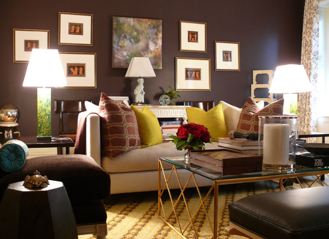
When working on the color design of the interior, it is necessary to solve several problems at once. It is necessary to consider the influence of color on the mood behavior of the inhabitants of the home, the psychological perception of color shades, the influence of color on the awareness of space in a particular color scheme. Imagine how the combination of colors will support harmony in the interior and create coziness and peace.
Content
To break the rules, you have to know them
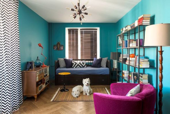
The construction industry offers such a variety and diversity of finishing materials of different shades that a traditionalist, a lover of risky decisions, and a modernist can realize the dream of a house in which you can relax your soul. You should start with visualization. Enter the room and look around.
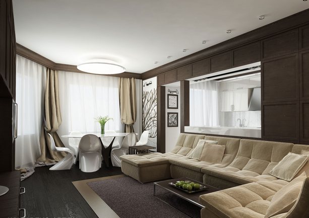
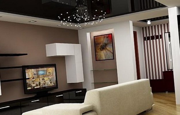
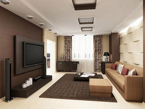
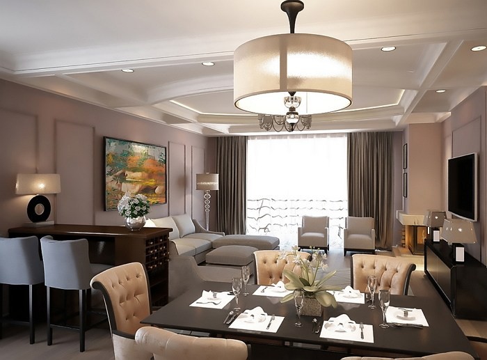
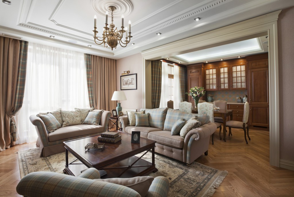
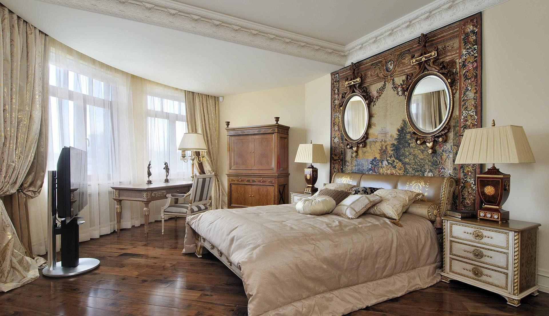
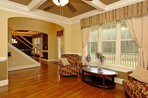
The interior of the premises can be designed as a whole (all rooms in the same style) or in detail. The color of the floor, ceiling, walls, baseboards, doors, windows, furniture, carpeting – everything is important.
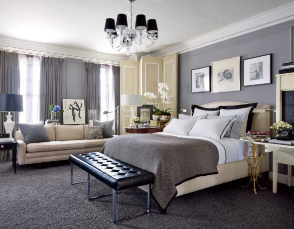
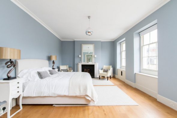
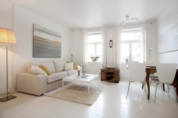
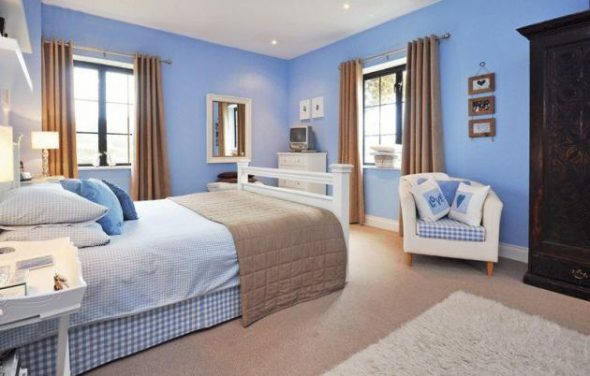
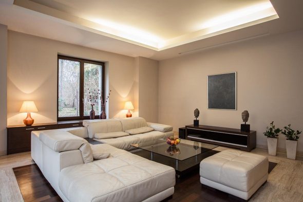
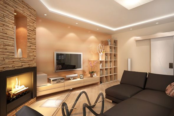
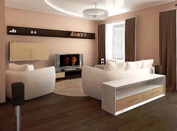
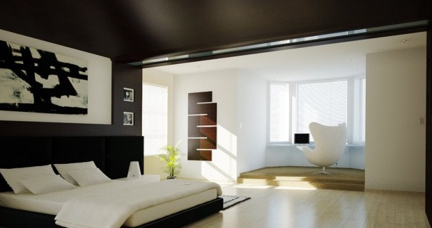
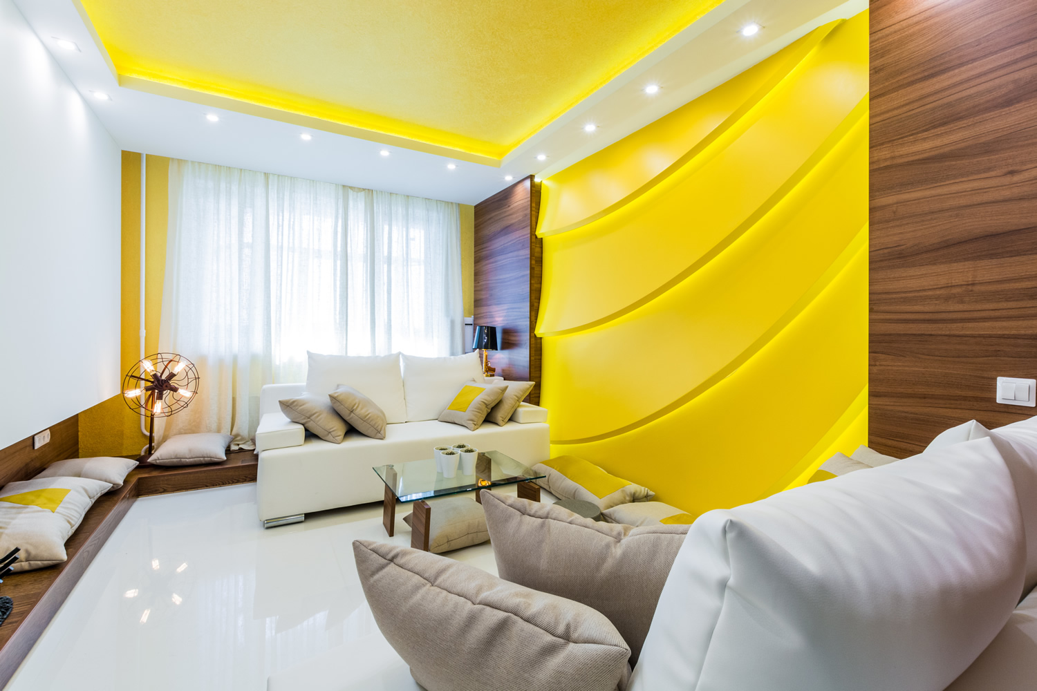
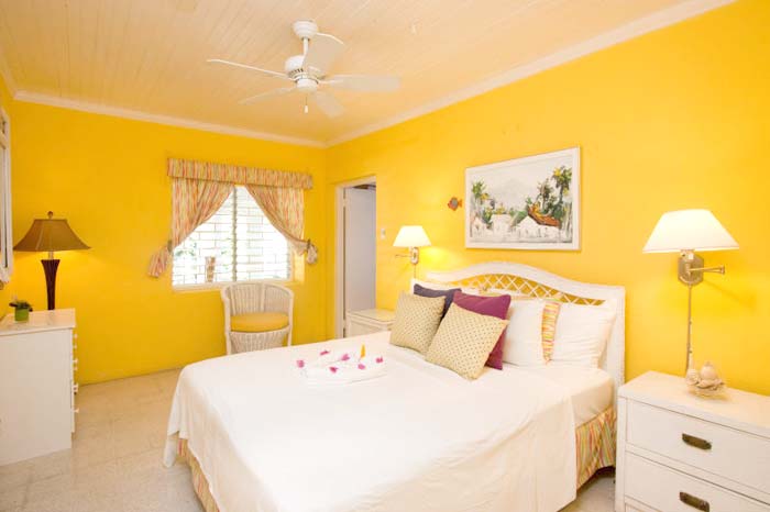
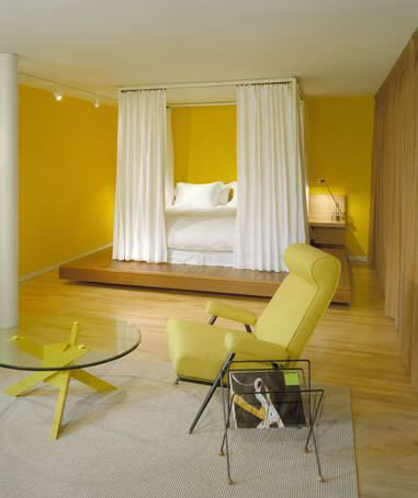
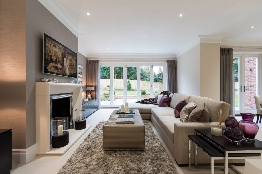
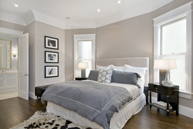
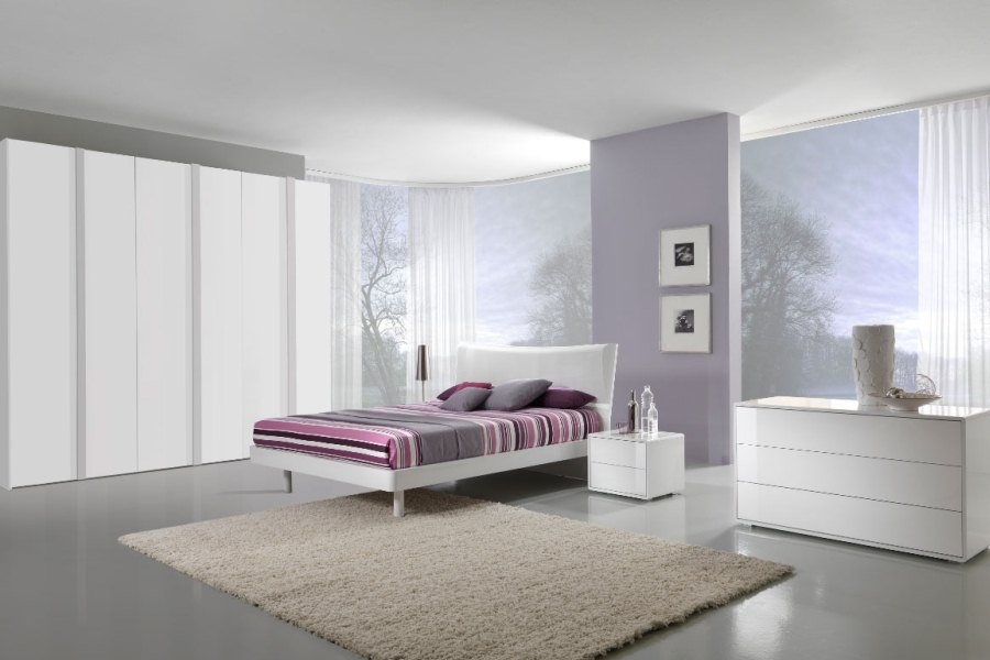
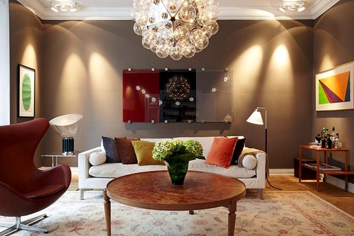
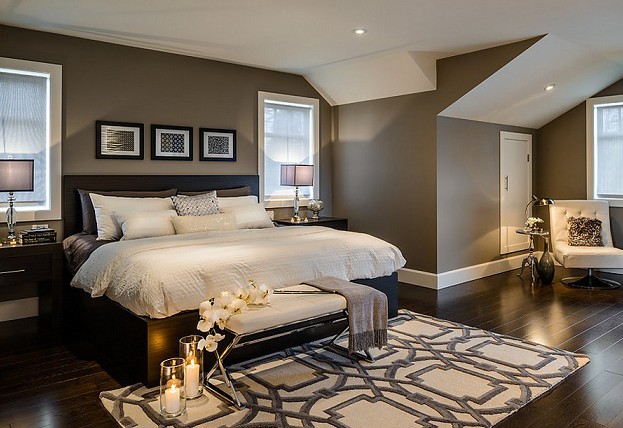
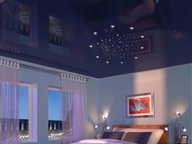
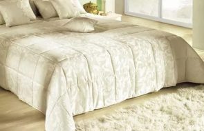
Light tones and shades in the living room and bedroom will visually increase the space. There will always be a good mood, peace, and full rest. In rooms facing north, use sunny yellow.
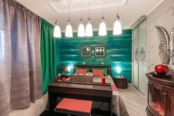
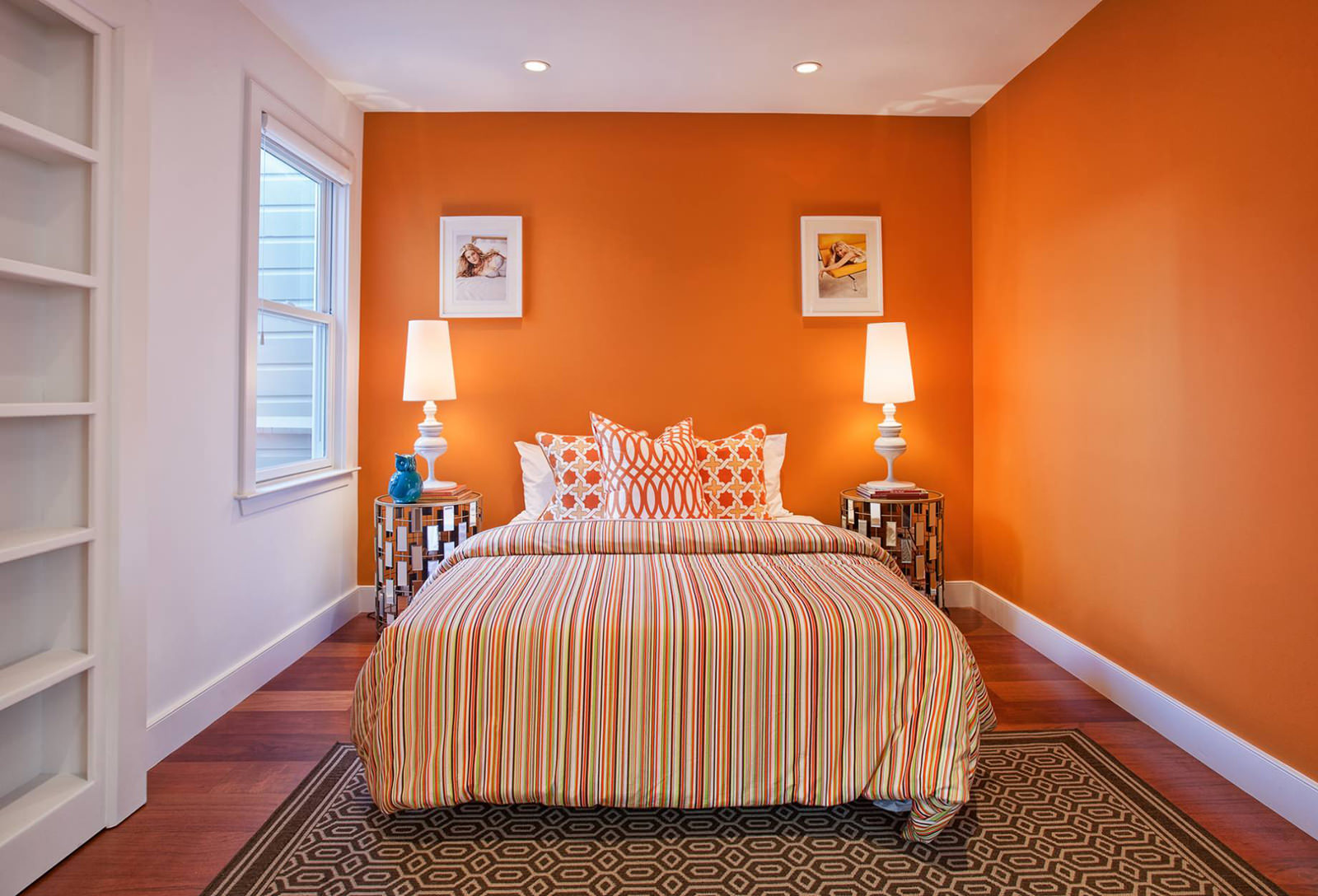
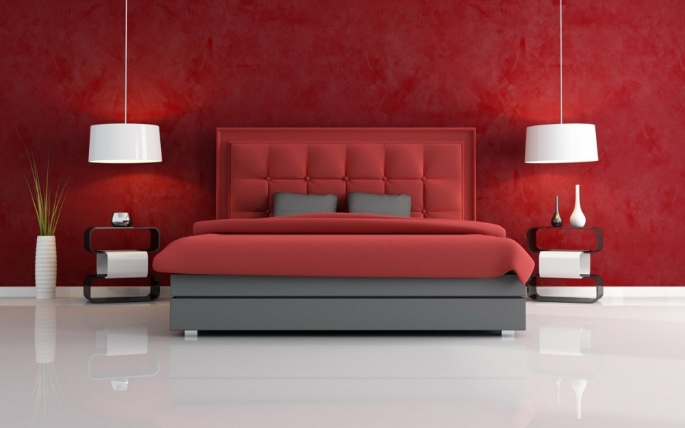
Delicate pastel combinations of the floor, walls, and ceiling in the nursery calm, develop creativity, and pacify. It is good to play and run in the red room, but impossible to fall asleep.
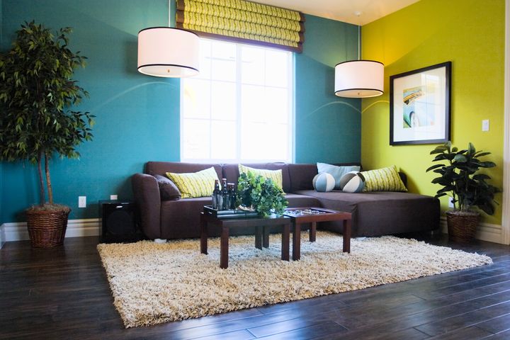
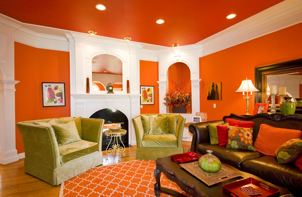
In a kitchen in blue and white tones, hunger is satisfied with small portions. And where yellow, orange and green predominate, it is eaten excellently.
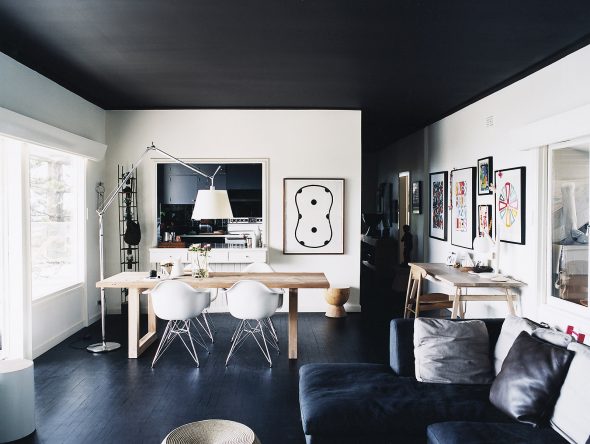
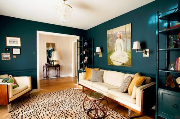
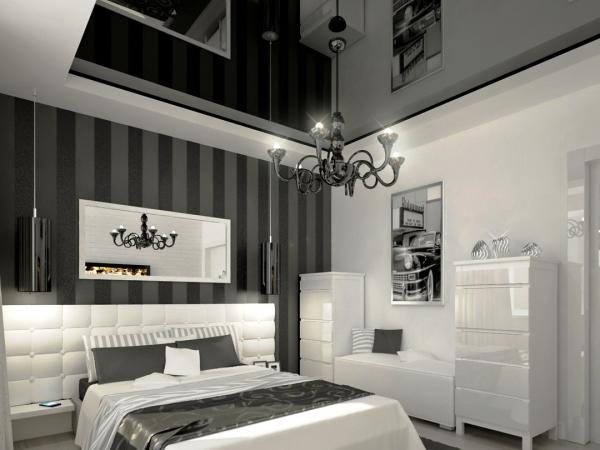
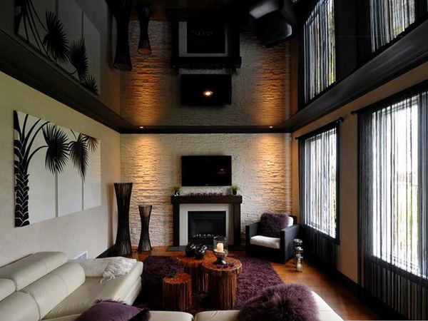
Dark colors in the room will visually reduce its size. A dark ceiling will make the room lower. It is necessary to select colors so that they do not tire, do not quickly become boring, do not irritate.
What does color say?
- Red is about sexuality, tension.
- Brown is depressive.
- Gray is sad.
- Blue – uncomfortable, sleepy.
- Yellow – sunny, joyful.
- Green is vital, cheerful.
Color "dependence"
A correctly chosen combination of colors can work wonders. For example, we choose the color of the floor. We focus on the walls, the ceiling.
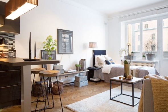
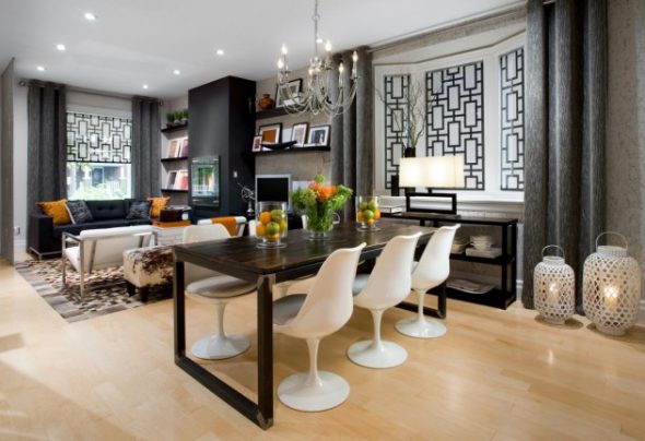
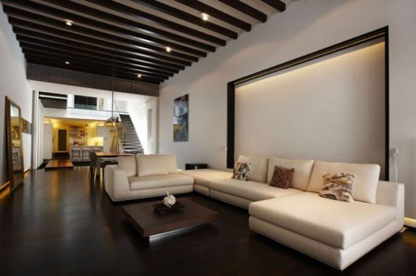
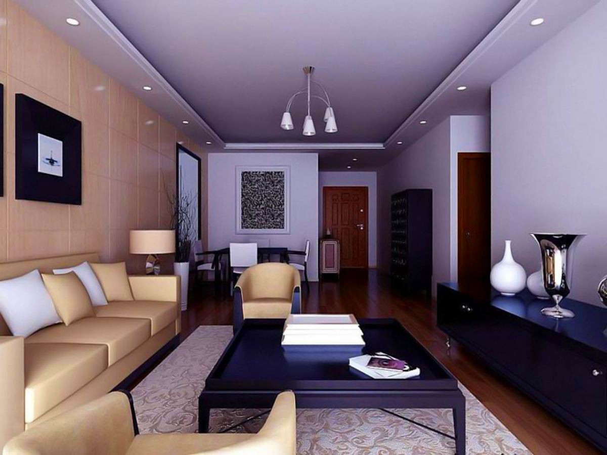
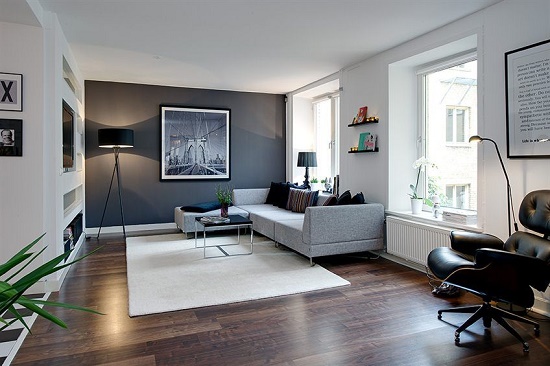
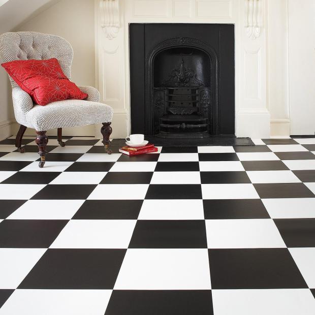
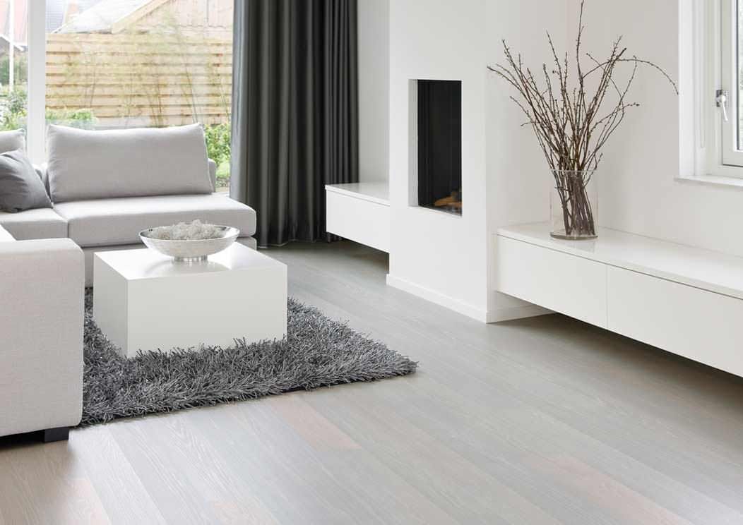
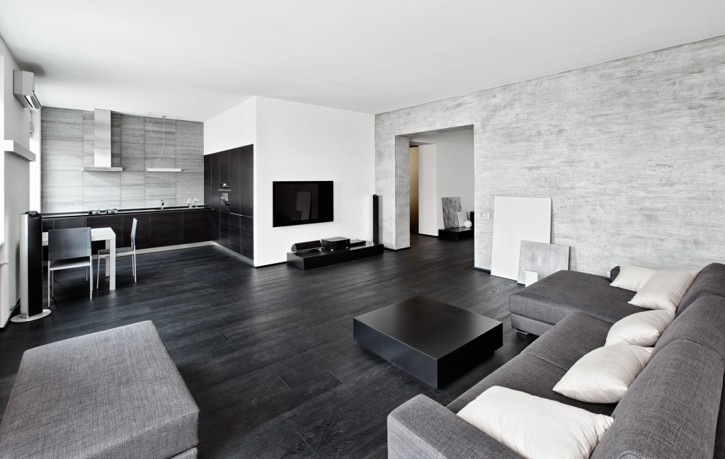
- Dark floors made of natural wood (parquet, board) or laminate in a room with white walls and ceiling will visually make the room larger.
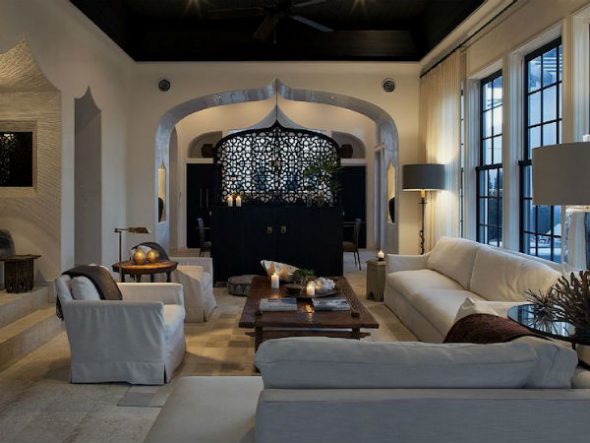
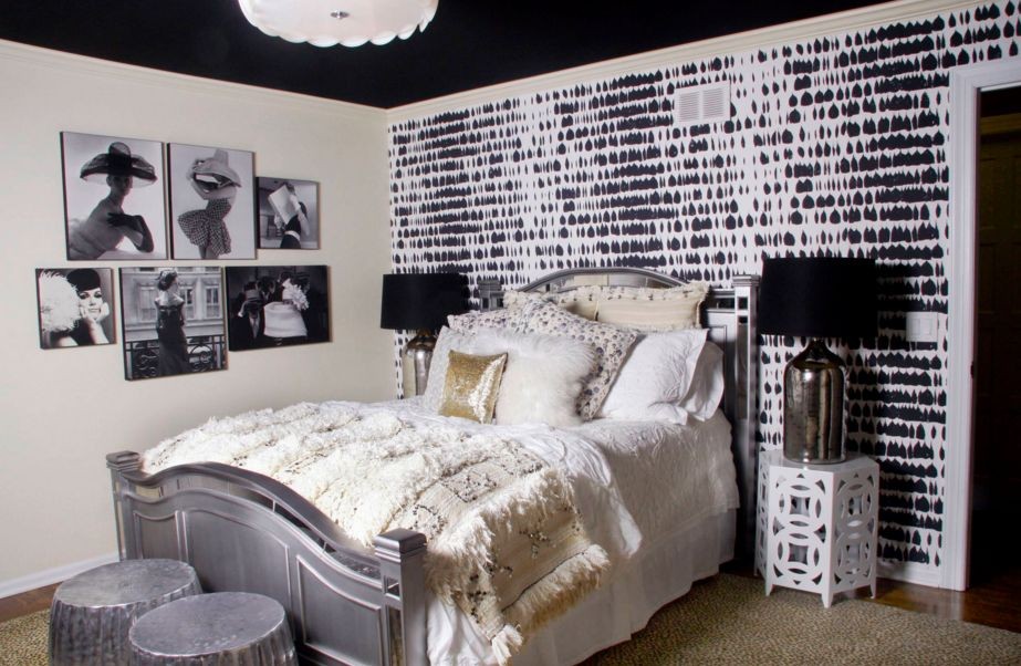
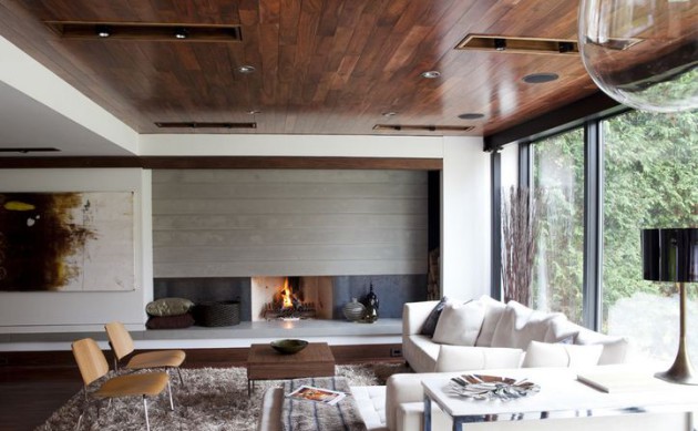
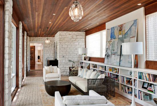
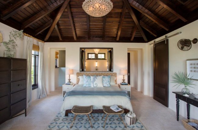
- A dark floor, dark ceiling and light walls will remove height and stretch the room.
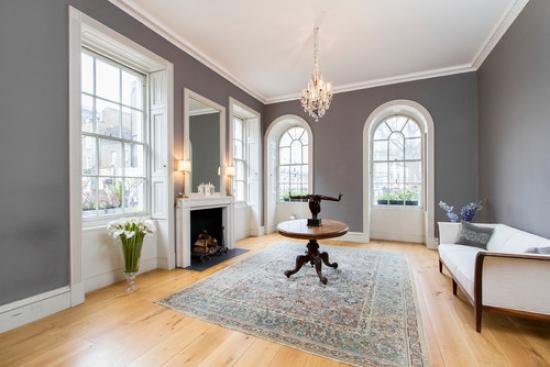
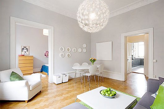
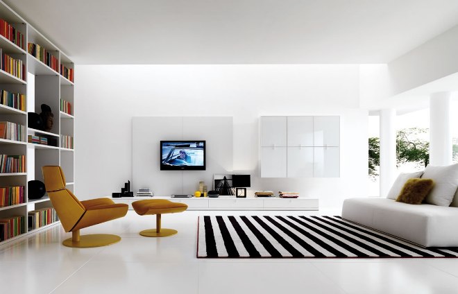
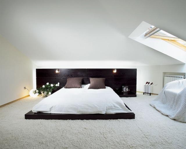
- Light floor color, light wallpaper, white ceiling will raise the height of the ceilings.
- Light floors, dark walls, and a light ceiling will flatten the room.
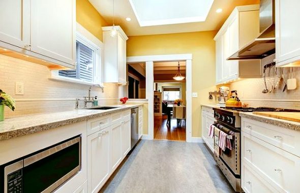
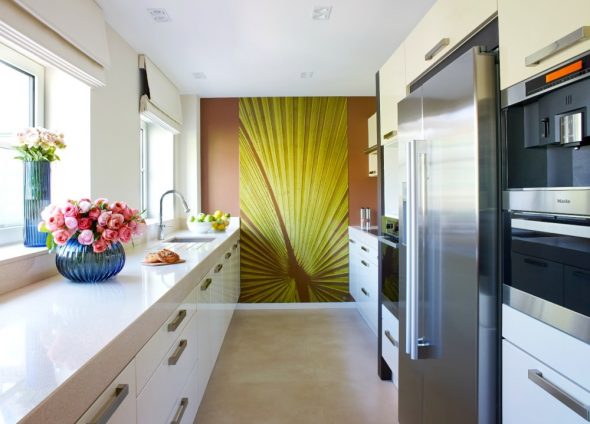
In the kitchen, the color of the floor depends on the theme: country style, modern, classic. The choice of material - white or colored tiles, natural wood in beige, brown, red tones, plain or patterned stone, even concrete - will emphasize the individuality of the owners.
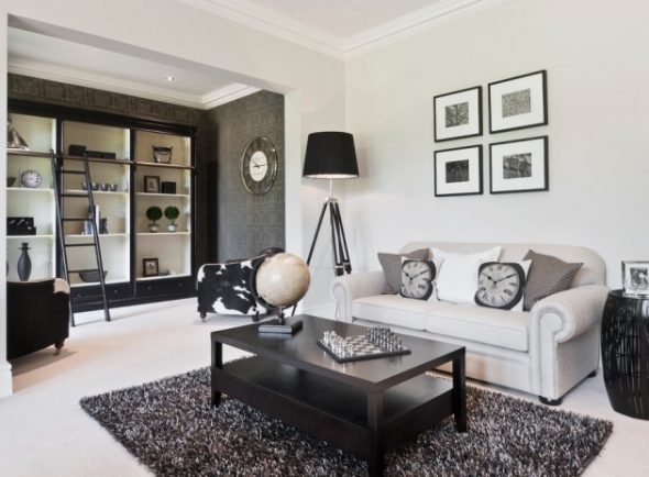
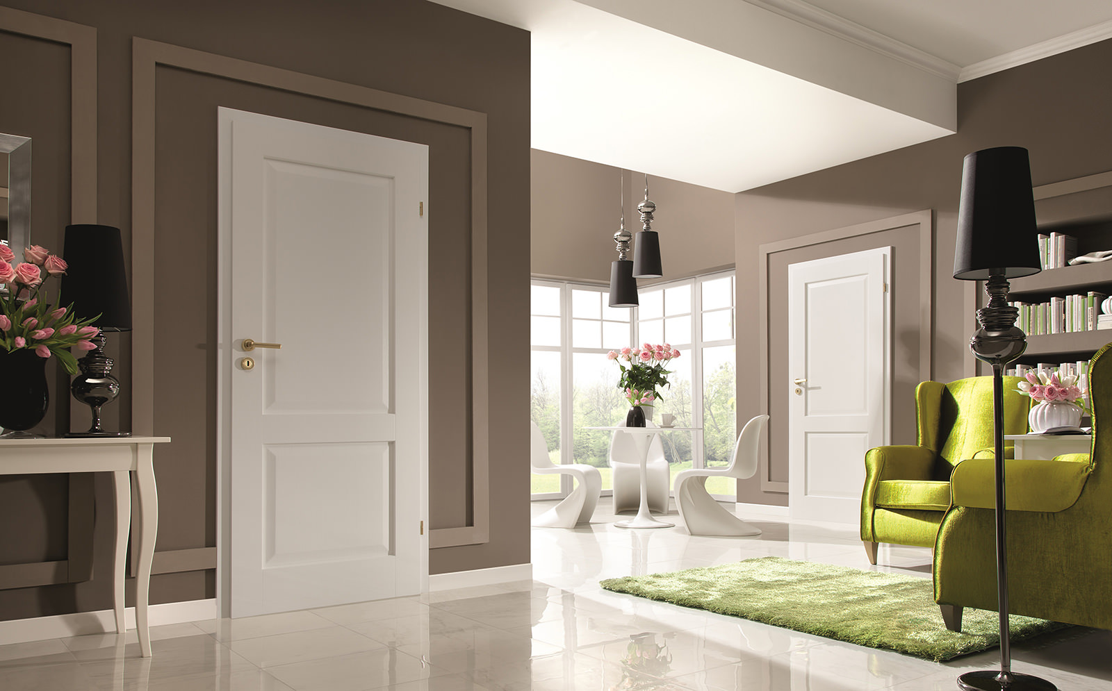
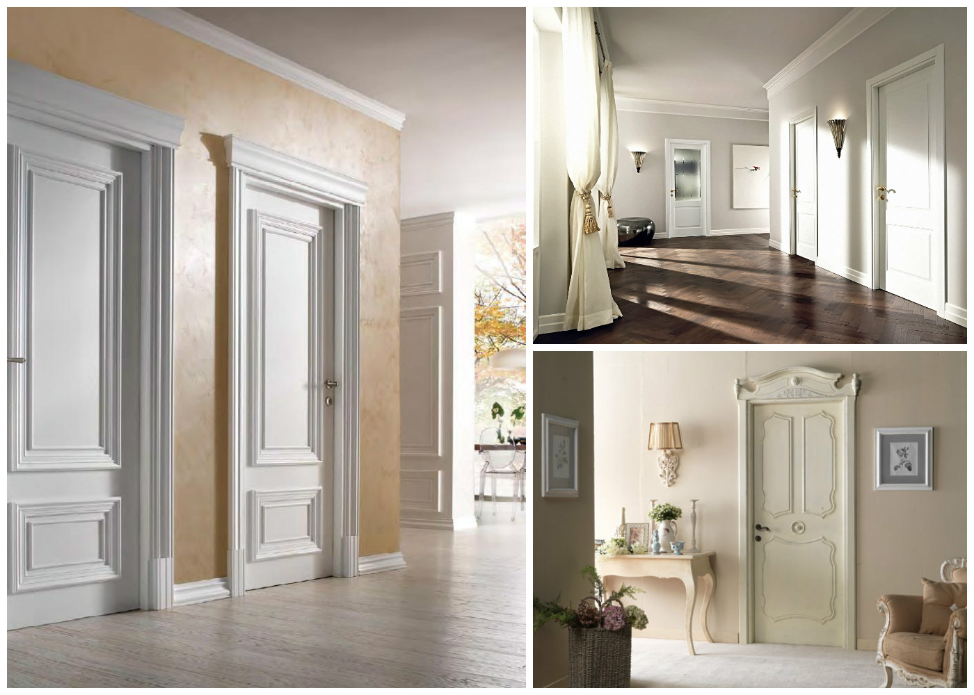
Dark colors of the floor, skirting boards and doors, chosen by contrast, look good in rooms with light walls and ceilings. White doors and skirting boards with dark shades of the floor create additional air in the room, soften the accents.
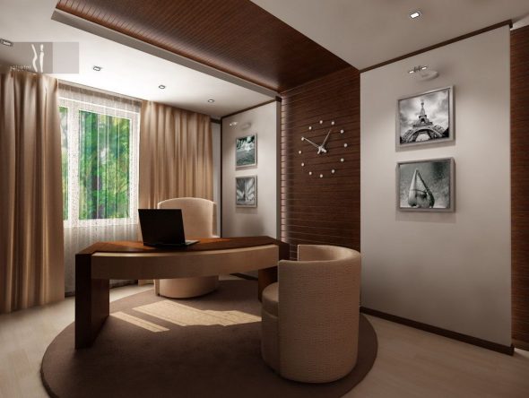
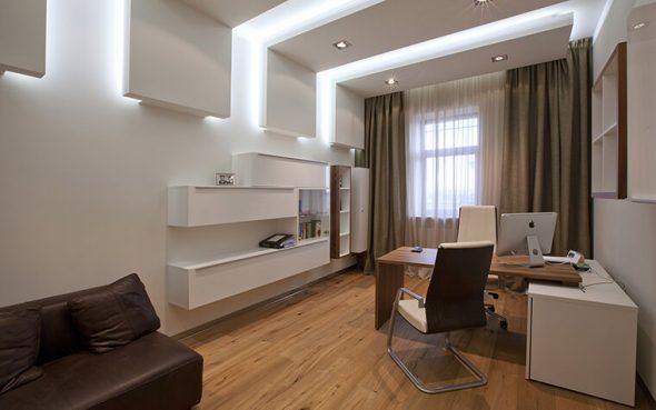
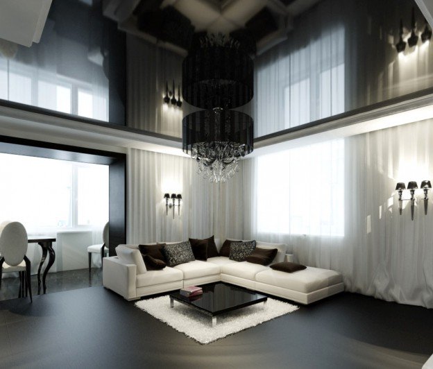
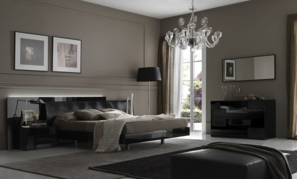
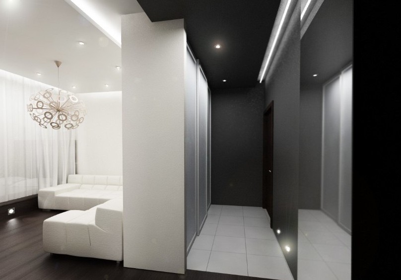
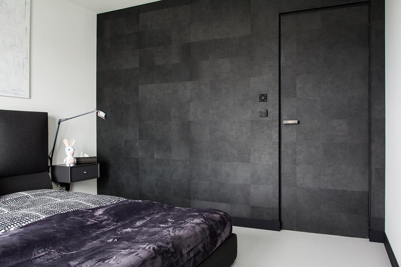
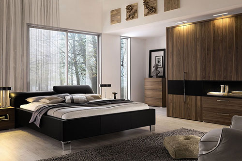
White furniture looks stylish and noble in a room with dark floors and walls, and a light ceiling. Black flooring is a fashionable trend in color design recently. Here you need to try to match the furniture to the color, so as not to end up in a gloomy room that is depressing. Heavy black will dilute fresh white. The purpose of the room dictates the choice of color. This color set is good for a home office, a small living room. A dark hallway with white furniture and a door looks unusual and bold. A black floor in the bathroom requires space, white walls and a ceiling.
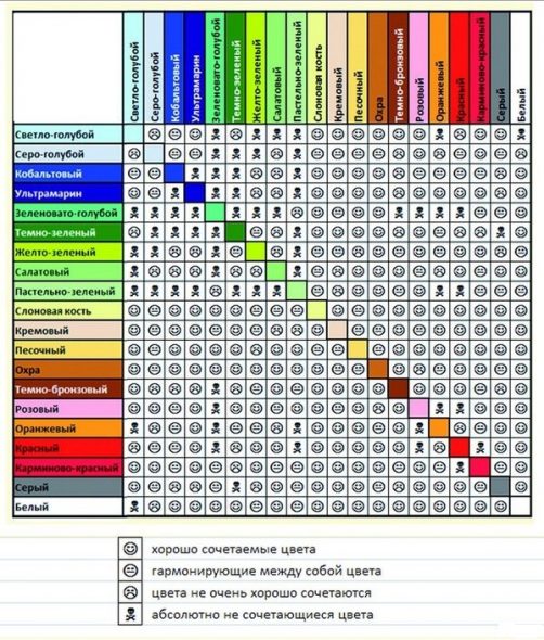
Color compatibility table
Each person has their own stable, formed tastes. Fashion is fashion, but living in a house whose walls are covered with fashionable 3D wallpaper, and you still like painted or with a small, unobtrusive pattern, will quickly become uncomfortable and you will want to redo everything. But how? To do it stylishly, originally. If you are in doubt, designers have developed a table of color combinations in the interior.
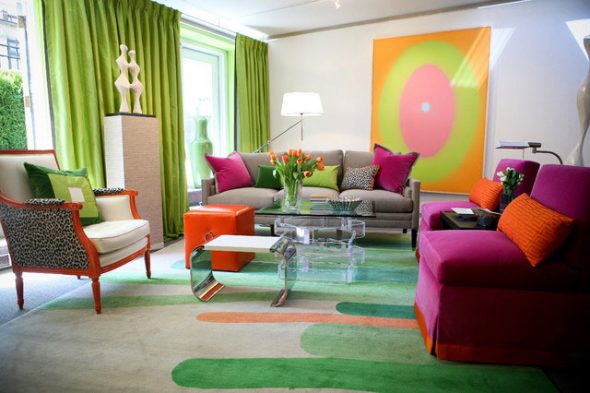
When the choice of a single-color design does not suit you, use the compatibility table. Experts have selected harmonious combinations of two, three or more colors that do not strain the eye, relieve psychological stress, and will look fresh and fashionable for a long time.
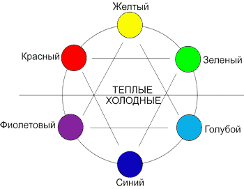
Lovers of contrasts should know such pairs. For example:
- red is opposed to green;
- lilac - light yellow;
- orange - turquoise;
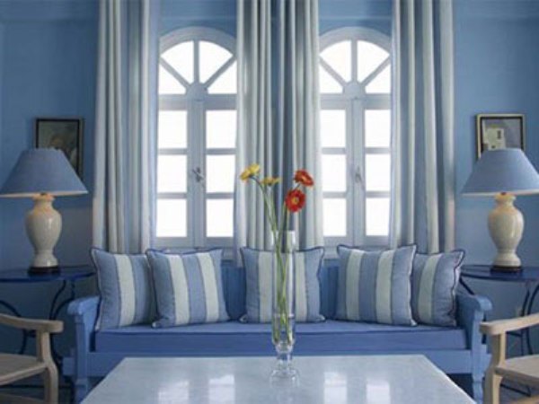
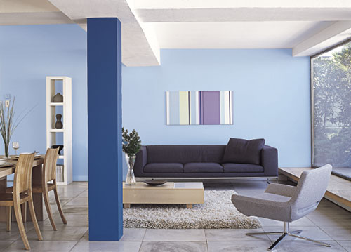
- blue - rich yellow;
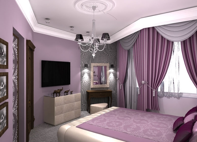
- purple - light green.
And vice versa, you will not be accused of bad taste if you are in the predominant interior:
- add a little pink and purple to the red;
- blue - turquoise, greenish, lilac, violet;
- green - young light green, blue, turquoise;
- yellow - orange and light green.
VIDEO:Table of color combinations in the interior.
50 photo ideas on how to combine colors for the floor and ceiling in the interior
If the ceiling is initially low (2.40 on one side and 2.15 on the other), and the length of the room is 9 m, will a high ceiling look good in combination with light walls and floors?