The original name of this color originated in France, in the Bordeaux region, where wines are produced that bear exactly the same name.
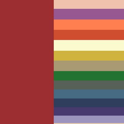
Burgundy is more muted and darker than scarlet, and belongs to the group of warm tones. Red and brown are combined to create it. Depending on the proportions, burgundy can be deep or bright. When merging the two colors, burgundy inherited their qualities, eventually receiving strength, activity, well-being, but lost the aggressiveness that red is so often guilty of.
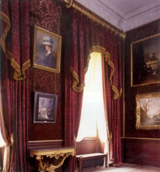
It is a representative of noble flowers and in ancient times was the color of emperors.
The impact of color.
- May evoke a feeling of joy.
- Like red, it promotes more efficient brain function.
- Universal in combination with both cold and warm shades.
But, unfortunately, there is a downside.
- For melancholic people, this color causes anxiety.
- If the interior contains even darker details, then all this will have an extremely depressing effect.
- May provoke aggression.
Please note!
It should not be used in small rooms as the basis of the interior, as it has the property of drawing objects closer to itself, the color will be oppressive and depress even more the already small space.
Psychologists believe that when used in moderation, burgundy creates a feeling of luxury, wealth, maturity, and also creates an invigorating, action-inspiring interior.
Burgundy cannot be overpowered; it will exert and spread its influence, even if it is only present in the interior as accents, such as burgundy curtains.
Important!
When choosing wine-colored curtains, you should definitely pay attention to their combination with other interior details.
Content
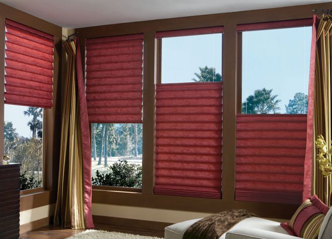
Burgundy curtains in the interior
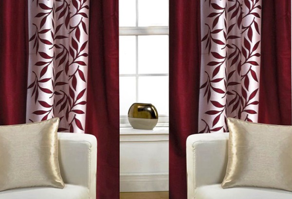
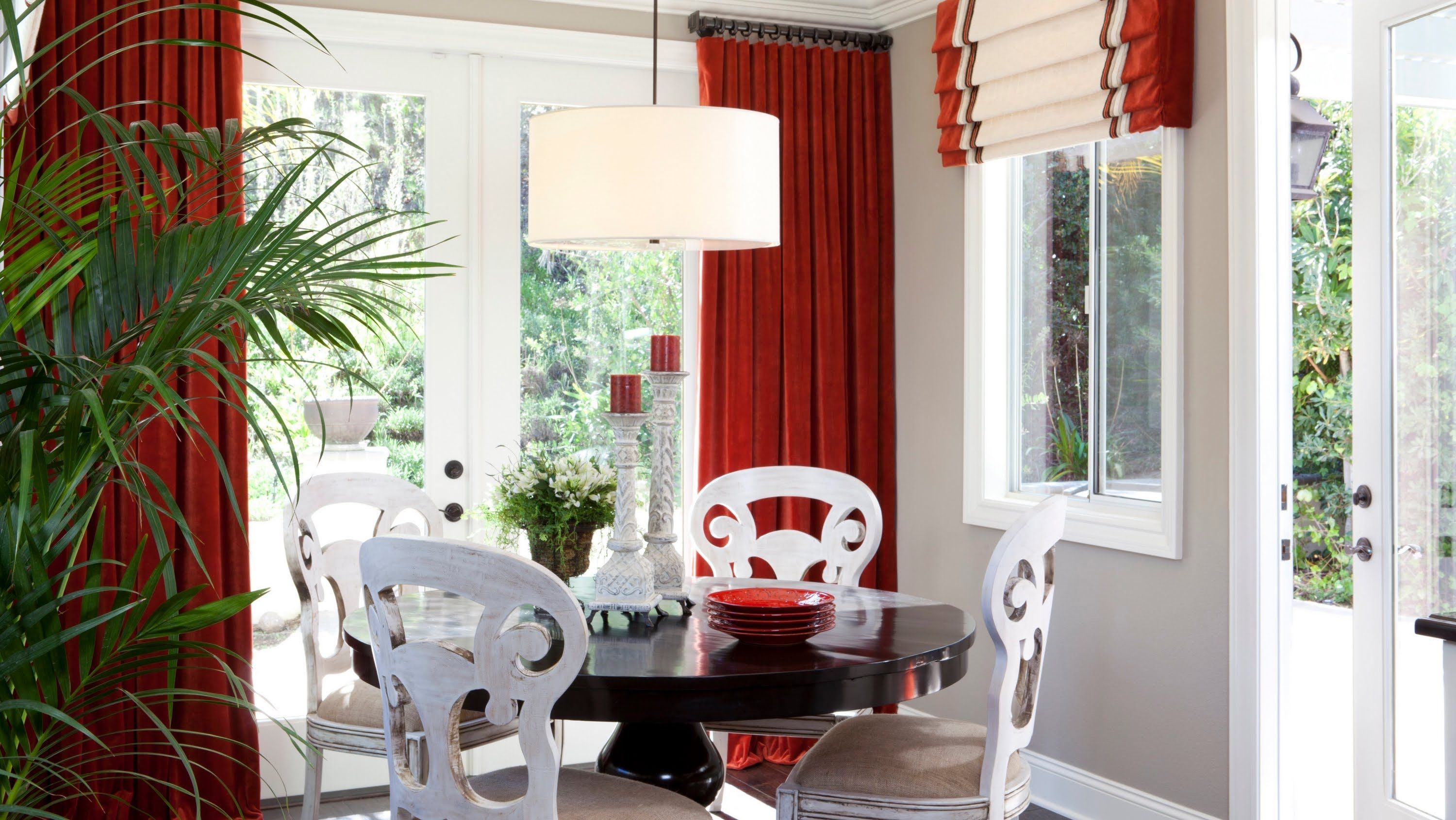
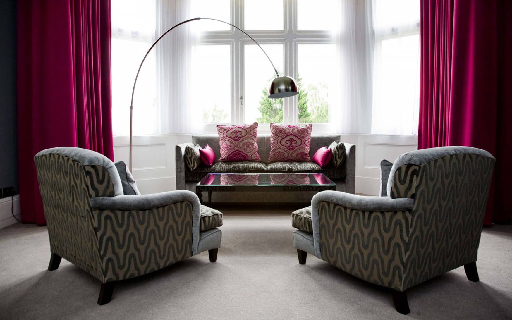
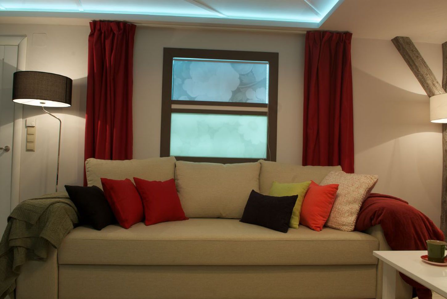
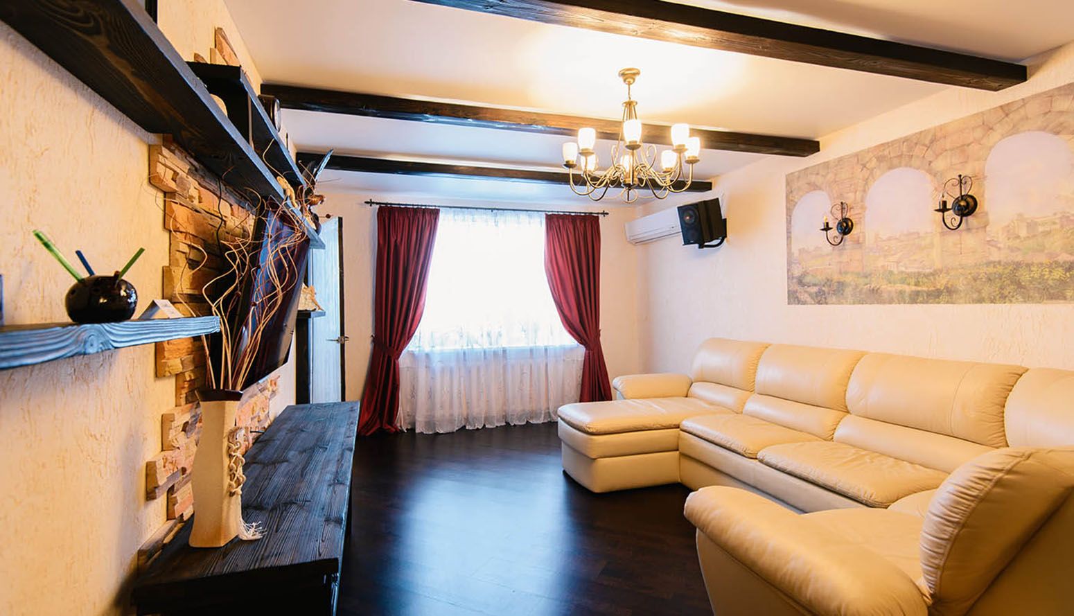
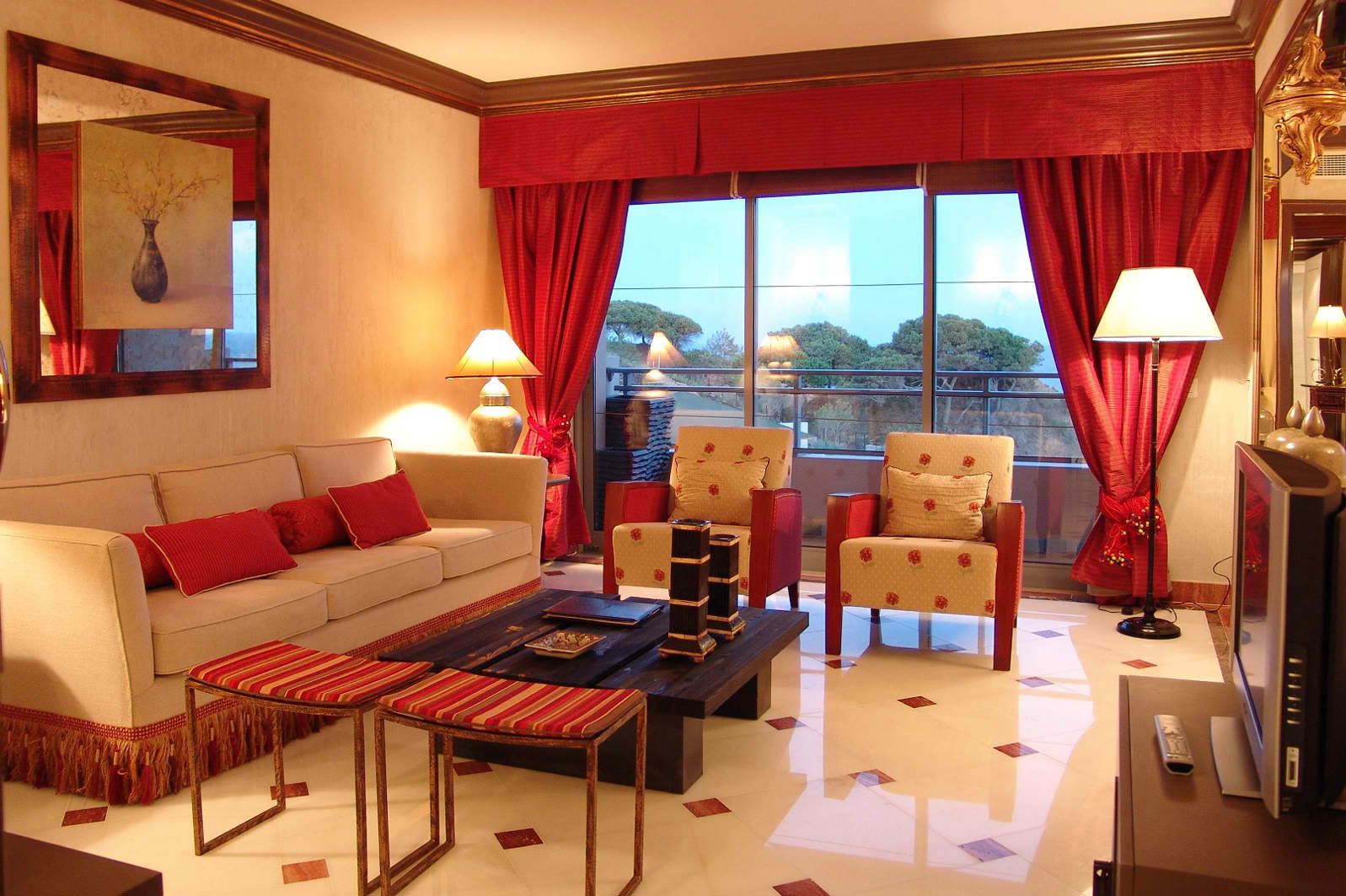
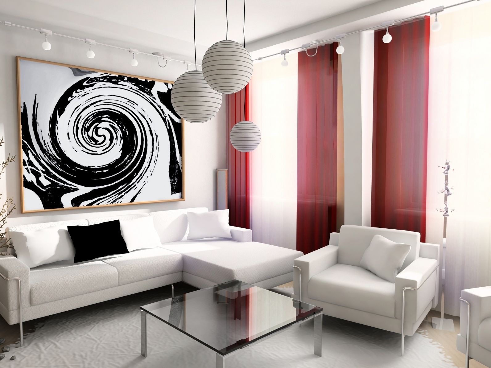
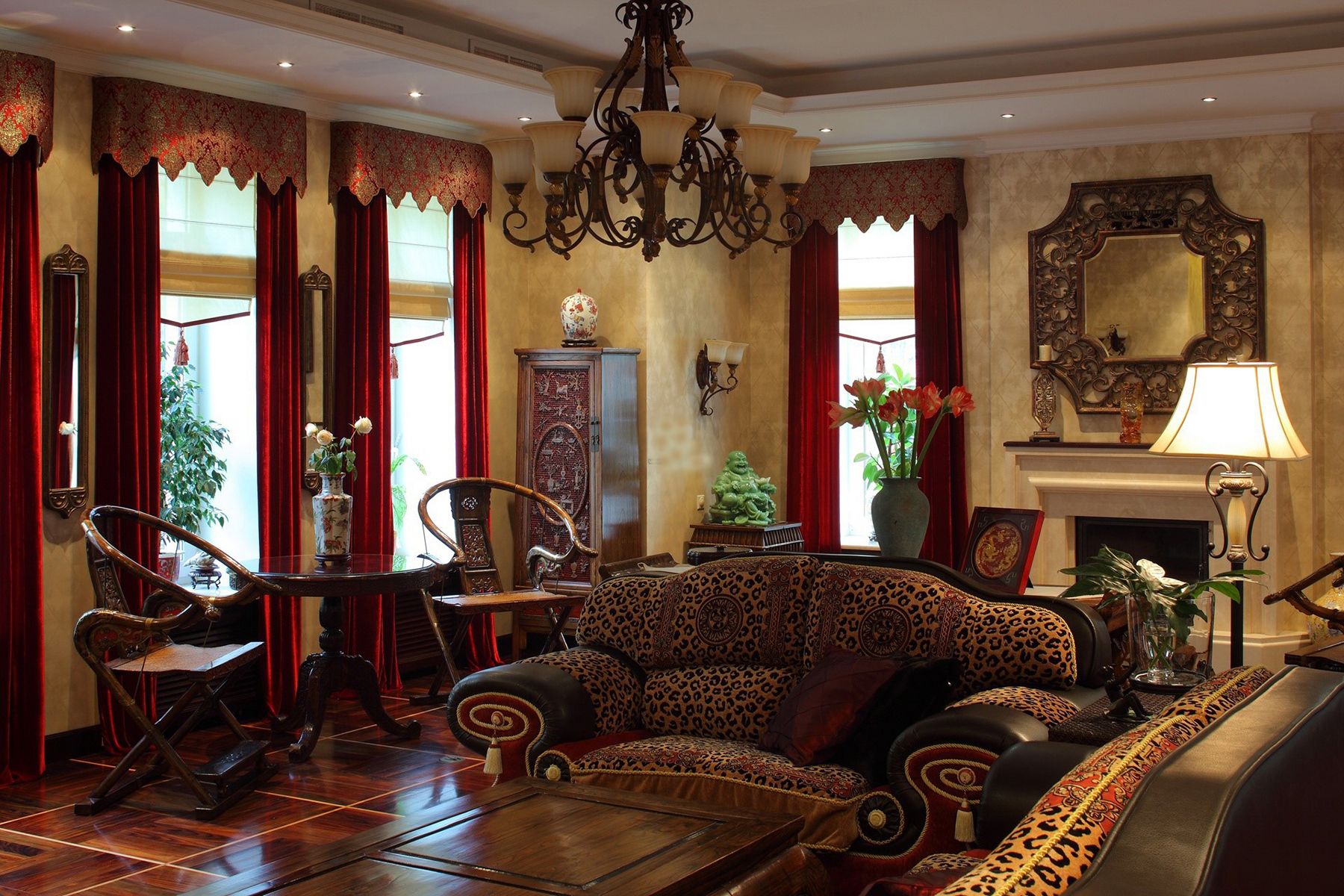
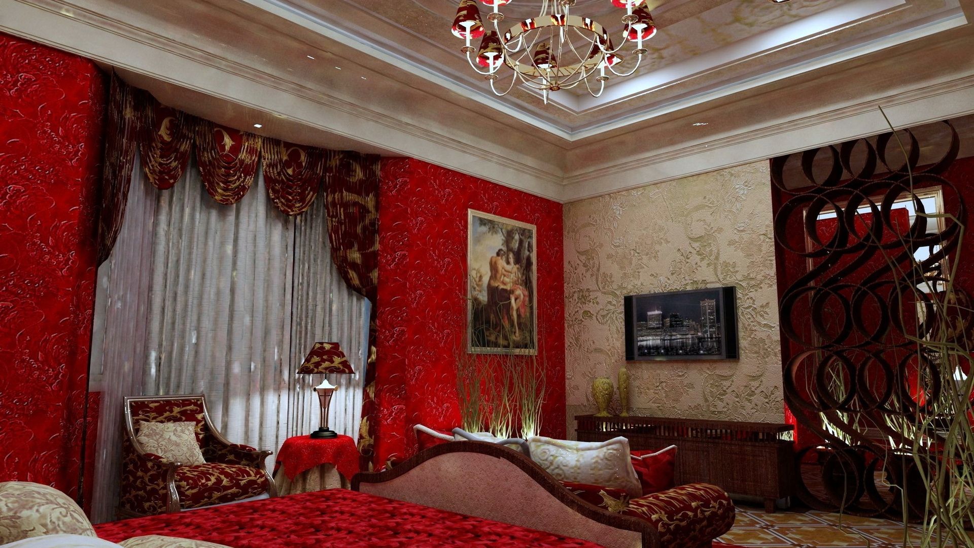
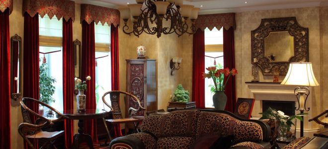
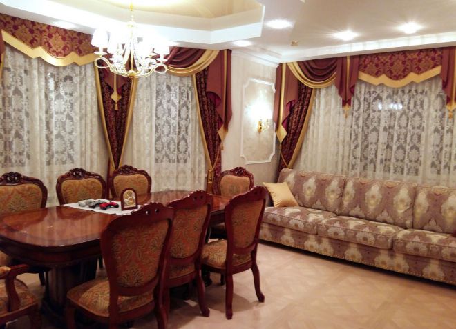
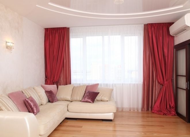
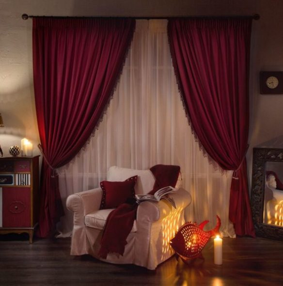
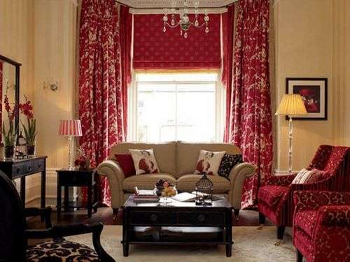
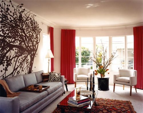
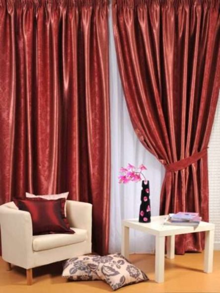
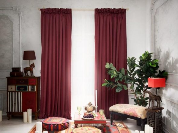
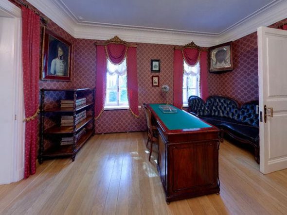
Living room in burgundy style
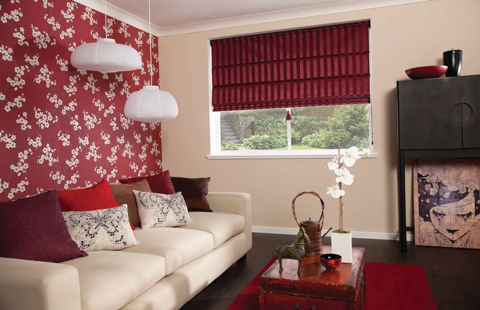
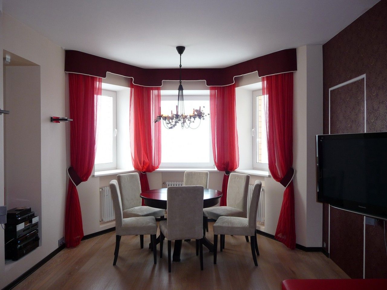
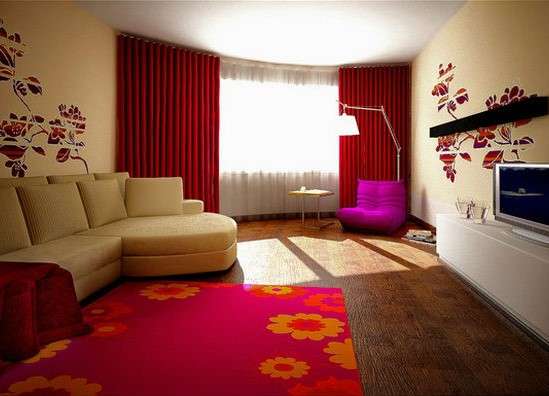
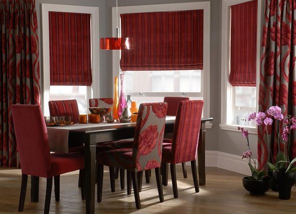
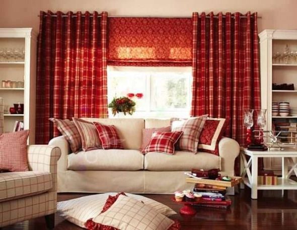
The living room is the business card of the entire house, so it is important to correctly combine all the interior details, the overall impression will depend on this. The most win-win option is a combination of burgundy thick curtains and gold or silver shades.
Important!
In darkened rooms located on the north side, it is better to use curtains in light colors with burgundy patterns or ornaments.
What wallpaper does it go with?
- Milky white.
- Beige and white.
- Gray.
- Sandy.
- Brown.
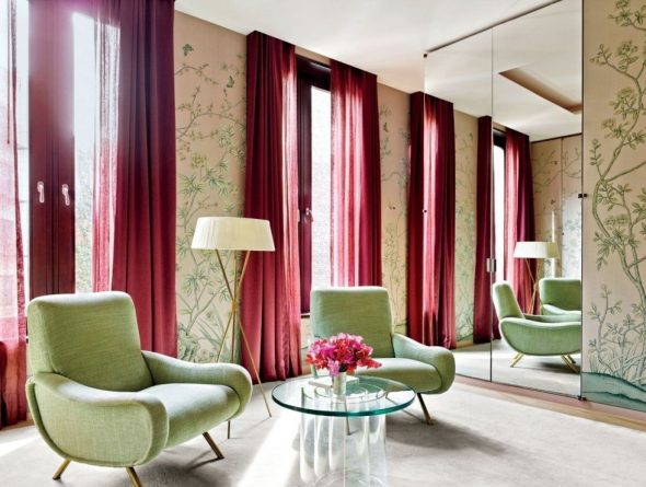
In a spacious, bright living room filled with artificial or natural light, burgundy curtains will look like the main accent spots.
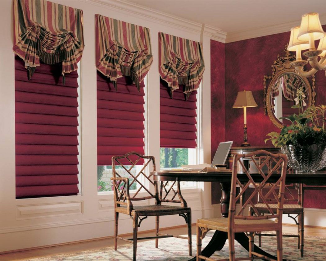
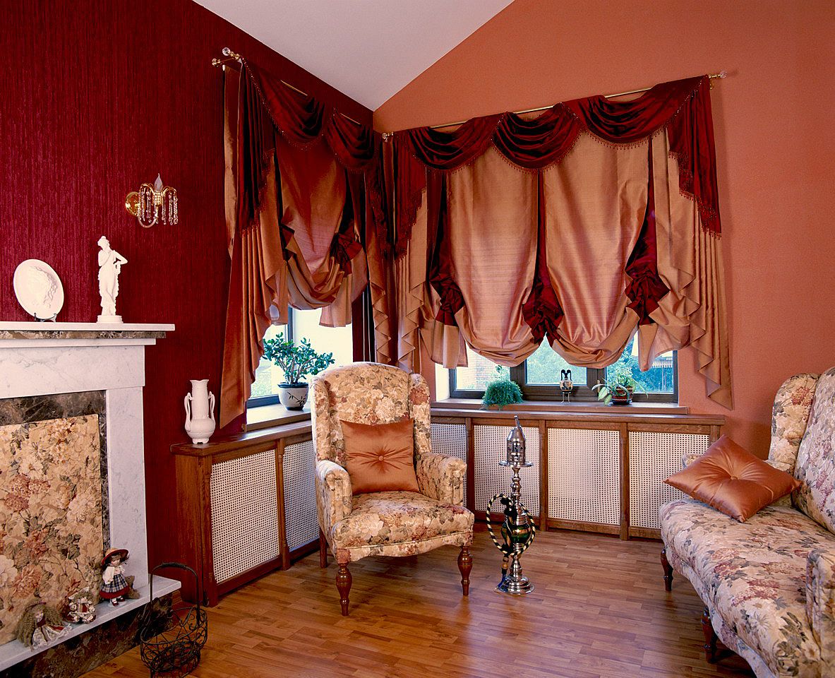
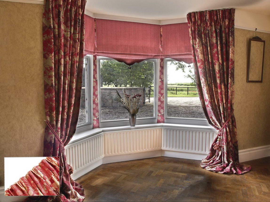
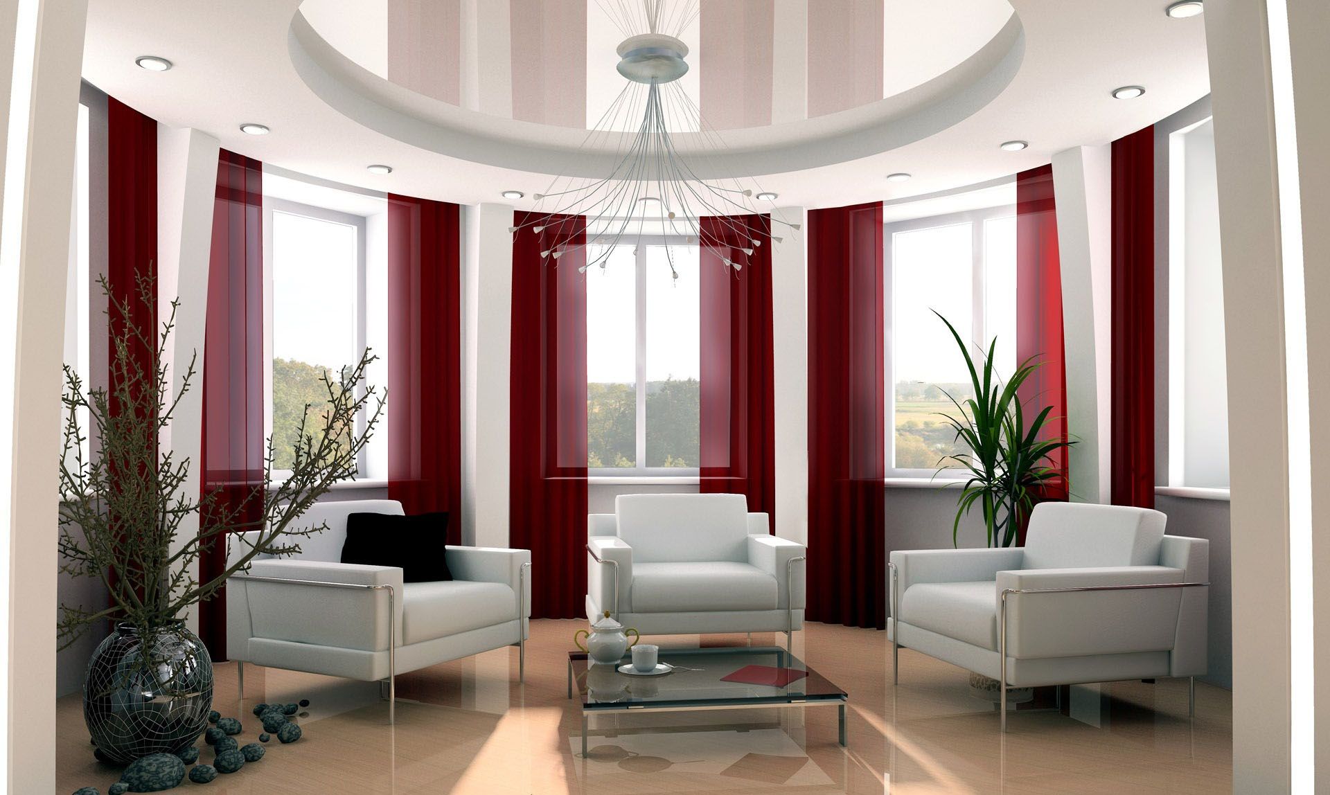
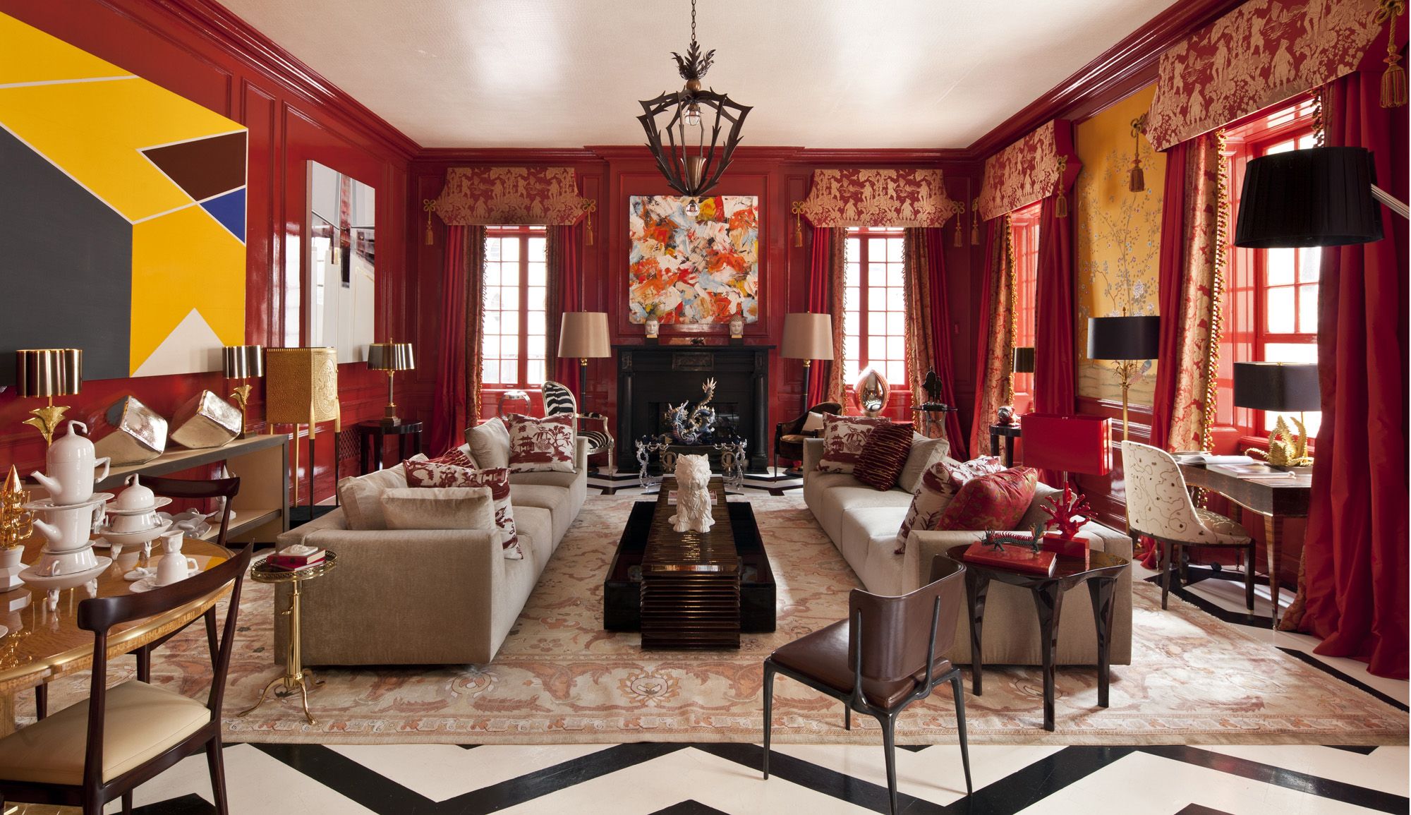
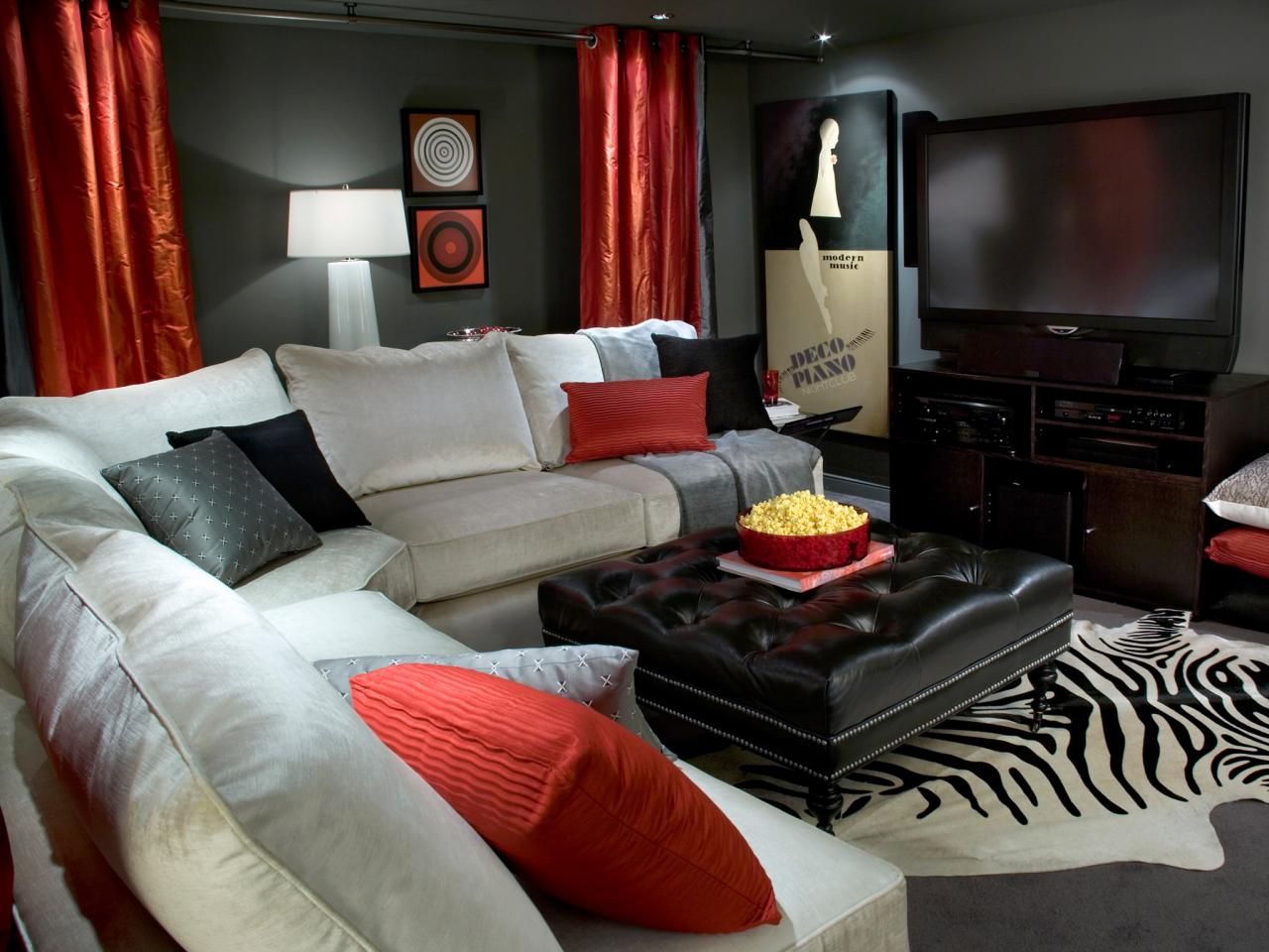
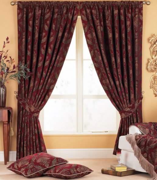
Design
In a large living room, you can use light curtains along with heavy draperies.
Long, sophisticated curtains with pleats are more suitable for modern styles.
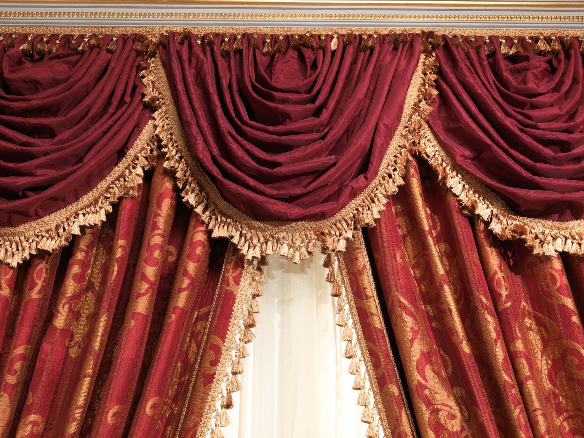
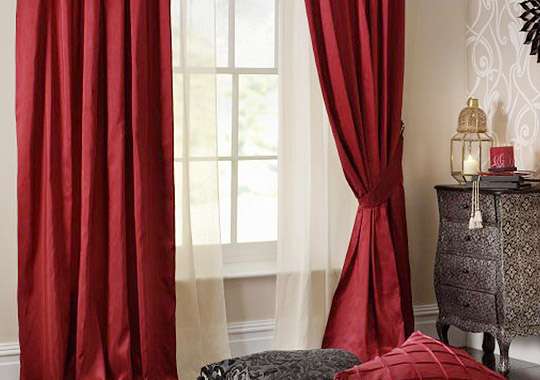
Tiebacks with tassels of gold or silver fringe will add luxury to the interior.
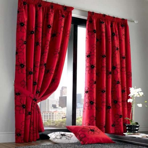
For fabrics, it is suitable to use natural silk, velvet, cotton, as well as synthetic polyester.
The length of the curtains can be any.
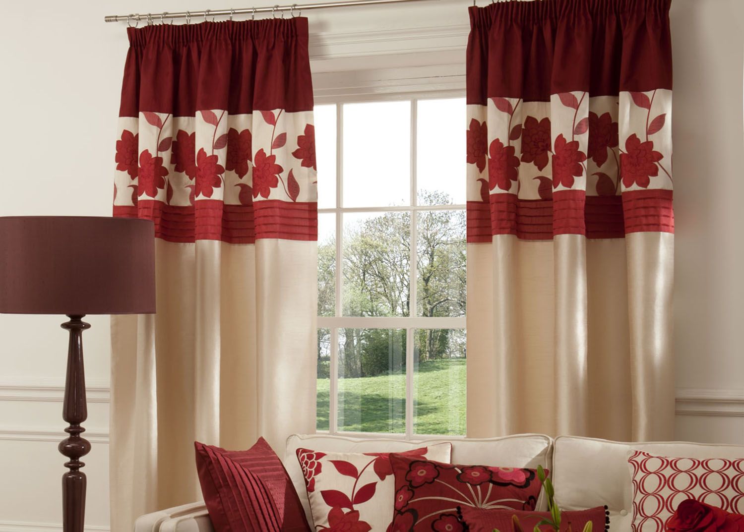
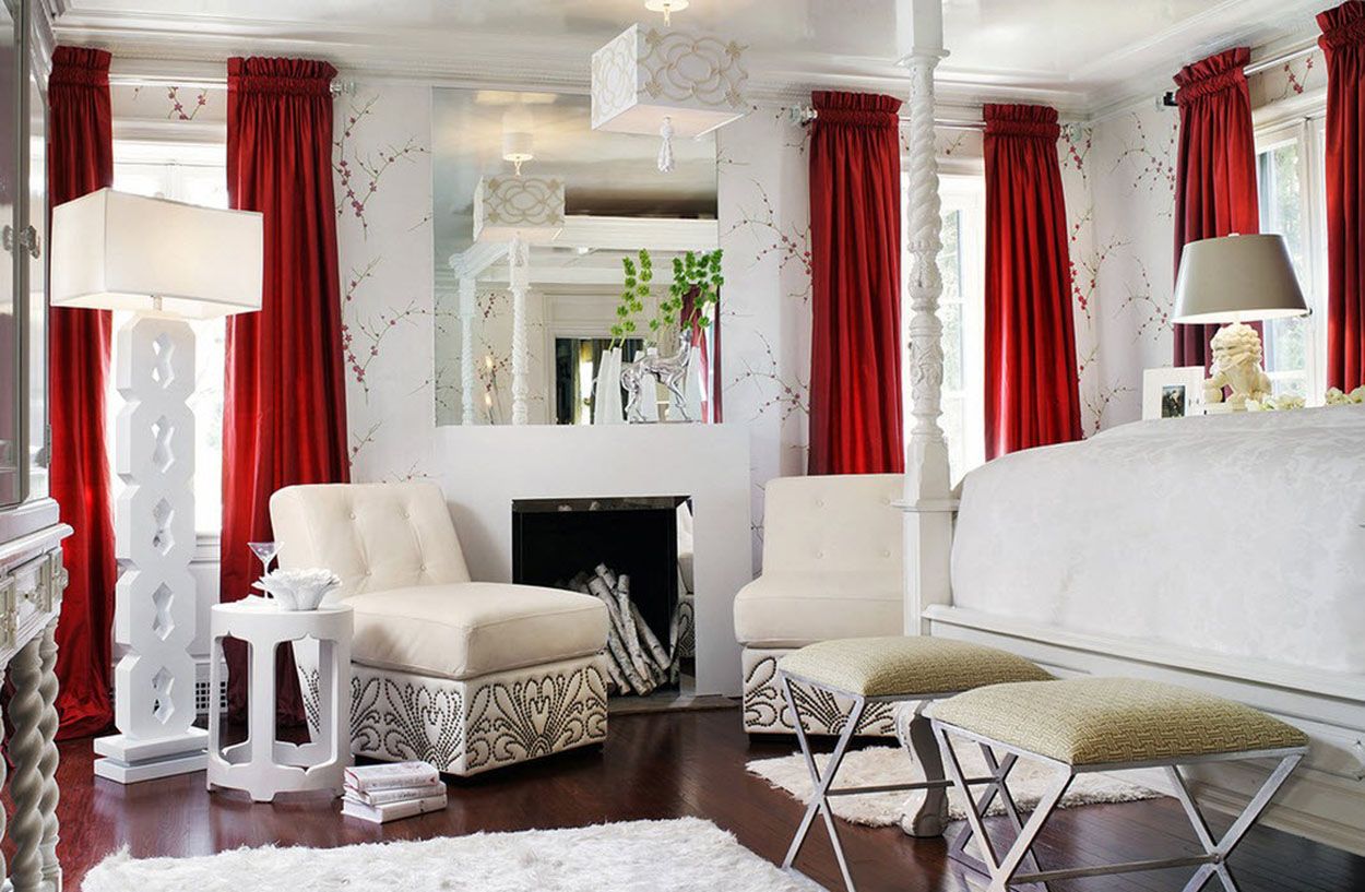
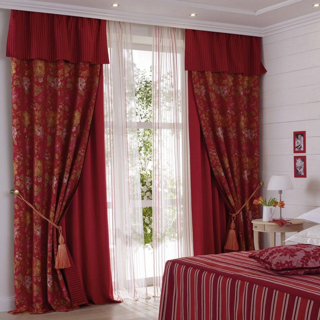
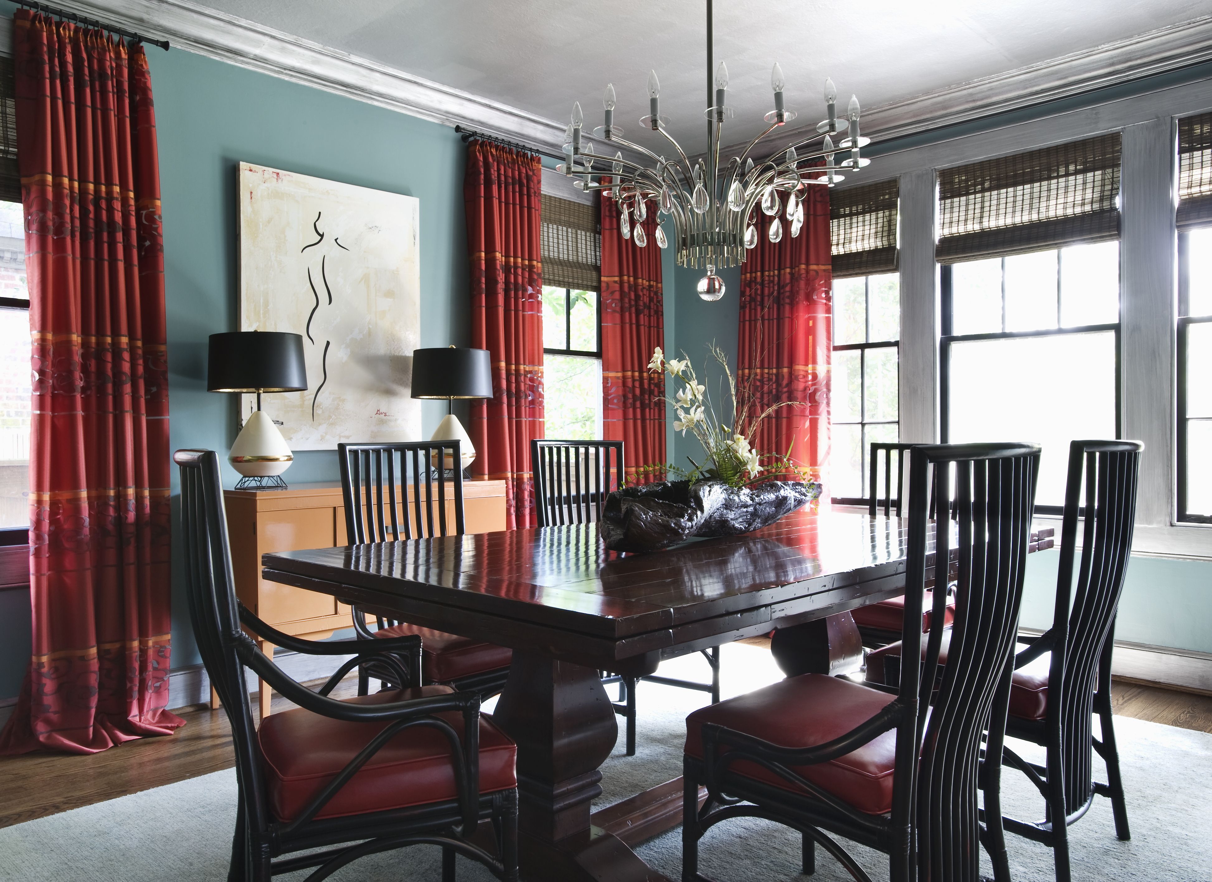
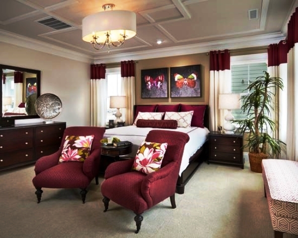
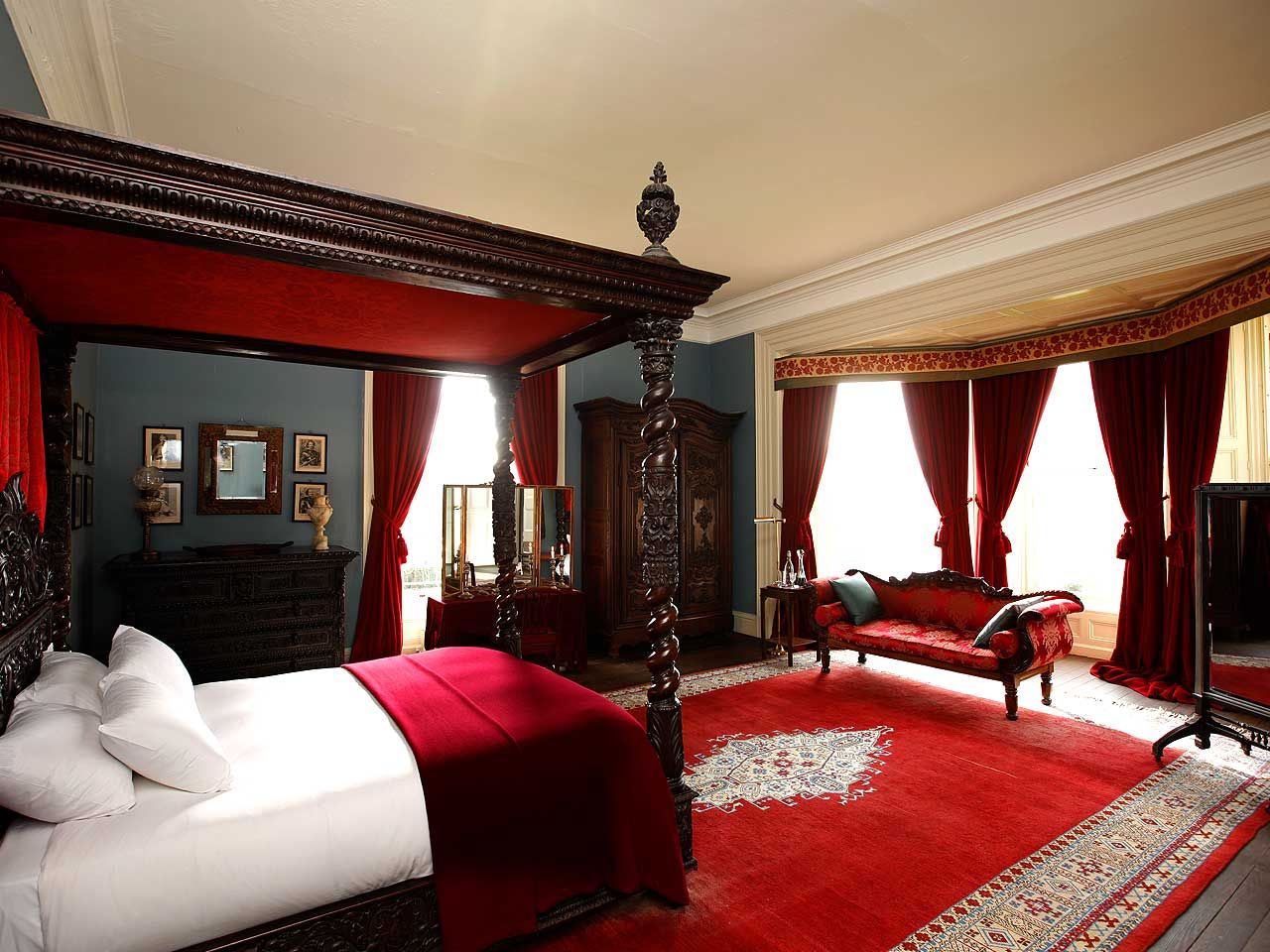
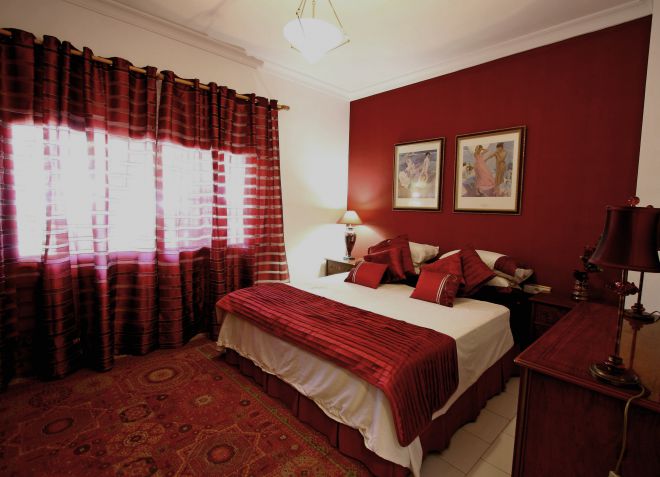
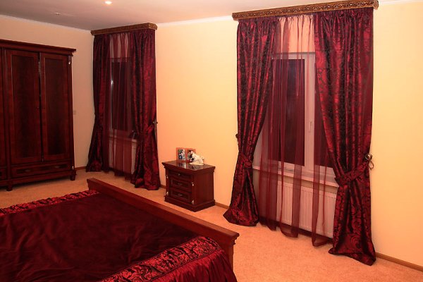
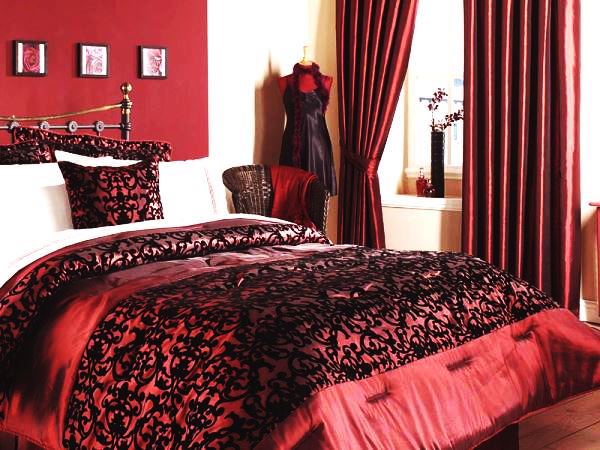
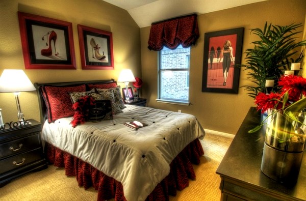
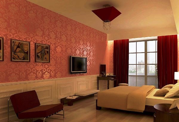
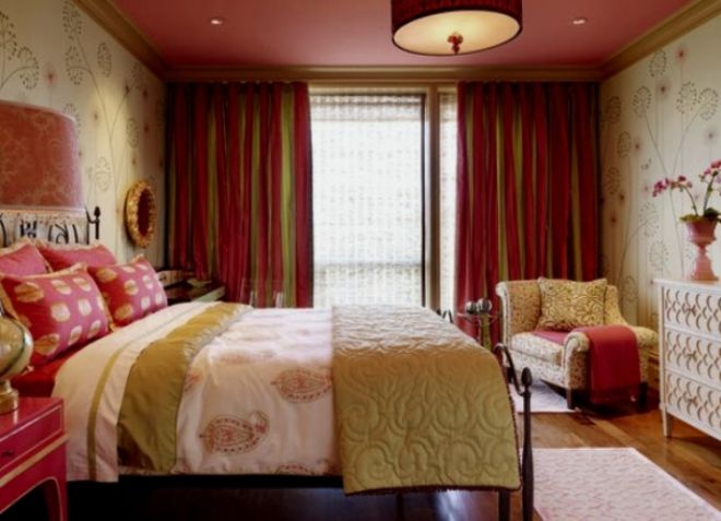
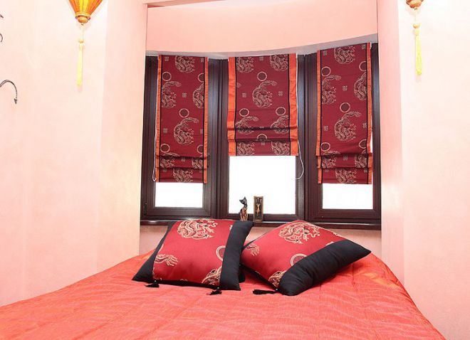
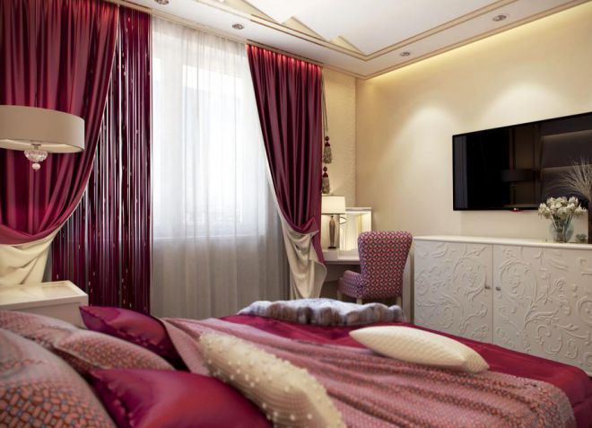
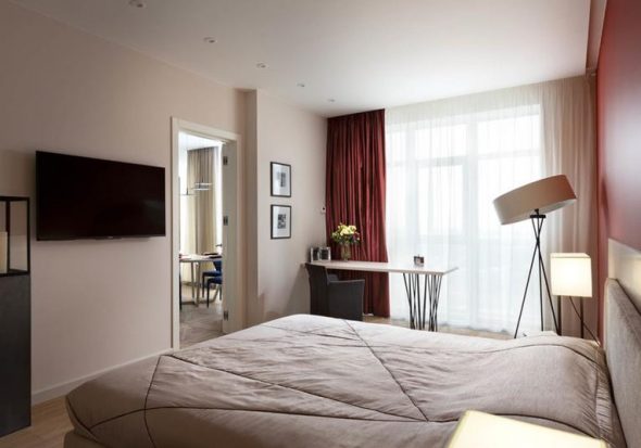
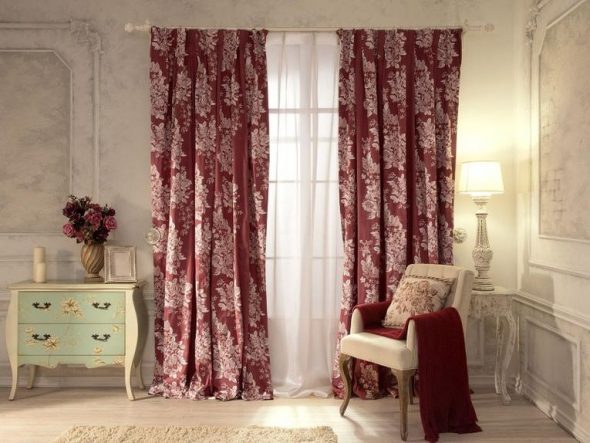
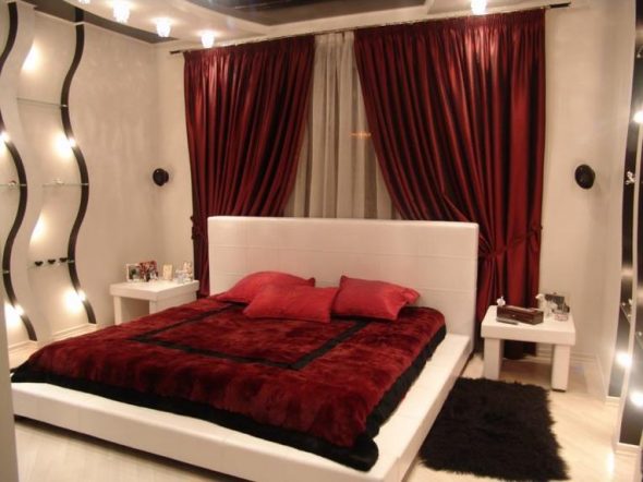
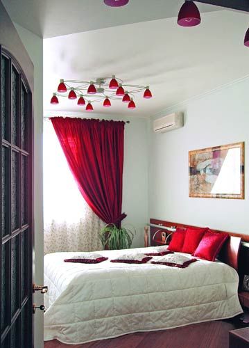
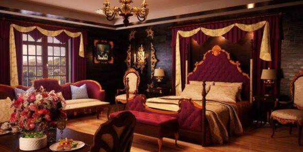
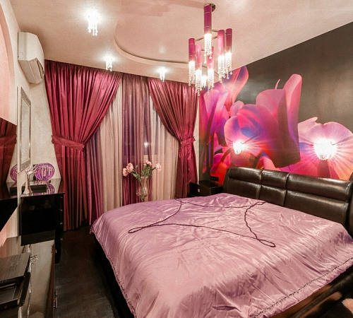
Bordeaux in the bedroom
When combined with soft pink and beige wallpaper, burgundy curtains will relax and promote sound sleep.
Important!
You should never combine such curtains with dark walls and floors; you will definitely not be able to relax in such a bedroom.
You can create coziness by duplicating colors, for example, a bedspread and pillows in burgundy tones that match the color of the curtains.
Design
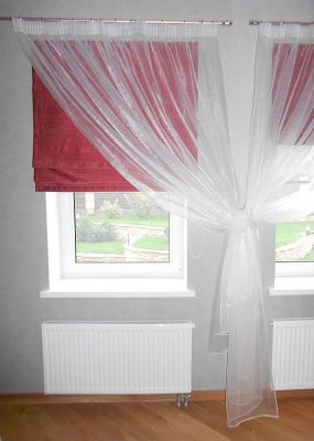
For the bedroom, satin or velvet curtains with gold fringe and almost white, literally flying, curtains are an ideal option. For a small room, plain curtains made of linen, satin or taffeta, as well as light tulle with various gold patterns, are perfect.
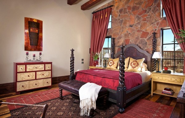
In a large bedroom, burgundy curtains made of velour and velvet, decorated in an oriental style, will become an attribute of luxury and wealth.
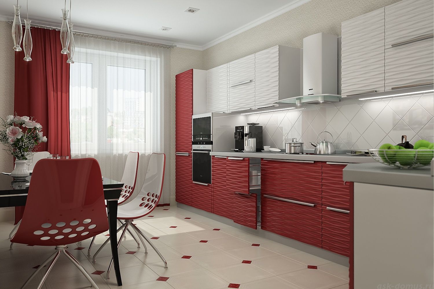
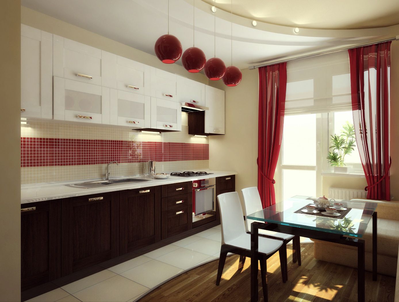
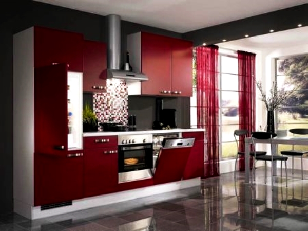
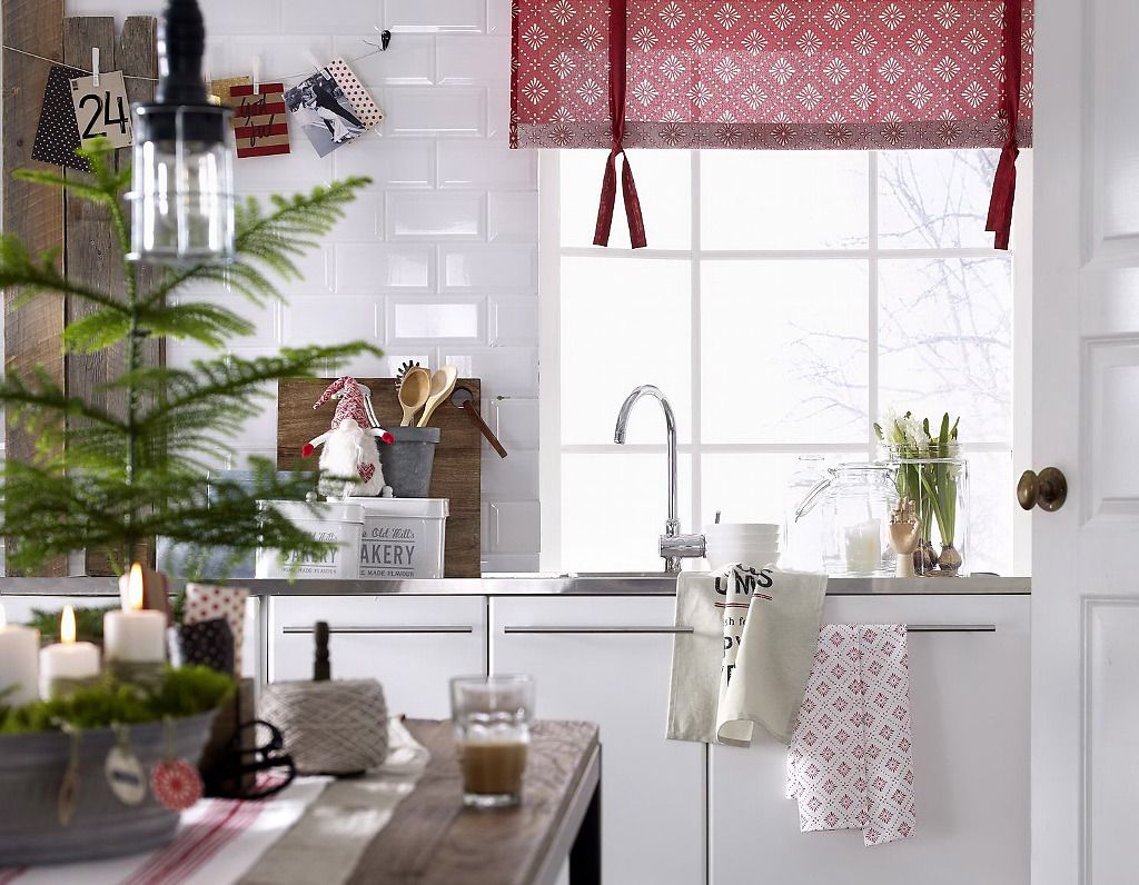
Kitchen in burgundy tones
Such curtains look very interesting and original not only in rest areas, but also in the kitchen.
This color will definitely increase your appetite and improve your mood.
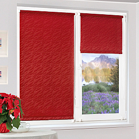
In a small kitchen, it is worth using roller Roman blinds. In a large one, hang curtains. An additional hanging tulle of cream or light beige color will help to add solemnity.
The kitchen should always be lit, use tulle in light burgundy shades.
It is advantageous to combine burgundy curtains in the kitchen interior with napkins, potholders, and a tablecloth.
Important!
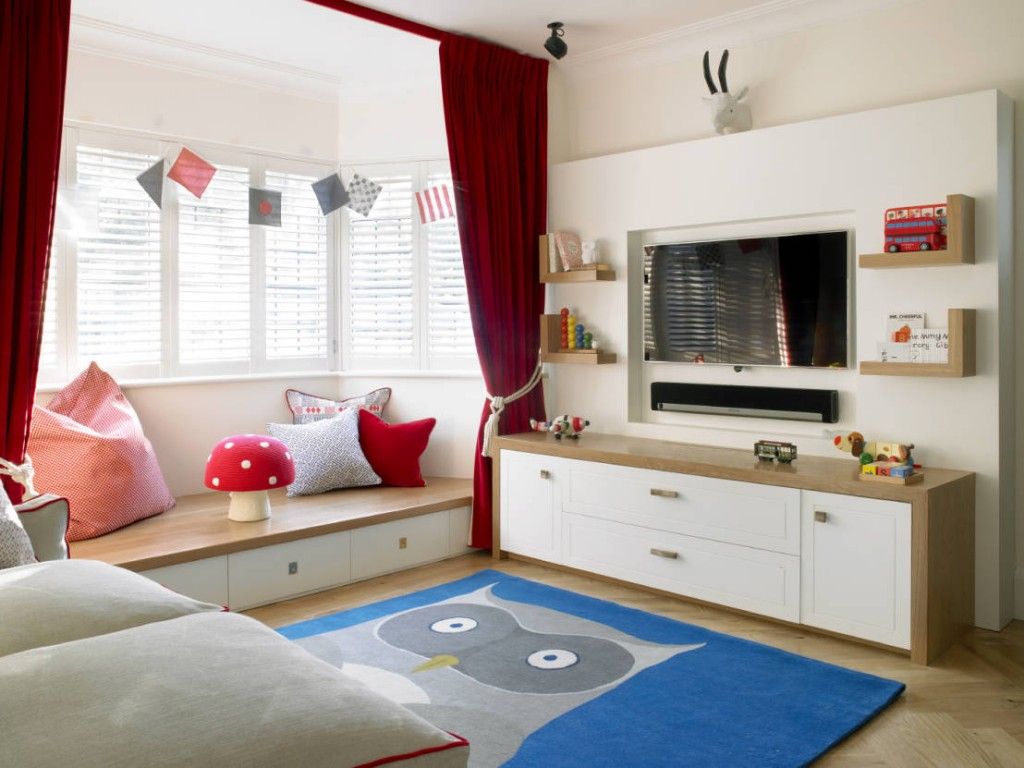
You shouldn't add burgundy curtains to children's rooms, it will overload the child's psyche.
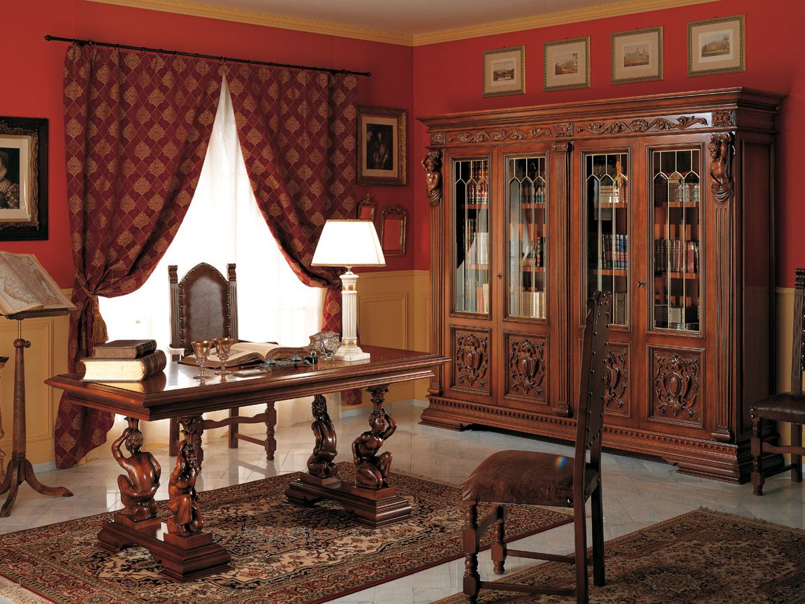
Combination with furniture
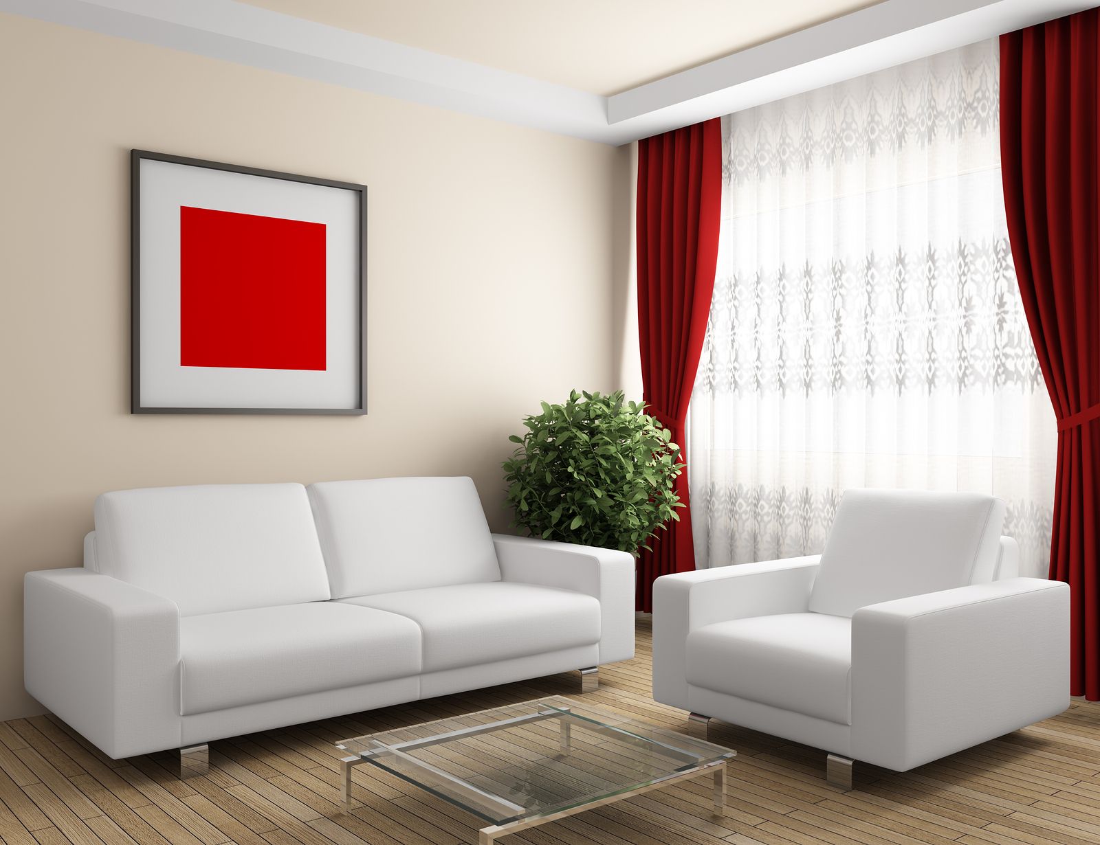
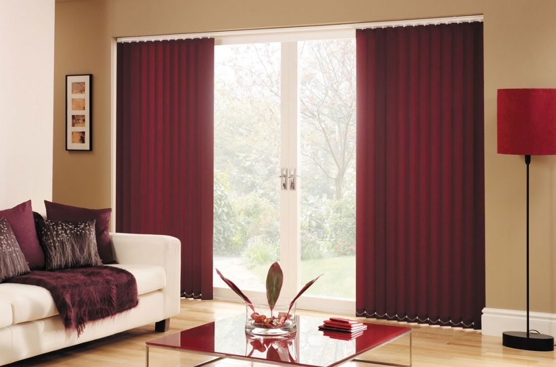
Furniture in light, milky shades with soft upholstery will look relaxed.
Mahogany furniture is also suitable, it will complement the feeling of a royal setting.
Pros and cons of wine shades of curtains
Burgundy will always be the dominant color, so you need to know the final picture of the interior design in advance.
Advantages
- When combined correctly, they look good in any interior.
- They go well with almost all colors.

Burgundy color goes well with both warm and cool tones. - Burgundy curtains have no gender specificity and can be found in either a man's or a woman's bedroom.
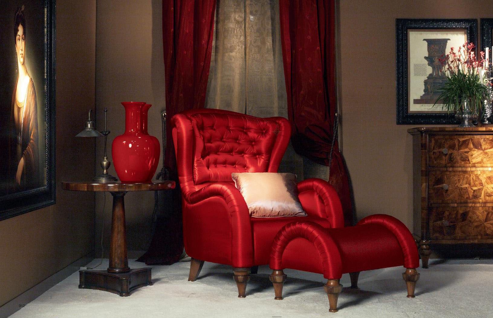
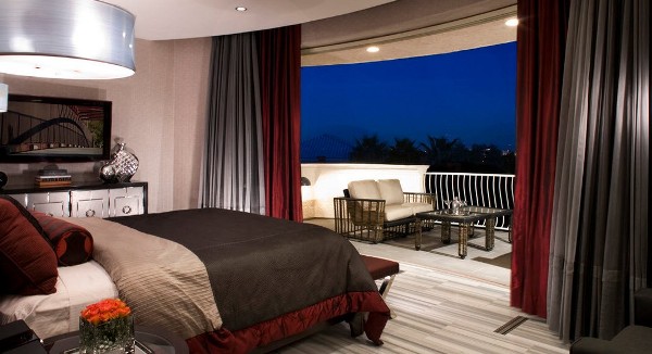
- The room becomes more luxurious and respectable, even if the furniture chosen for its interior is not too expensive.

Burgundy curtains are a bright option for decorating a luxurious interior - The room becomes visually warmer.
- Burgundy curtains for the kitchen help to infuse energy.
- Never goes out of fashion.
Flaws
- In small rooms, the already small space becomes narrower, making it more difficult to breathe.

The area of the room should be impressive, otherwise the burgundy curtains will look gloomy and bulky. - Too much color can cause aggression and irritation.
- Abundance can seem ugly and vulgar, so you need to know your limits.
Design tips and combination examples
Always carefully study the entire burgundy color palette to see which combinations should be avoided.
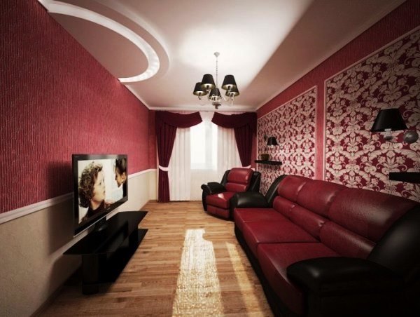
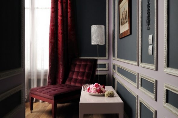
If you don’t “overdo it” with black, then together with burgundy they will create a solid business style, for example, for a work room.
Burgundy in combination with olive will quickly become boring, it is best to combine it in places where you do not spend too much time: in bathrooms and toilets.
In living rooms, you can achieve the effect of sophistication and wealth. Unobtrusive curtains will emphasize the high social status of the owner of the house.
Light burgundy curtains with eyelets and pale gray wallpaper will fit very organically into the living room interior - minimalist and restrained.
You shouldn’t add various antique accessories or other intricate accessories to an interior with such curtains – it will look too theatrical.
If the ceilings are low, you should decorate the top in light colors and the bottom in burgundy. This technique will visually raise the ceiling.
Burgundy with chocolate or soft pink shades looks very interesting, provided that there is not too much pink, otherwise such an interesting solution will turn into bad taste.
Always use plenty of lighting, both external and internal.
Conclusion
Burgundy, bordeaux, maroon - this color has enough names, even more shades. It is so diverse that it can cause rejection and complete hostility or, on the contrary, win a person over, it all depends only on the combinations and taste preferences.
Video: Living room in burgundy color
https://www.youtube.com/watch?v=ivA2Y2E2O7I
A selection of the best photos of burgundy curtains in the interior of beautiful and unusual living rooms, bedrooms, kitchens: