White is a frequent guest in the design of interior spaces. It is loved by both professional designers and ordinary people who undertake repairs. However, the use of this paint is associated with a number of features.
Content
- Peculiarities of working with white color in the interior
- White or milky curtains as a designer's tool
- Pros and cons of white curtains
- Features of combining white curtains with elements of other shades
- VIDEO: White curtains in the living room interior.
- 50 photos of white curtains in living room interiors:
Peculiarities of working with white color in the interior
The specific “talents” of this color are the following factors.
Visual expansion of space
That is why it is almost always used for ceilings in low rooms. To prevent the upper plane from seeming too close and oppressive, it is painted white.
Small compact spaces, studio apartments, cramped kitchens in budget small apartments invariably benefit from the use of light colors. Including for curtains.
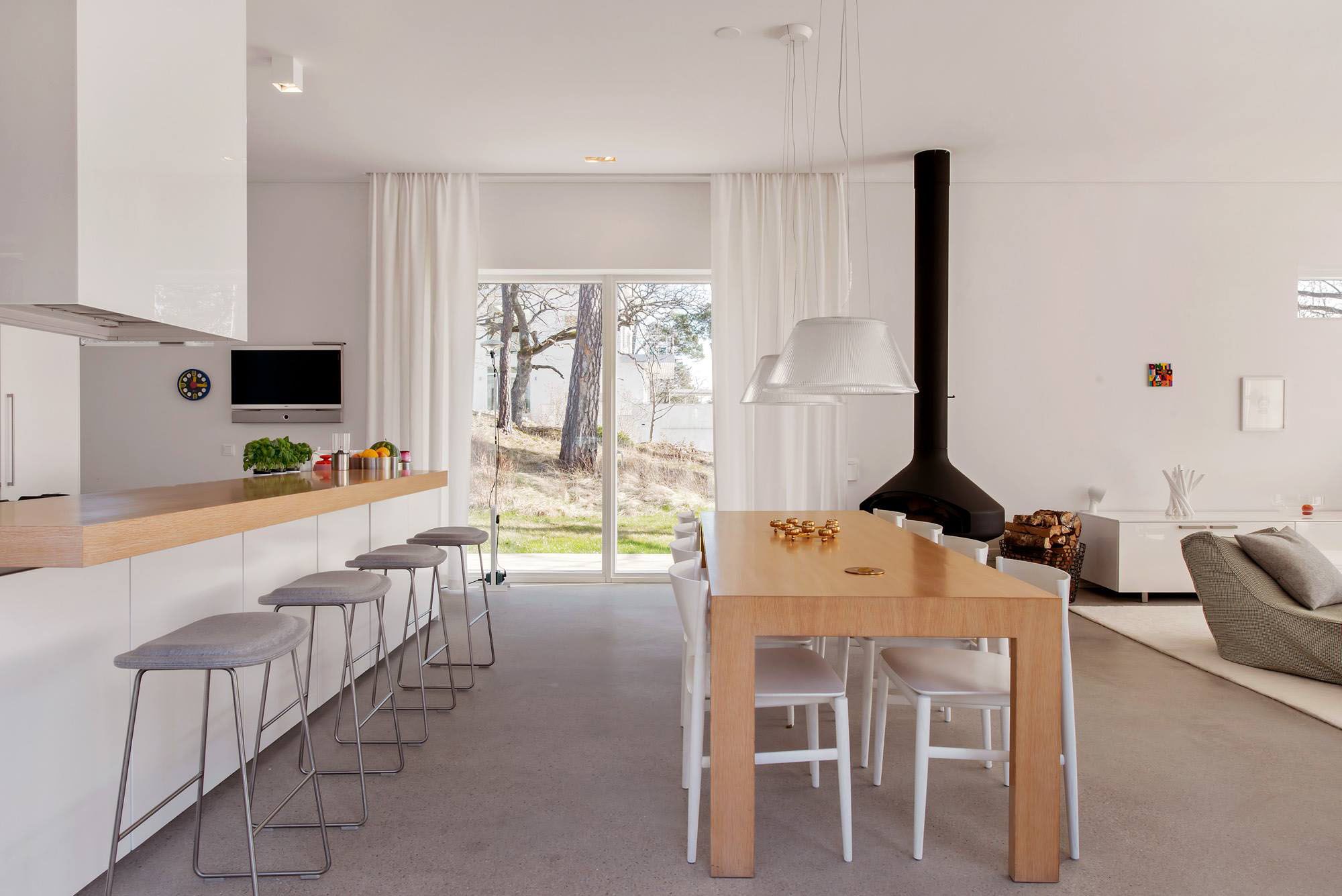
Good light reflectivity
With the same number of lamps, a room with a lighter design will seem better lit than one designed in dark tones. Therefore, in rooms with windows facing north, an abundance of white is a justified step.
Compatibility with almost any other shades
For this reason, white is called the "universal background." It looks good with any colors, bright or dark, it doesn't matter.
Please note! The exception is light, heavily bleached paints. Their combination with the original milky whiteness may not look very good, the final effect depends very much on the specific examples.
The ability to effectively convey the features of form
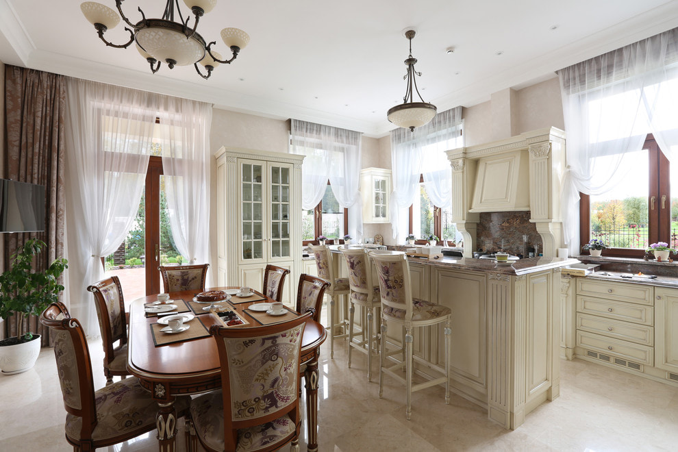
A well-known rule is that if you need to emphasize the configuration of an object, its texture, you should paint it light. That is why classic interiors, saturated with sculptural details, work well with white.
Another reason that motivates people to turn to this color is its psychological subtext. Cleanliness, orderliness, honesty, straightforwardness - if there is a need to bring these emotions into the interior, white seems to be the best solution.
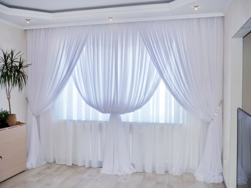
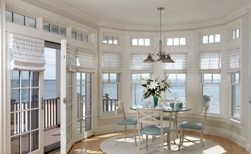
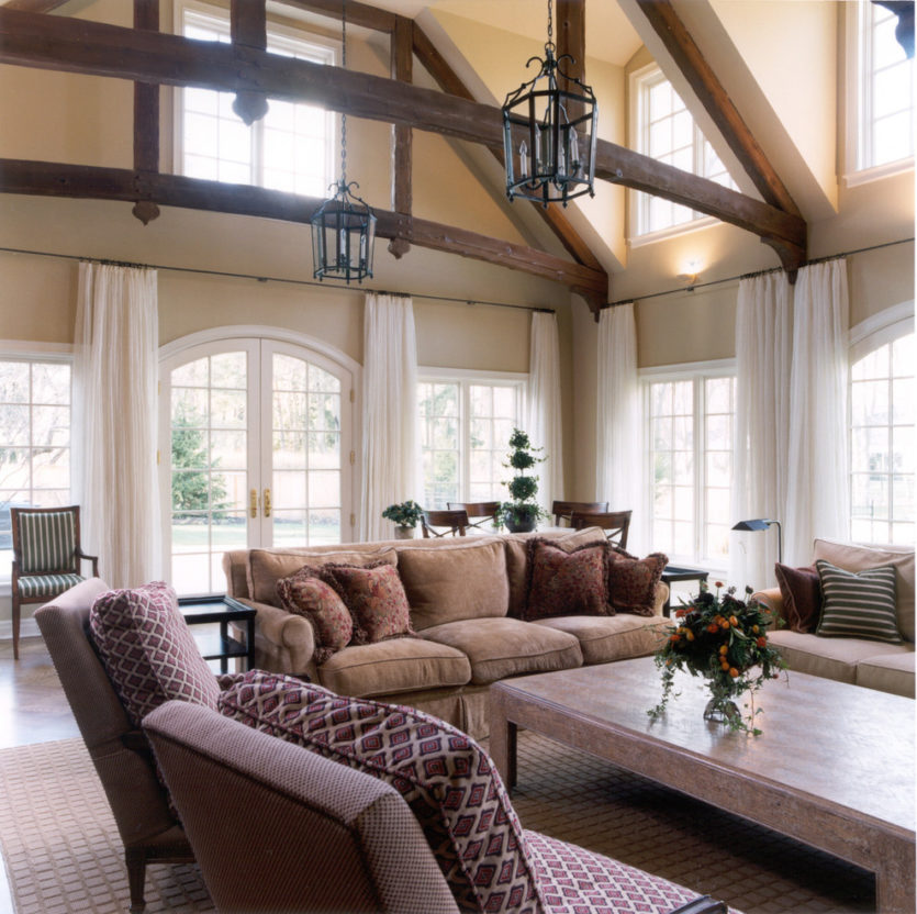
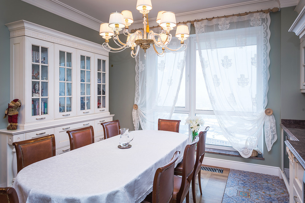
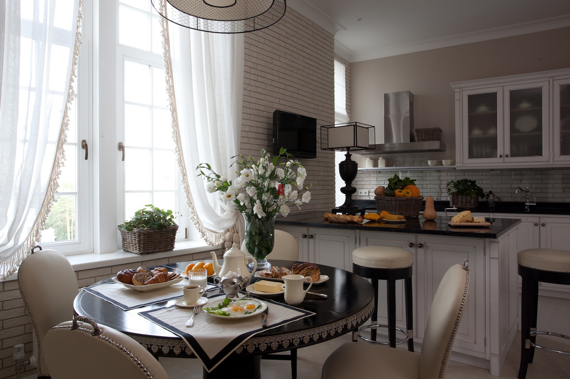
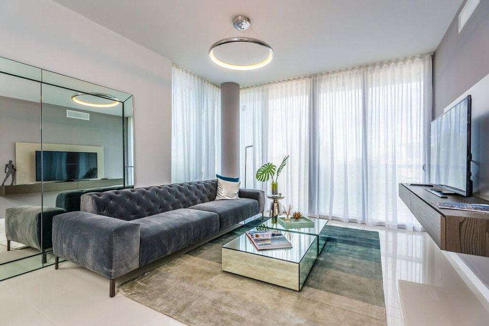
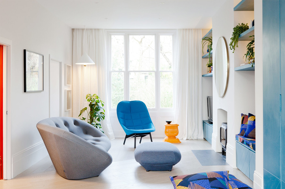
White or milky curtains as a designer's tool
One way to introduce this interesting color into the interior of the room is to use white curtains. This is a subtle technique that can achieve very impressive results.
As an example of color solutions created with the help of white curtains in the interior, the following techniques can be given.
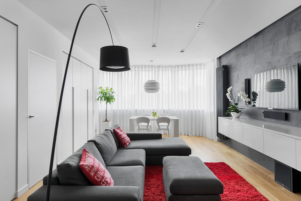
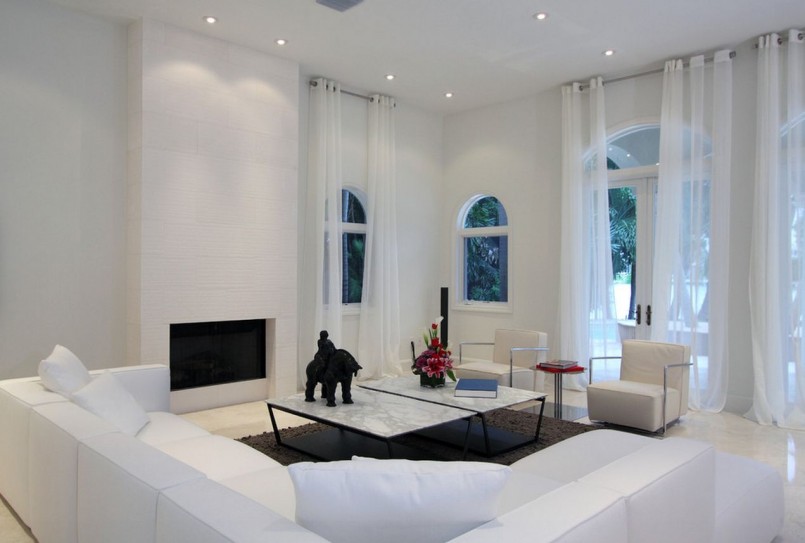
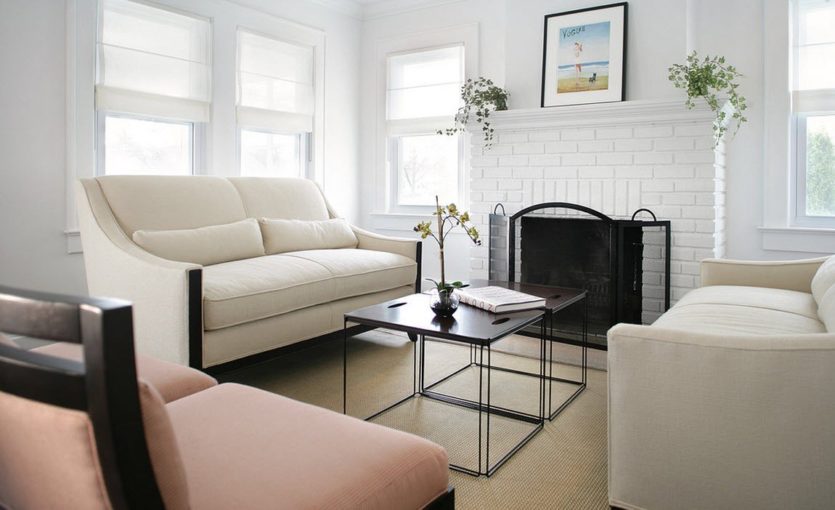
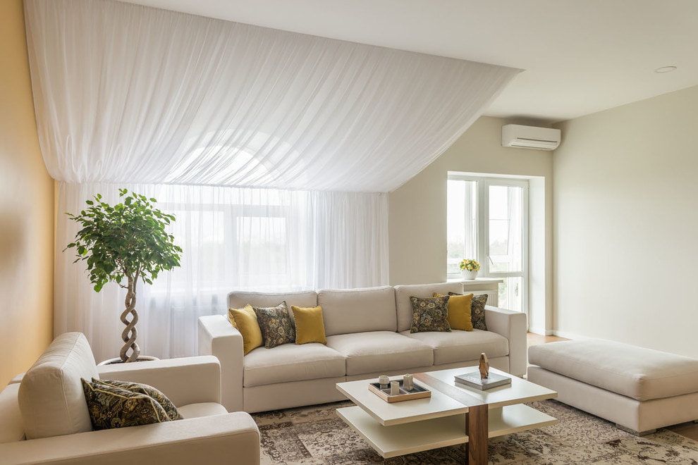
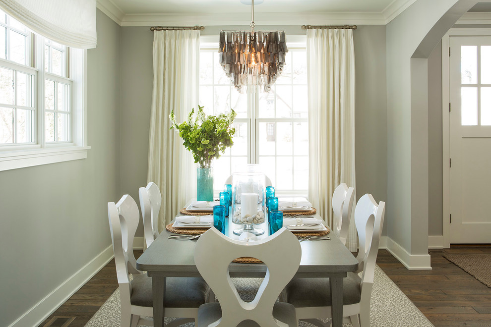
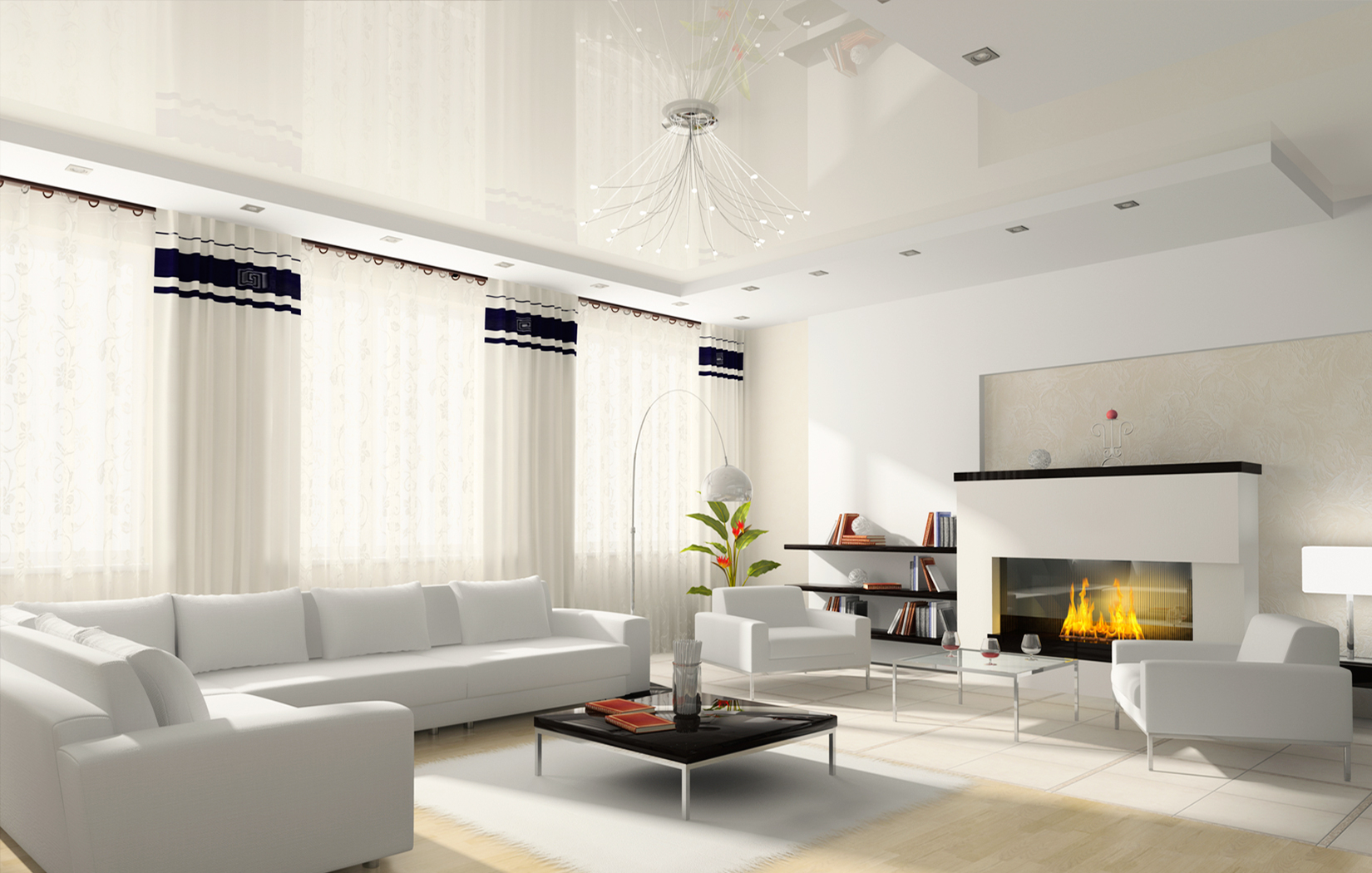
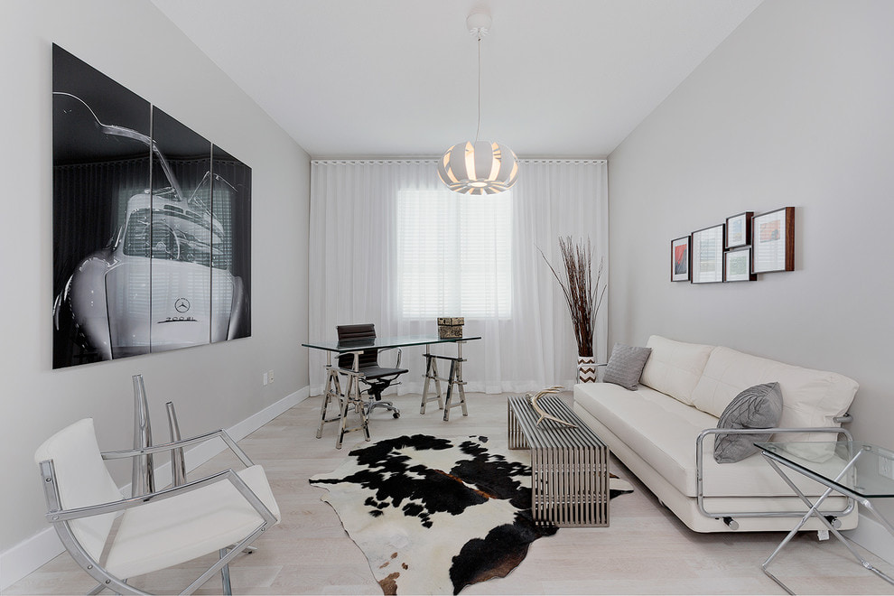
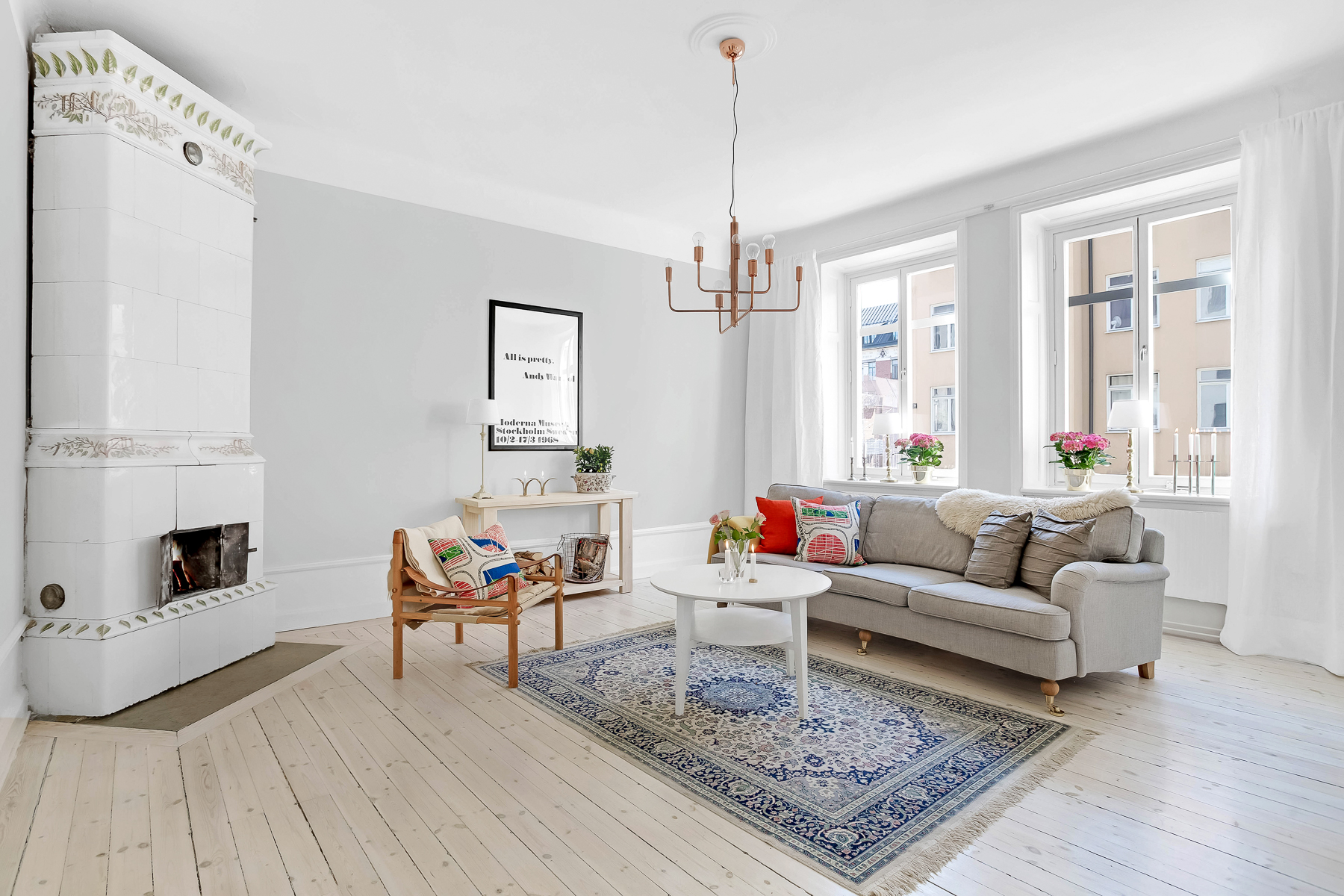
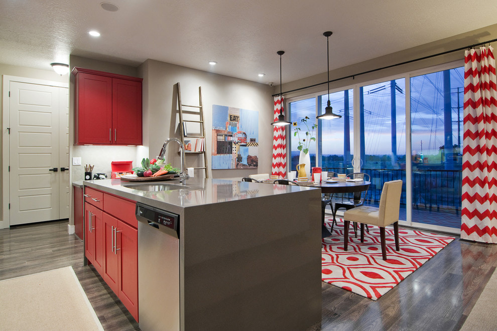
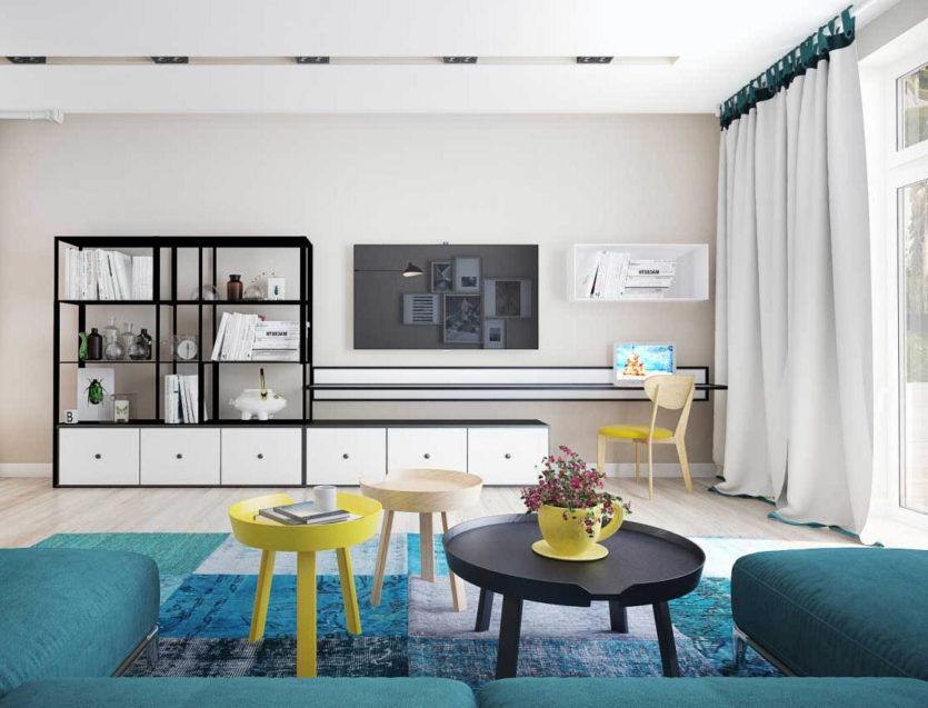
Composition with a bright color accent
The red sofa will literally glow if it is in a neutral light environment. Every guest will certainly approach the painting on the wall, which is the only color spot in the room.
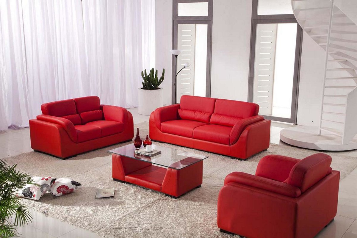
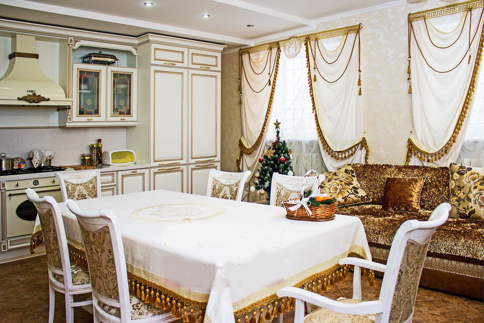
Please note! The technique of using a bright color accent is good for decorating a living room. It can be used in the interior of a kitchen or dining room. But it is not suitable for a bedroom, library, or study. These rooms require more calm, restrained solutions.
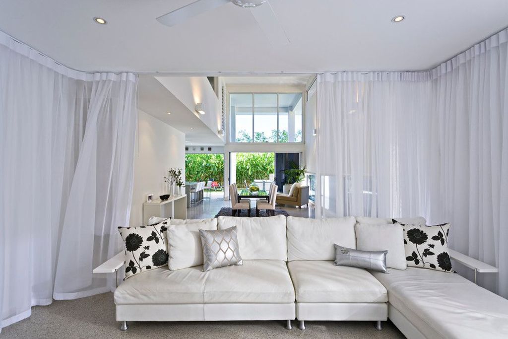
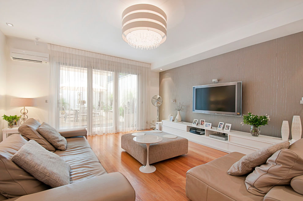
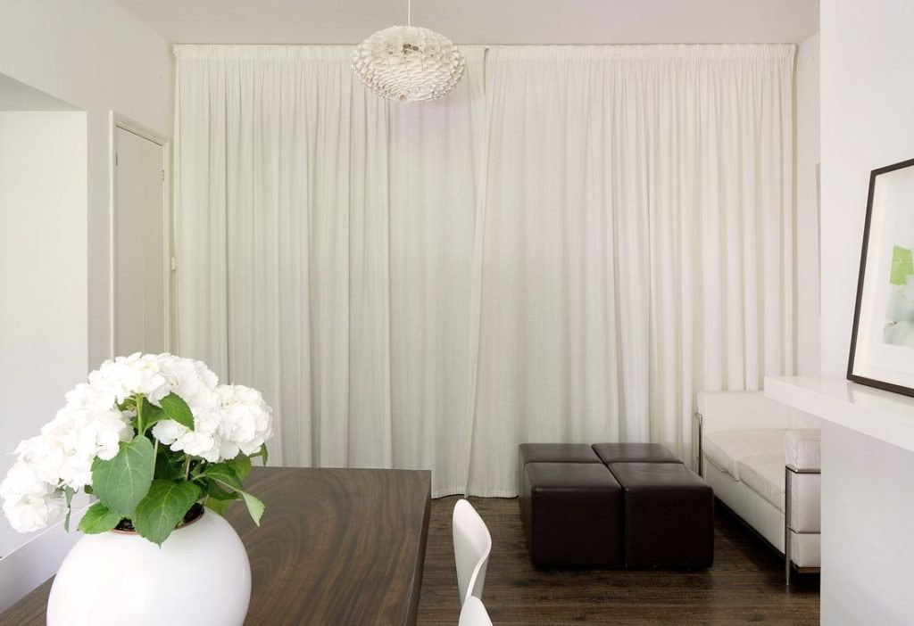
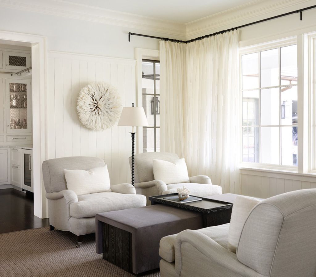
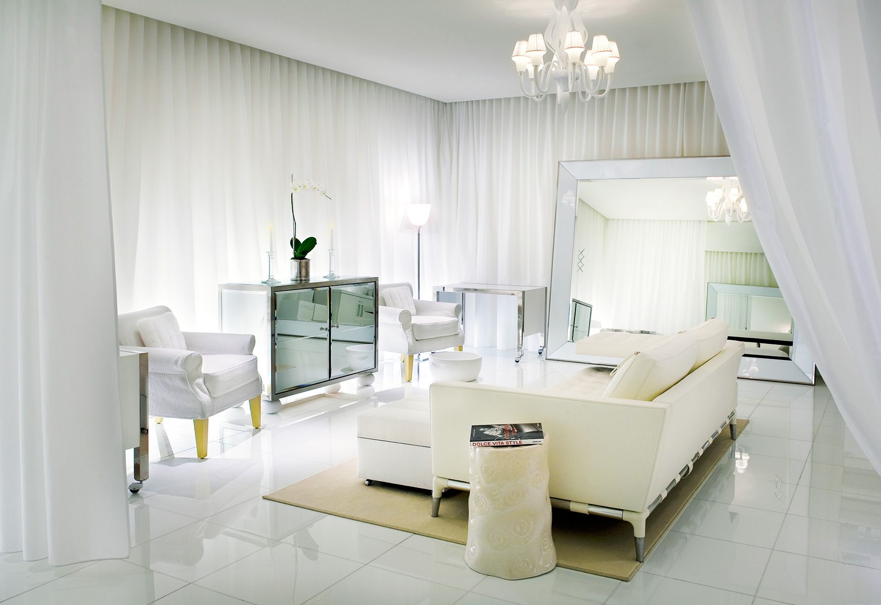
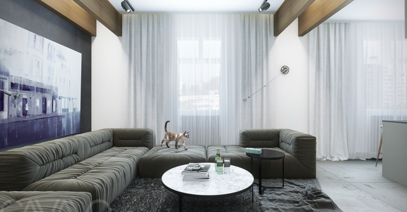
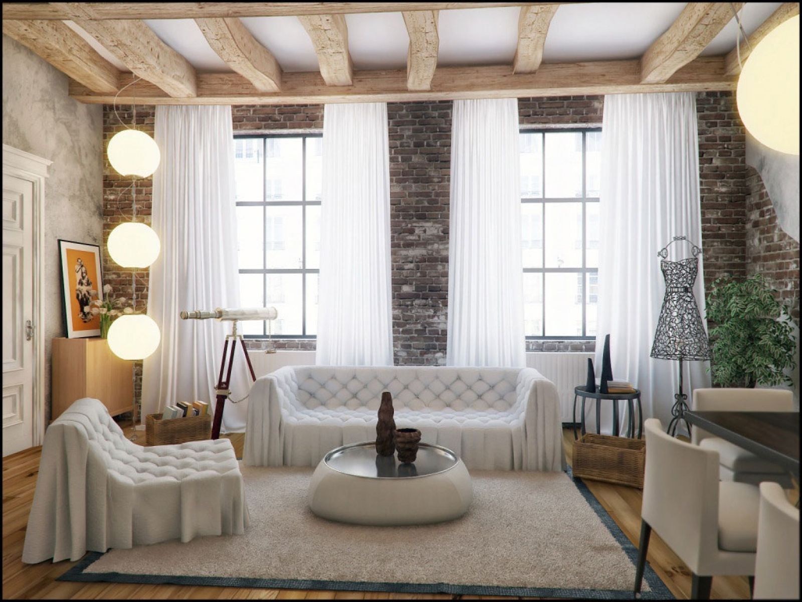
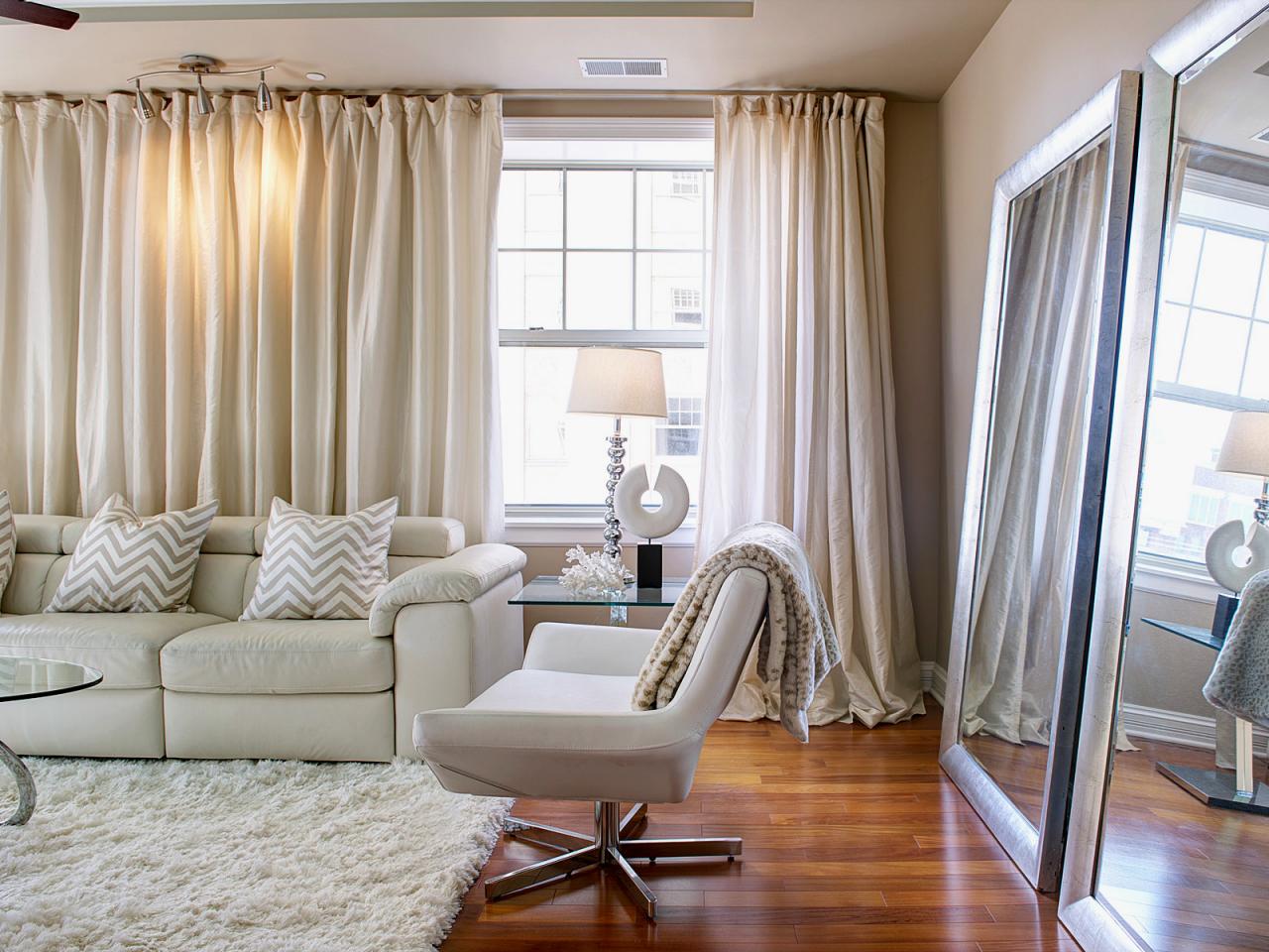
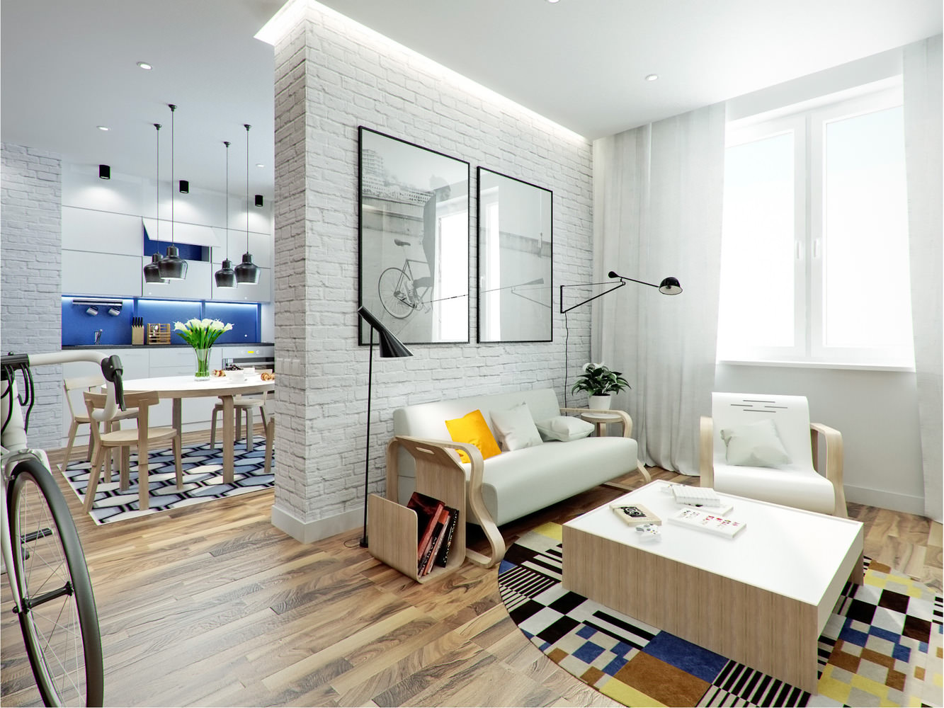
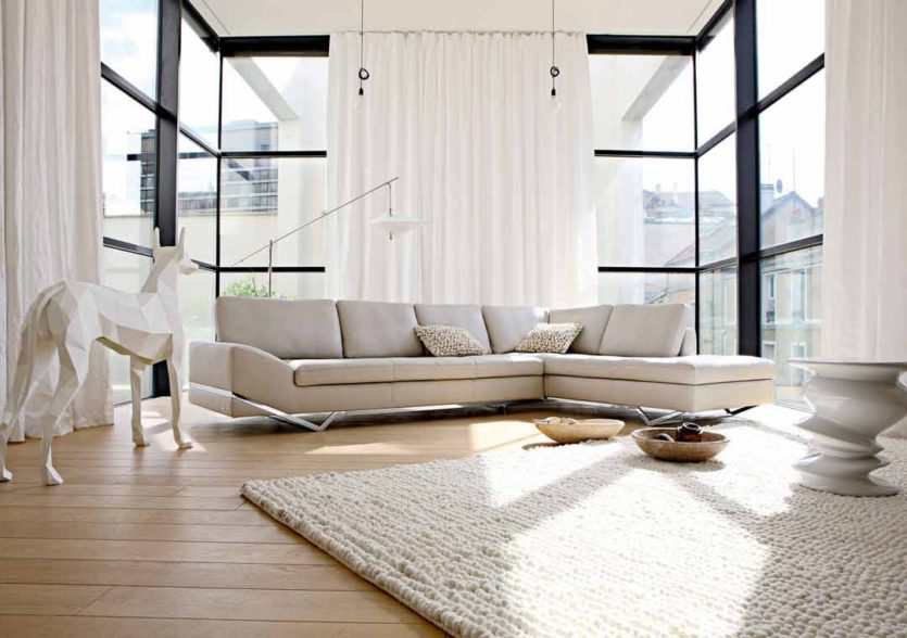
Nuanced composition
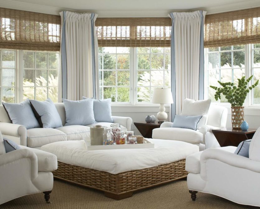
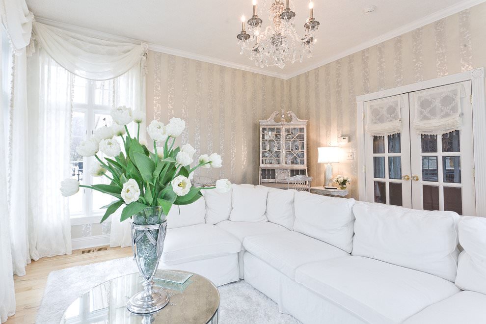
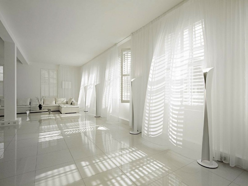
When the difference between the shades used to decorate a room is barely noticeable, it is called a "color nuance". Icy walls, milky curtains, a light-light gray floor, a sofa in the same color, a snow-white carpet - all this together forms a very calm, neutral space.
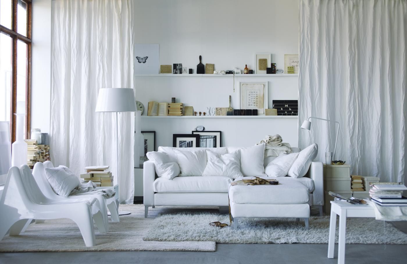
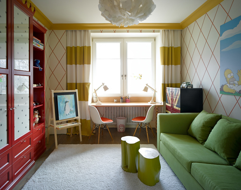
This solution will suit the living room, the kitchen, and the bedroom. It looks out of place only in the children's room. There you want to see more living colors.

Please note! When creating such a coloristic composition, it is important to take either only warm or only cold shades. Yellowish "ivory" next to coolish "pearl" paint looks dirty. Selecting a palette for a nuanced interior requires great care.
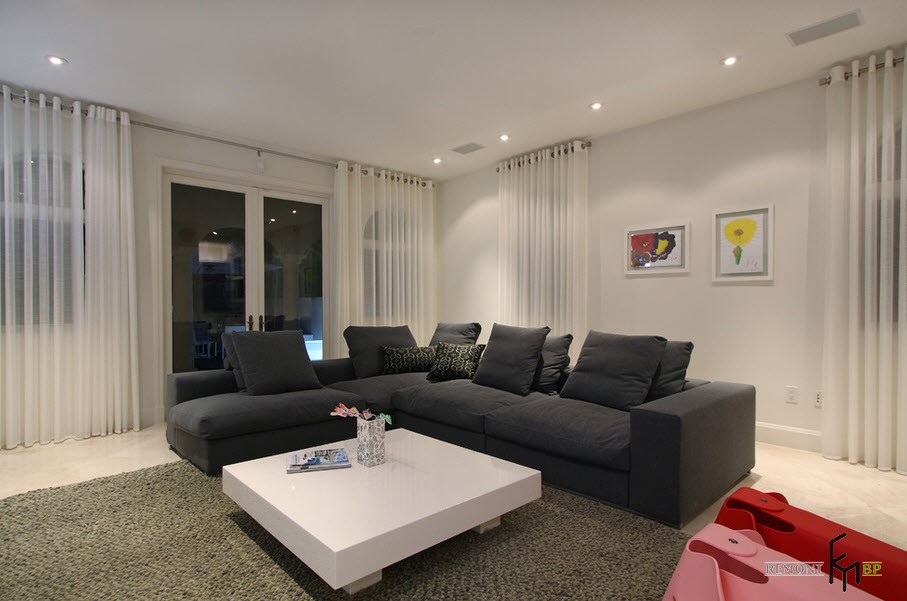
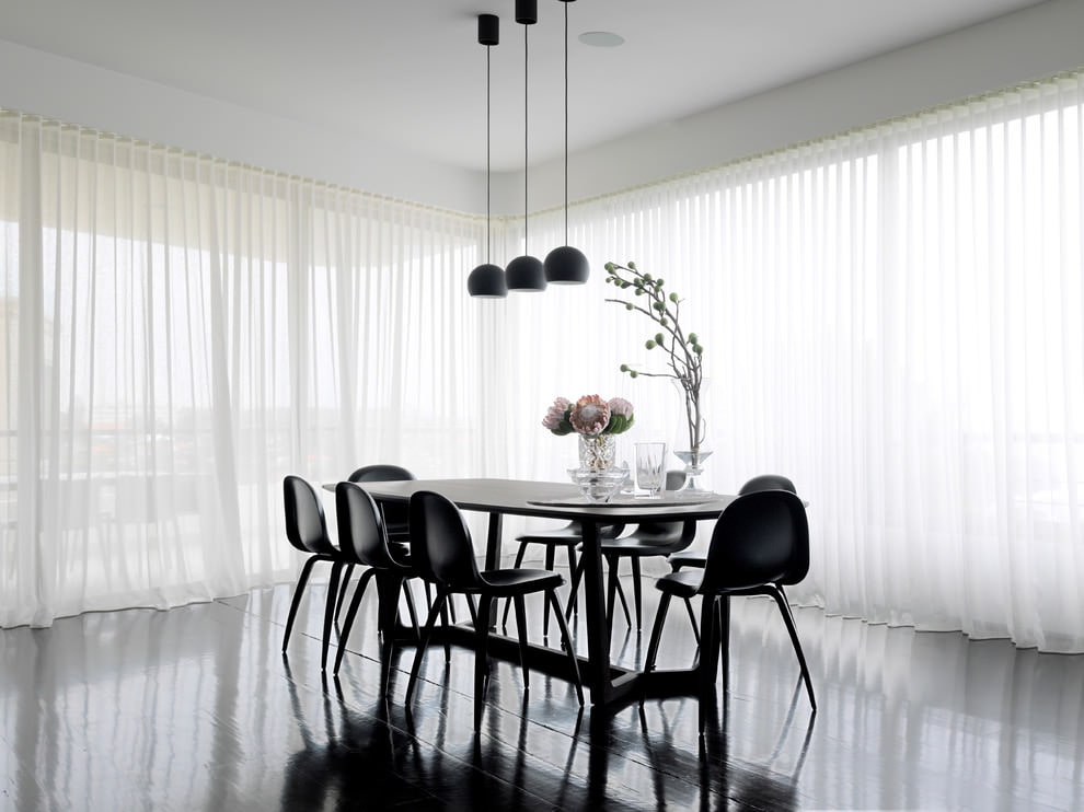
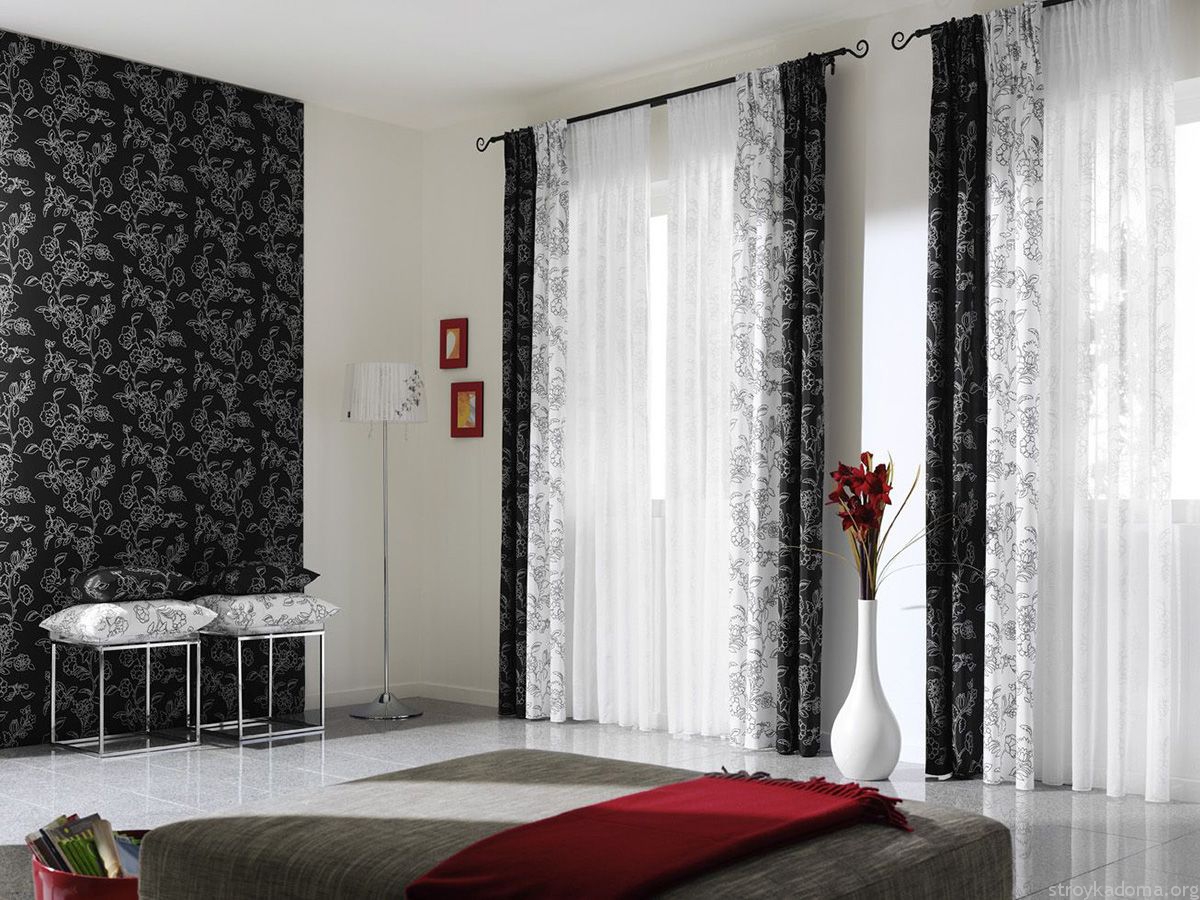
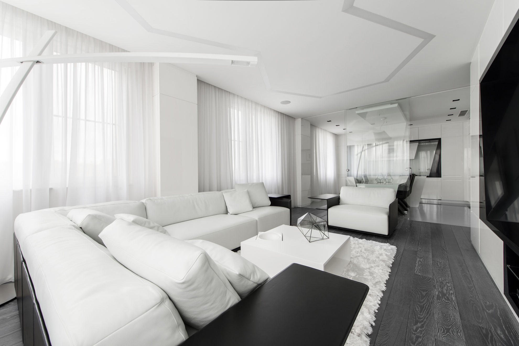
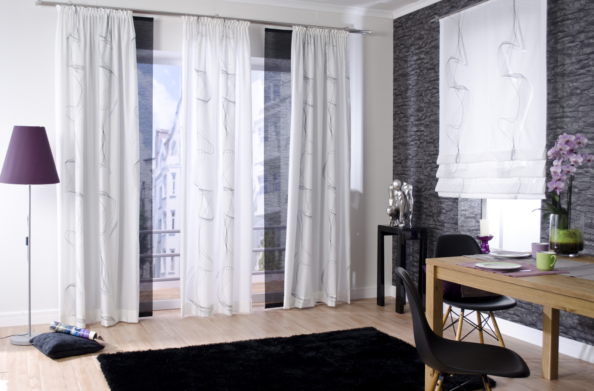
Black and white solutions
Compositions based on a combination of black and white often look modern and fresh. It is difficult to introduce any additional color into such interiors, and it is not clear why.
In order for such a room to look balanced as a whole, the ratio of dark and light should be approximately 30 to 70. Then the black elements do not get lost in the surroundings, but do not seem too heavy.
The opposite ratio is also acceptable, when the designer creates a dark space with a small inclusion of light elements. This looks good in public interiors. A cafe, bar, club only benefit from such a color combination.
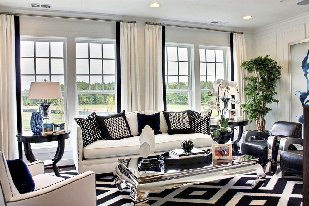
In catalogs, in photos with black and white wallpaper, curtains are almost always presented as light. Because they do not distract the eye from the contrasting pattern. Finishing manufacturers understand this well and skillfully use it.
Of course, there are many more ideas on how to use white in the interior. However, the three methods listed are effectively perceived and are easy to implement.
Please note! Often curtains are selected at the final stage of interior design. That is, after wallpapering, painting the walls milky white and purchasing furniture. In other words, the interior has already been formed, and now it does not need to be redesigned in a new way, but only to support the trends embedded in it.
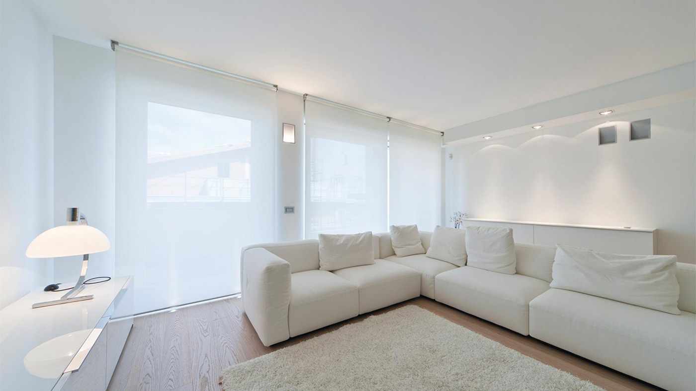
Pros and cons of white curtains
White curtains can be a good solution in a number of cases. When you want to create a contrasting and stylish design based on a combination of darkness and light. Or to draw additional attention to your collection of Mexican ceramic dishes, making its surroundings as neutral as possible. However, there are situations when white curtains are inappropriate.
Poor quality finishing materials
Some types of paint and wallpaper lose their color over time. Bright coatings fade. And light ones, on the contrary, acquire an unpleasant yellowness. In everyday life, this is not noticeable. However, having curtained the window with really snow-white new curtains, you can suddenly discover that it is not as white as it seemed.
Increased levels of dirt and dust indoors
The main disadvantage of white is deservedly called its dirtiness. Any spot on it is clearly visible. This means that milky curtains hung in the kitchen or in the workshop will have to be washed very often. That is why even expensive fabrics become unusable over time.
No matter how beautiful and impressive ivory curtains look, sometimes it is worth preferring something darker.
Features of combining white curtains with elements of other shades
It is already clear which curtains will look most appropriate in a white room. However, in addition to coloristic compositions that deliberately avoid an abundance of bright shades, there are other design solutions. Where white is introduced delicately, and only complements other color combinations.
In combination with red, burgundy
The union of icy white with cold scarlet looks fresh and even provocative. High-tech, constructivism, the Bauhaus school often use this pair of colors to create an expressive, contrasting space.
In traditional classic styles, such a combination is also possible, but in a diluted version with other shades. Gold, soft beige or peach shades form a solemn and slightly pretentious palette.
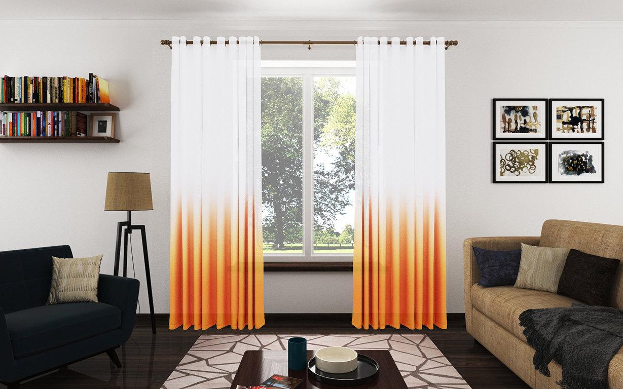
Orange
Such an energetic color as orange should be balanced with something. Cold white thread curtains will muffle the energy of bright fiery sofas or a kitchen wall. Such a contrast will be complemented well by coverings imitating wood, light blue tiles.
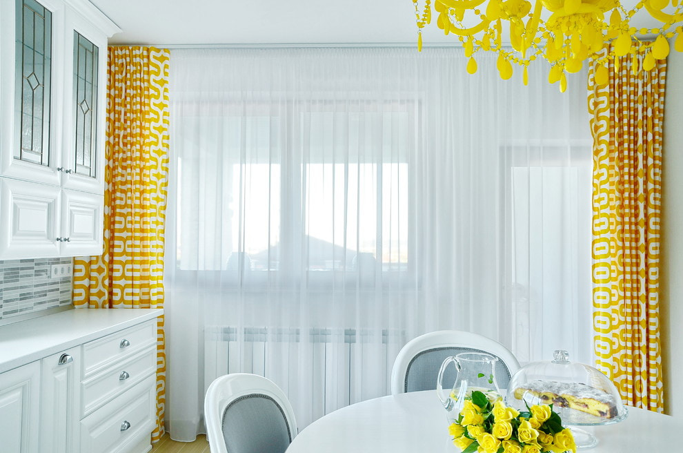
Yellow
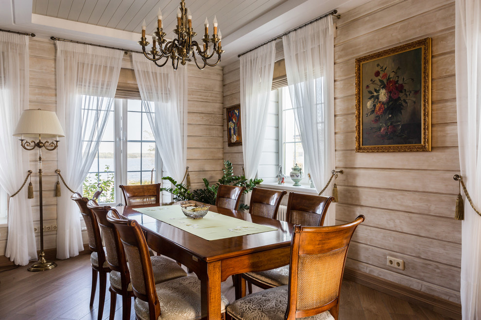
Golden, ochre, light brown, light wood textures are traditional partners of white. These contrasting tones enhance each other, making the room festive and positive. In this situation, it is worth stopping at warm shades of white. Ivory, linen, light-light beige will be a successful interior solution.
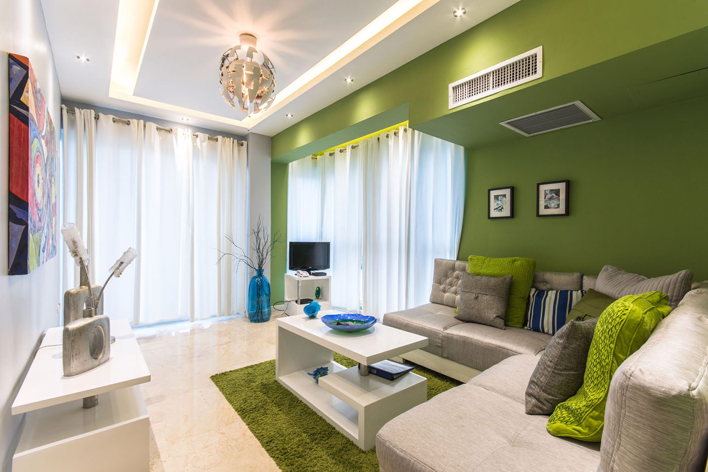
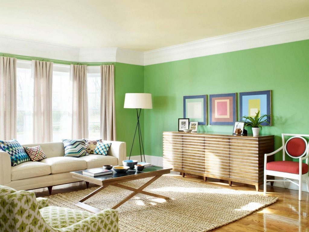
Green
Marine blue-green tones or cheerful light green, slightly muted olive, rich emerald - everything is acceptable. Such bright colors need to be toned down with something neutral and light for a harmonious result. Light white curtains draping dark green walls soften their visual heaviness.
Blue and blue
You can find many photos of milky curtains in an interior designed with blue. Light and dark shades of blue, gray - these are the tones that benefit greatly from being next to snow-white. True, some find such a palette emotionally cold.
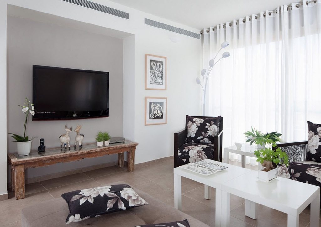
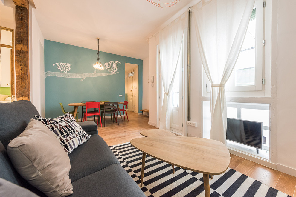
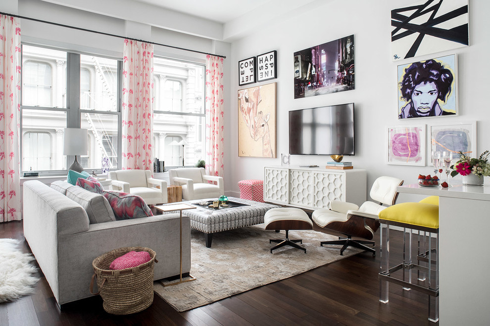
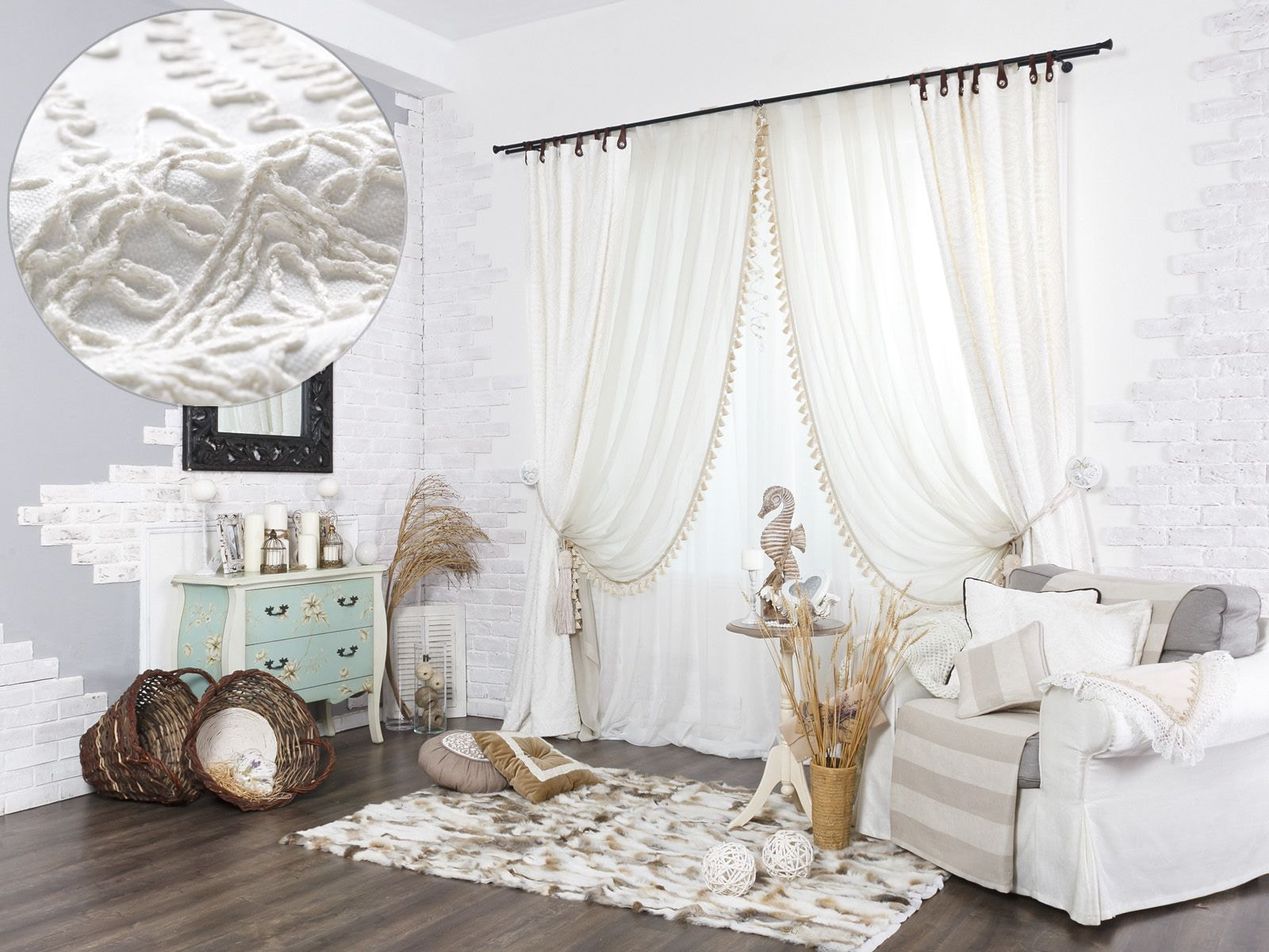
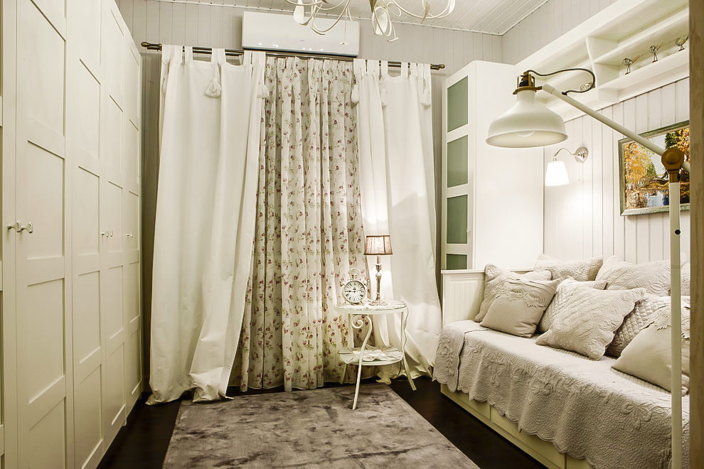
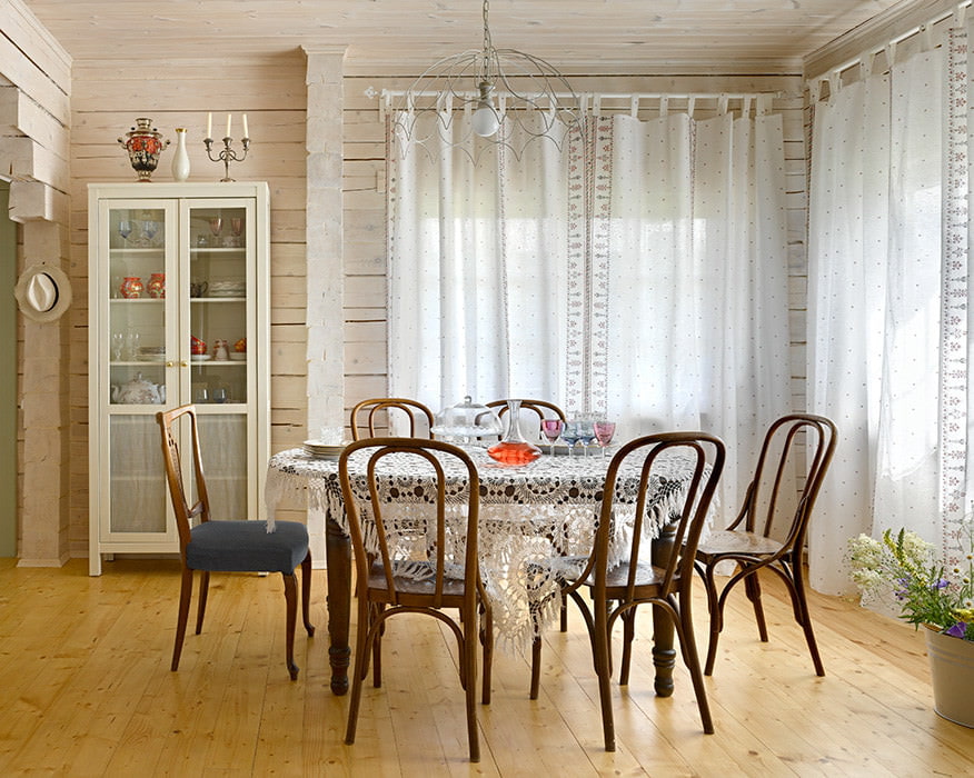
Prints and patterns
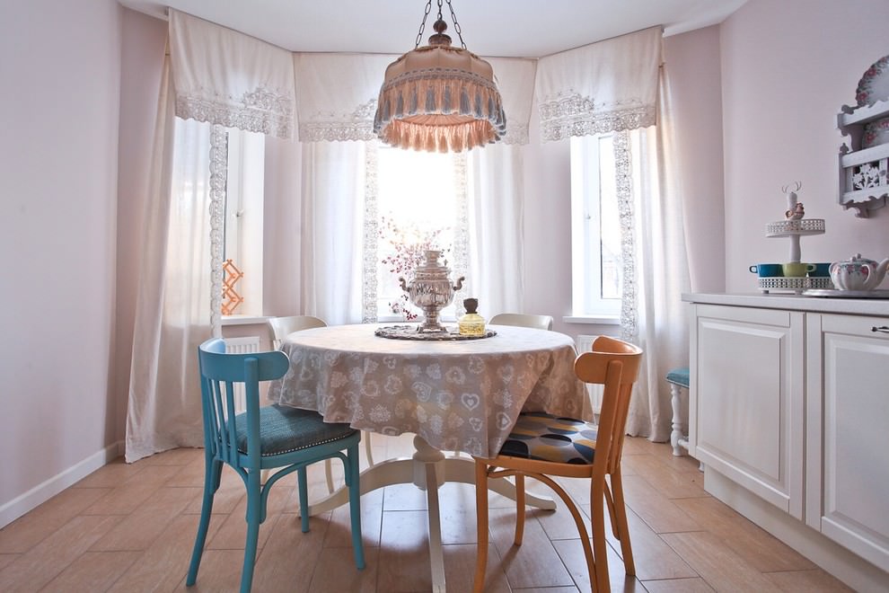
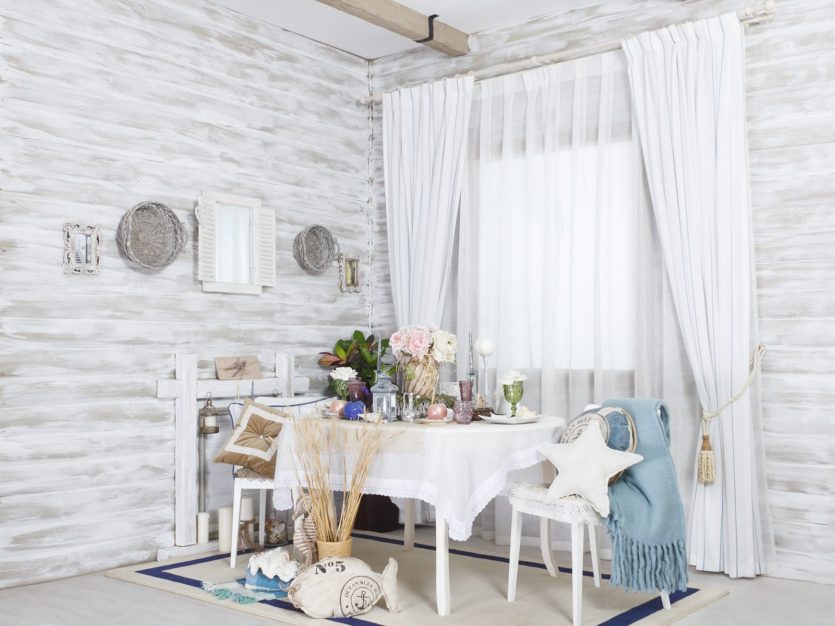
White thick curtains with light transparent fabric with a small floral pattern look good. This is a very typical technique for the country style, with its lightness, abundance of light and emphasized coziness.
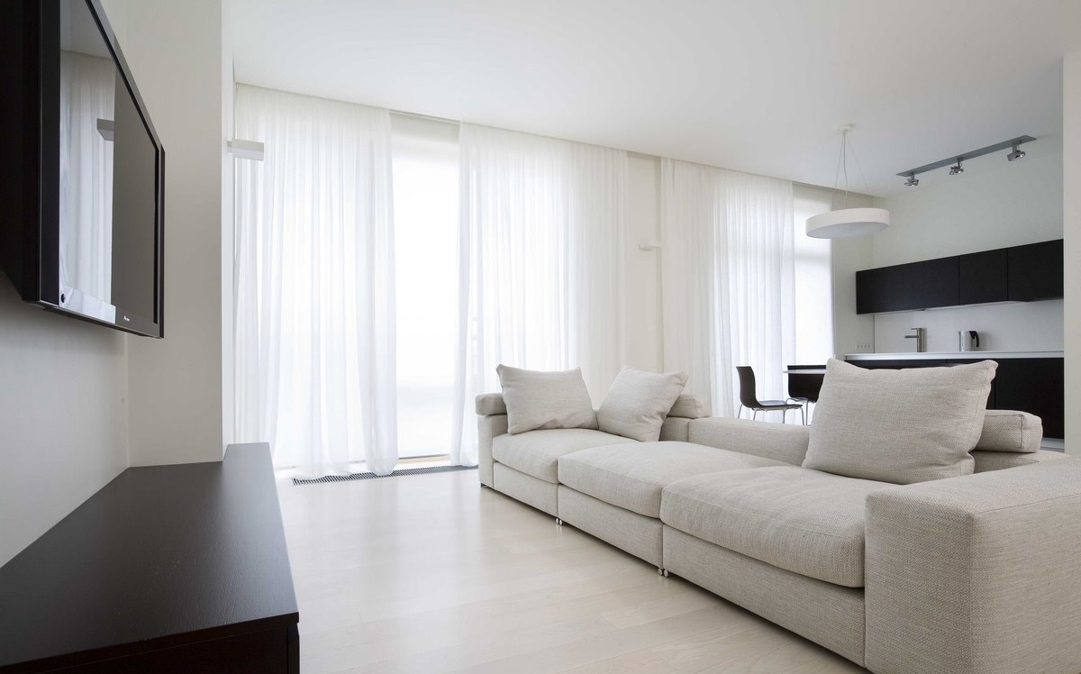
In short, shades of white are quite universal and go with almost everything, which is their big plus. They contrast with bright colors, muting their explosive energy. They gently complement muted shades, emphasizing their depth.
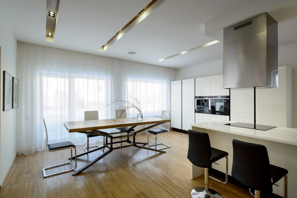
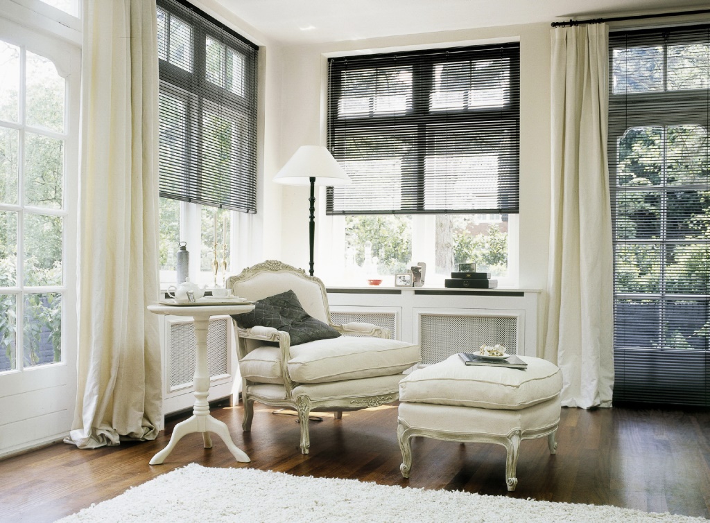
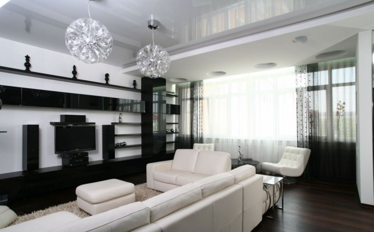
Light curtains suit any style - both solemn classics, saturated with architectural details. And provocative design experiments. And minimalism, although in the latter case it is better to stop at such curtain models as smooth Roman blinds or blinds. Country, art deco, eclecticism, ethnic styles - milky curtains are always appropriate.
VIDEO: White curtains in the living room interior.
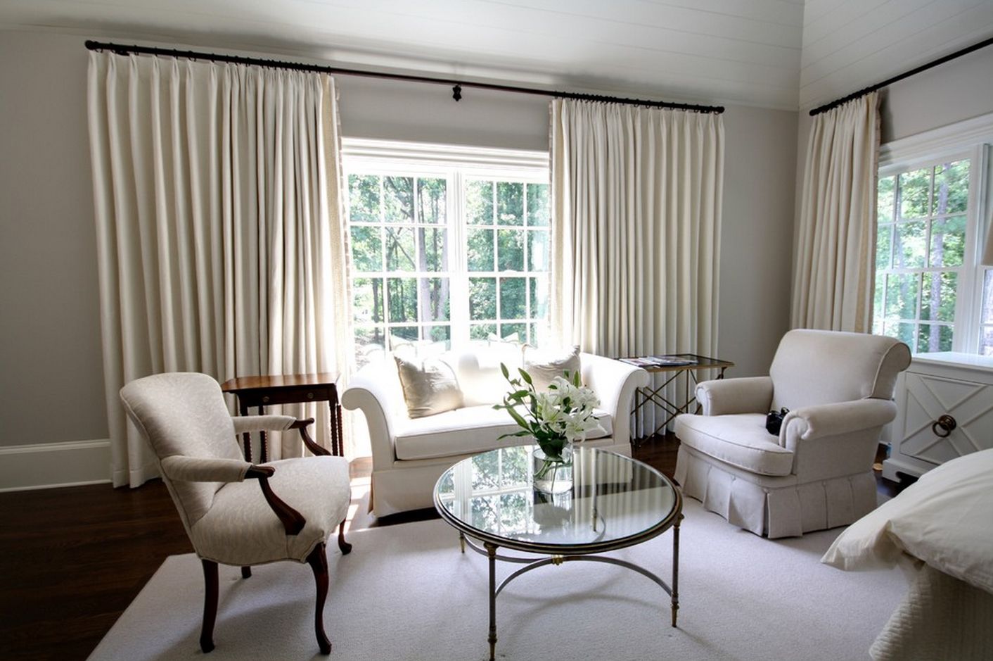
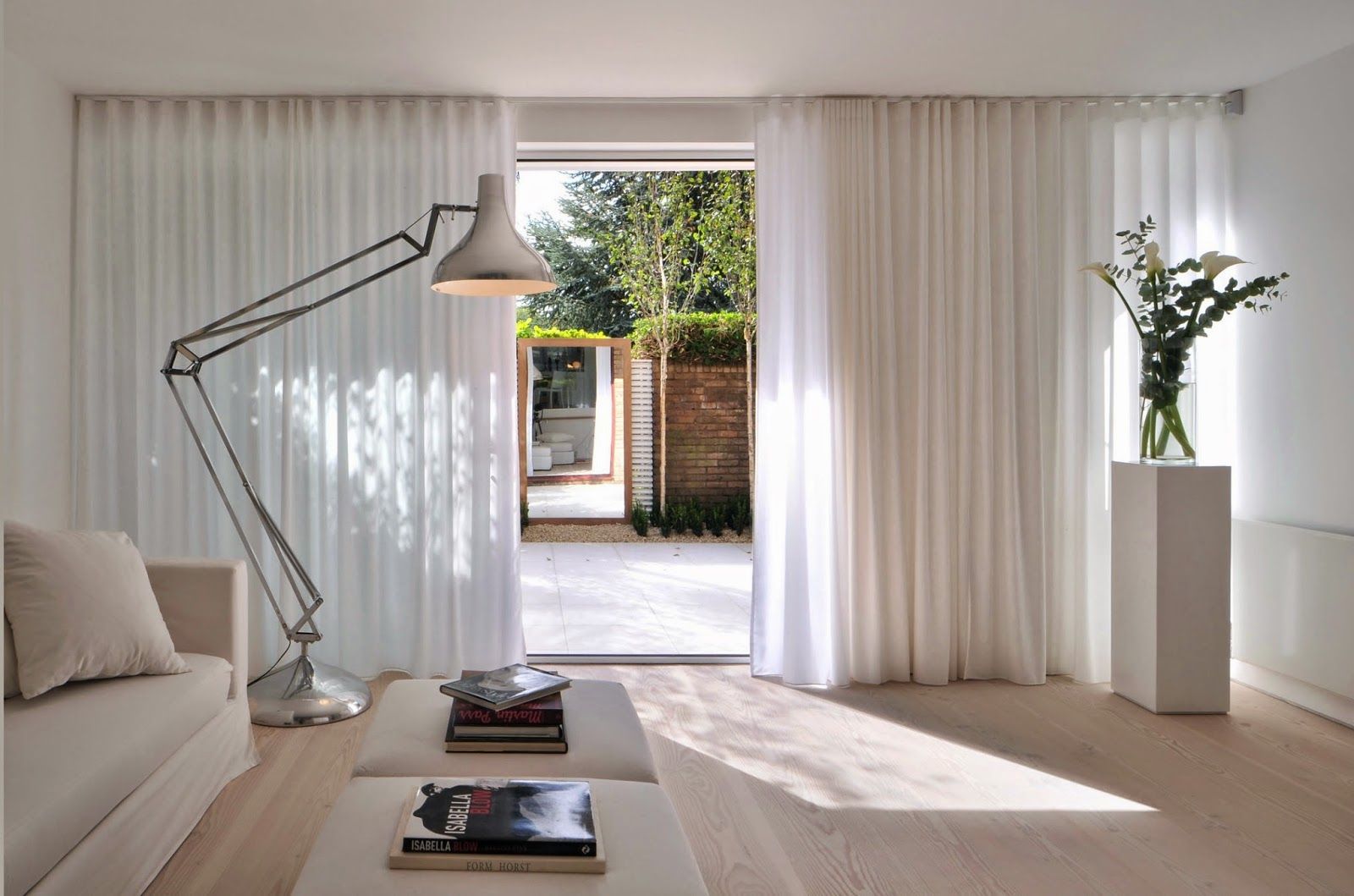
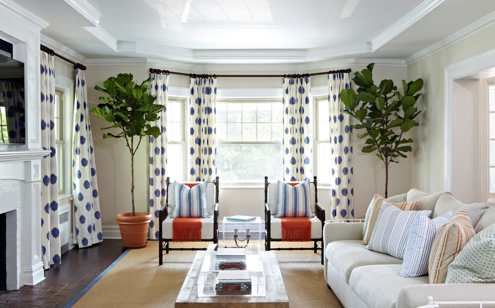
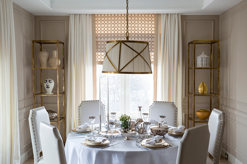
50 photos of white curtains in living room interiors: