Gray is the simplest mixture of black and white. Today, the world of design has changed its attitude to this black and white "mix". It is no longer considered dull and boring. New halftones are added to it and a variety of variations are obtained. Cold and warm shades have appeared. In a modern interior, it is gradually replacing the hit of previous years - beige.
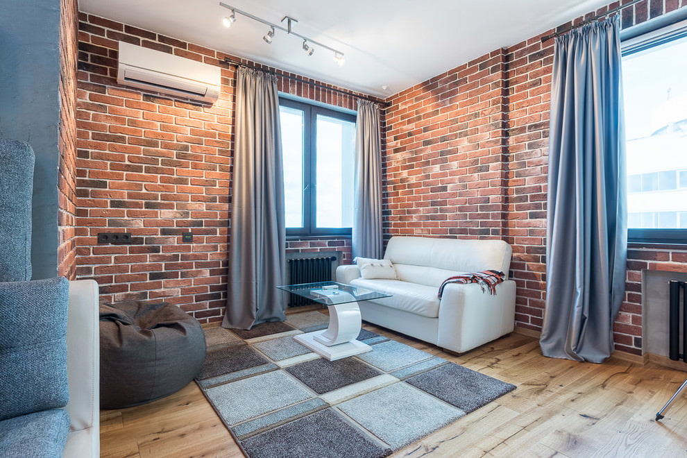
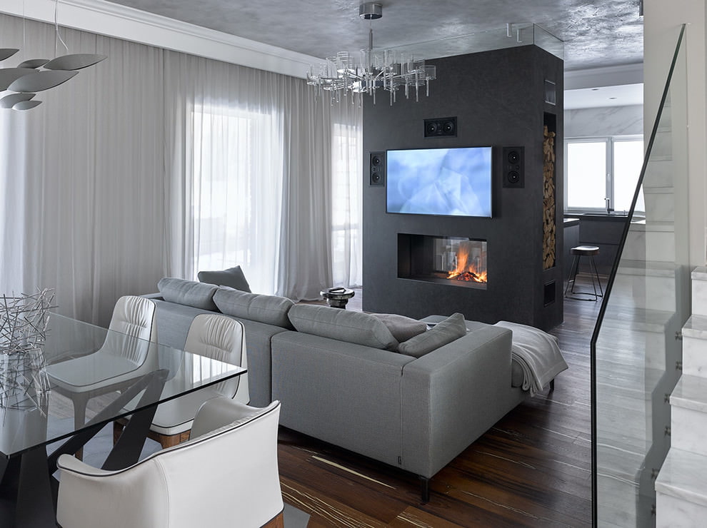
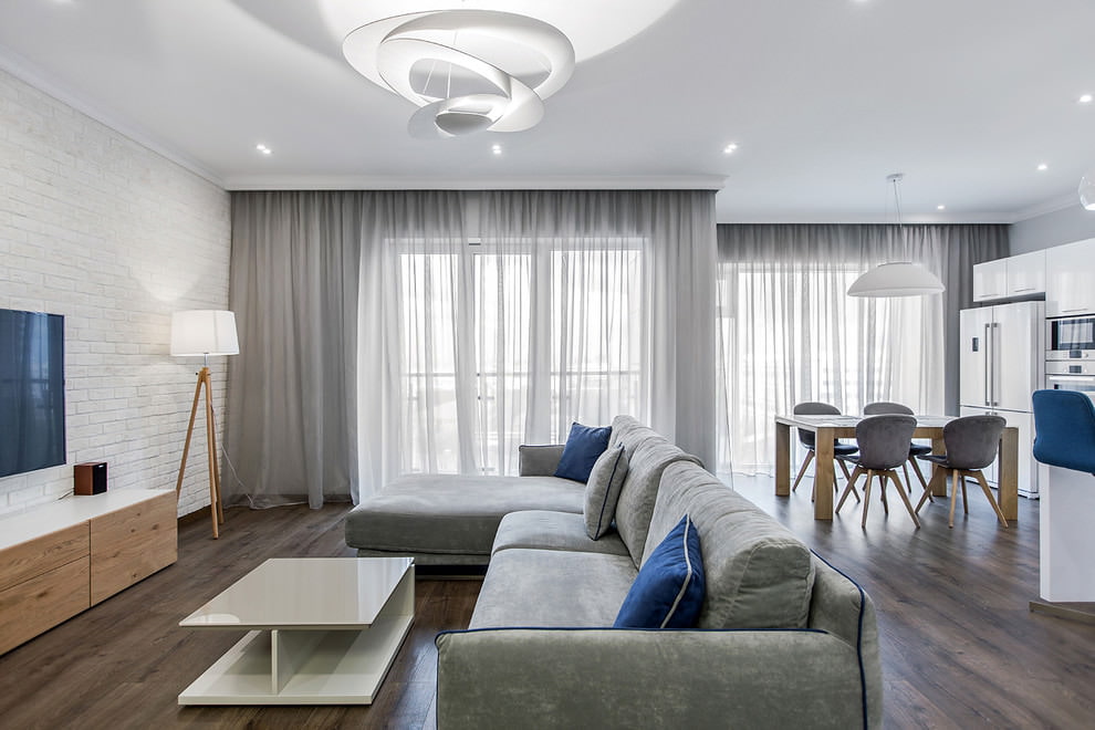
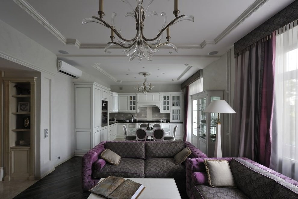
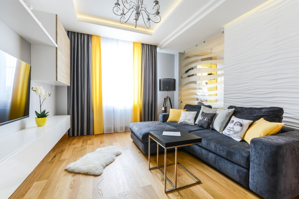
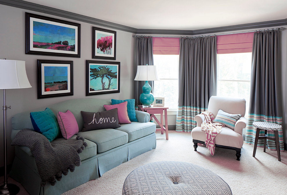
Designers who follow the latest trends are increasingly turning to a rich gray palette. And if someone still hesitates to decorate the room entirely in this tone, they use it as a stylish accent. Gray curtains or tulle can become such “inclusions”. Now they are often used to create fresh interior solutions.
Content
- The Influence of Color on Style and State of Mind
- Interior design with gray curtains
- Fashionable palette of ash curtains
- What interior styles are suitable for grey curtains?
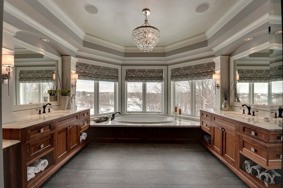
- What fabric is ideal for smoke curtains?
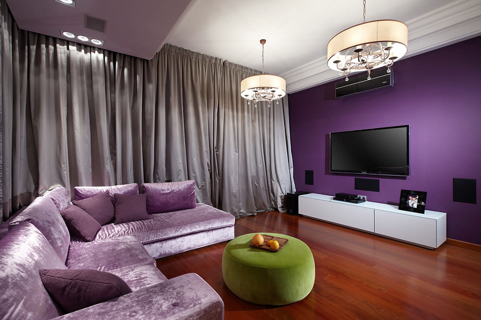
- Shades for the living room
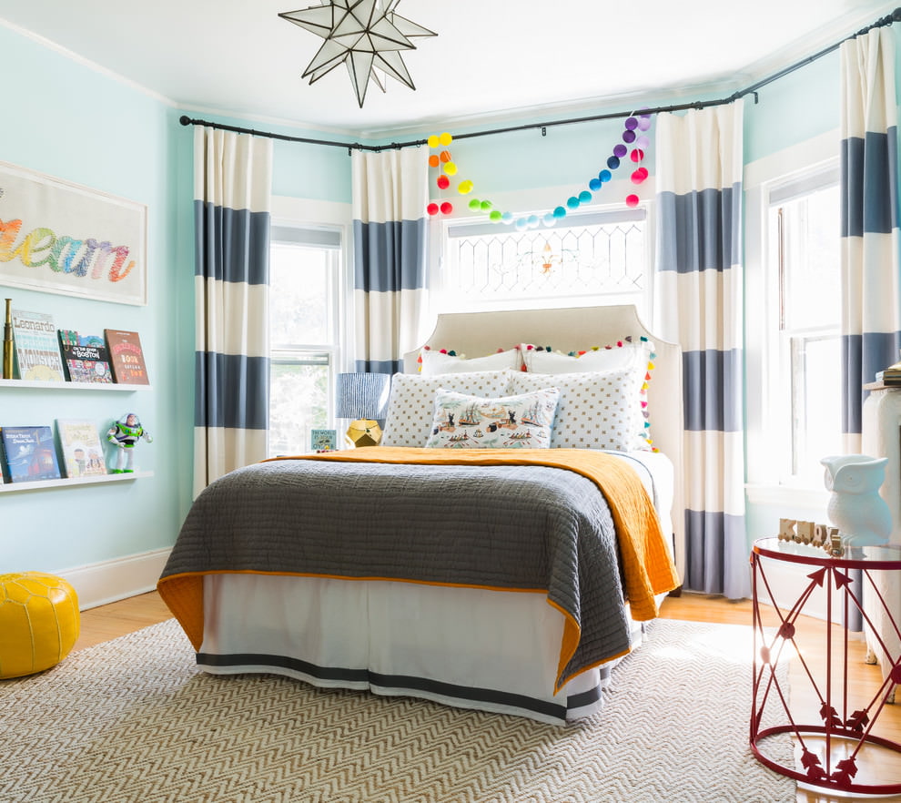
- Curtains in the bedroom
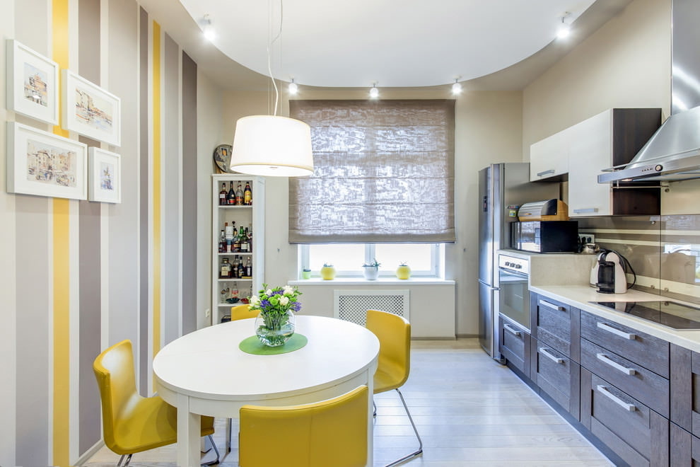
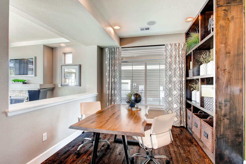
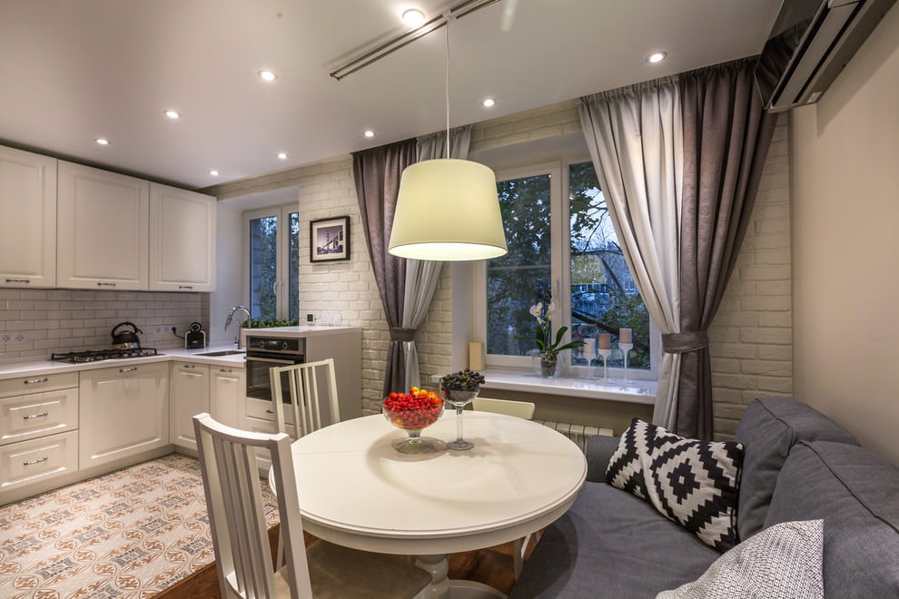
- Kitchen decoration
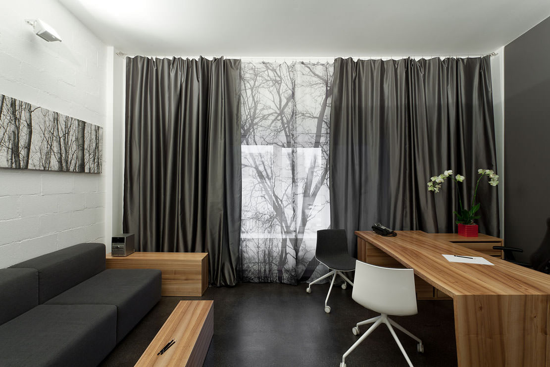
- Dark curtains in the hall
- Pros and cons of gray and steel shades of curtains
- Examples of combinations of gray curtains with other colors in the interior
- VIDEO: Interior with grey curtains.
- 50 photos of gray curtains in various interiors:
The Influence of Color on Style and State of Mind
Gray is considered to be a privilege of the upper classes, who can appreciate its restrained beauty. Therefore, the entire smoky palette is associated with nobility, elegance and solidity. Many consider such a range mysterious and ambiguous. If we talk about the impact on the psyche, then, according to psychologists, it gives a feeling of stability and confidence in the future, brings an atmosphere of peace.
Interesting fact. This color is preferred by people with a refined worldview. They are neat, always and in everything practical. They strive to keep up with the times.
Interior design with gray curtains
More and more often, designers use gray tulle in the interior, photos of which amaze with their thoughtfulness and elegance. This choice is due not only to fashion. Such textiles ennoble the room, making it more elegant. There is also a practical side to the issue - excellent compatibility with many other representatives of the color circle.
Fashionable palette of ash curtains
Fashion for colors has existed for many years. Every year, Pantone experts develop a palette of trendy shades that are widely used in fashion and design.
Today, the most relevant tones for curtain compositions include:
- ash;
- slate;
- steel;
- taupe;
- "mixes" involving lilac and beige.
What interior styles are suitable for grey curtains?
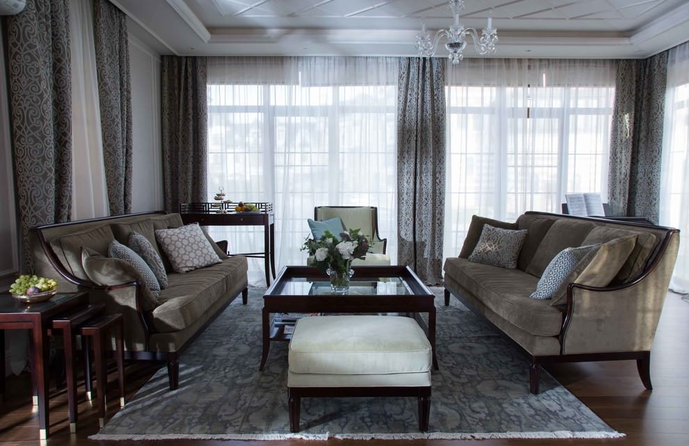
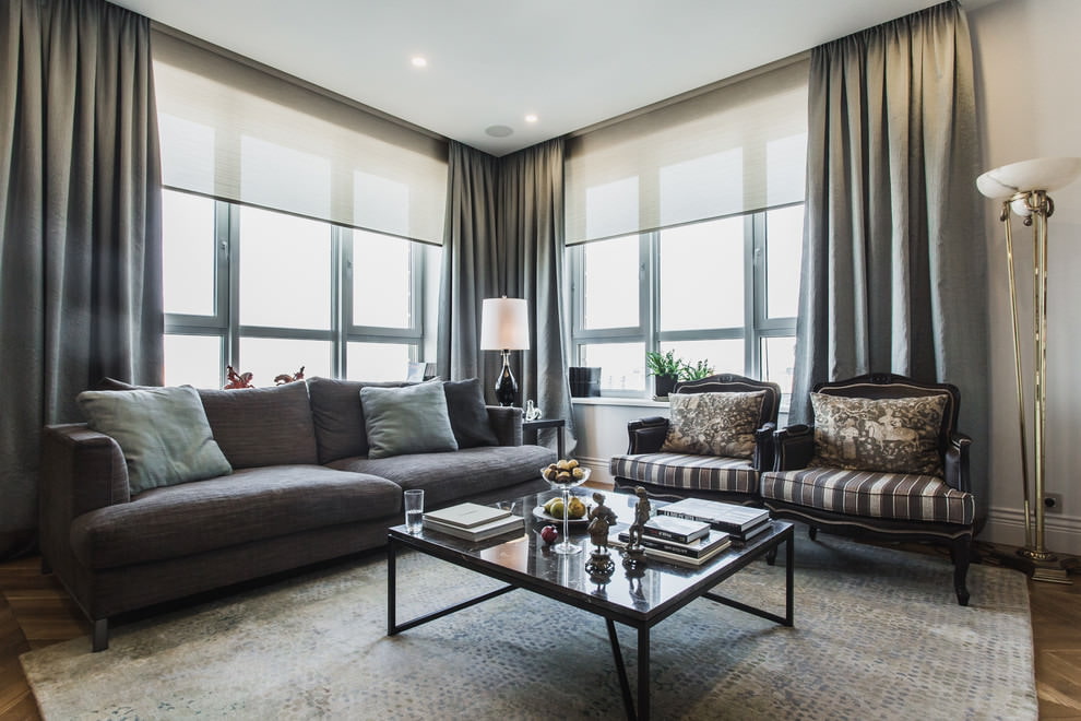
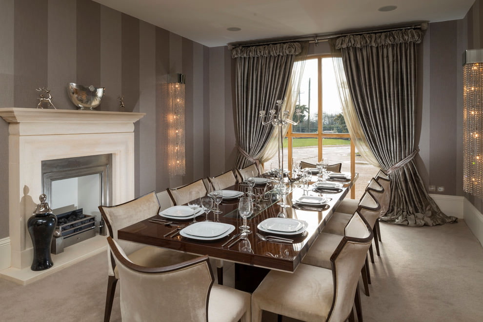
Steel shades are widely used for decorating rooms in different styles. But they best show their "character" in such areas as:
- baroque;
- classic;
- modern;
- high-tech.
Even in the gentle and romantic Provence style, smoky curtains will fit in wonderfully. But only if they have millefleur and the fabric is natural.
Well, the most ideal option would be to use "lead" curtains for a minimalist style. Strict and solemn minimalism will be achieved if you use a combination of light gray wallpaper and gray curtains in shades of steel, anthracite or wet asphalt. In this case, it is better to choose rich plum, lilac, dark pink colors for the surrounding furniture.
What fabric is ideal for smoke curtains?
It is interesting that even the choice of fabric influences the perception of the ash range, which is perfectly embodied in any texture. But still, it has its favorites.
- Atlas.
- Cotton.
- Taffeta.
- Jacquard.
- Flax.
- Organza.
- Velours.
- Guipure.
When it comes to texture, this neutral color works well with almost any type of fabric.
- Dense tapestry.
- Fabrics with relief patterns.
- Smooth materials with a noble sheen.
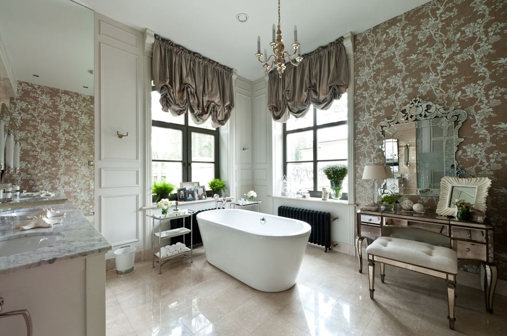
Silver curtains are very popular today. The metallic effect is one of the most relevant in designer fashion. Such "steel" curtains are used to create a classic style. They harmoniously combine with chrome chandeliers, "gilded" frames of mirrors and portraits, as well as metal decor - vases, figurines, clocks. Metallic curtains also effectively fit into the high-tech style.
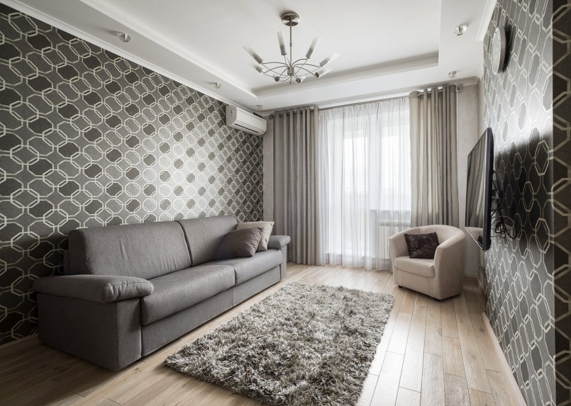
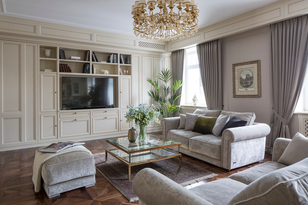
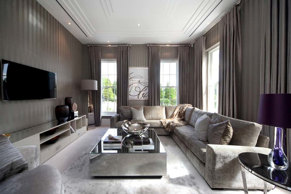
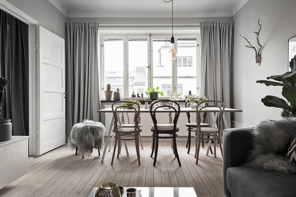
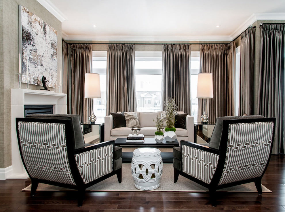
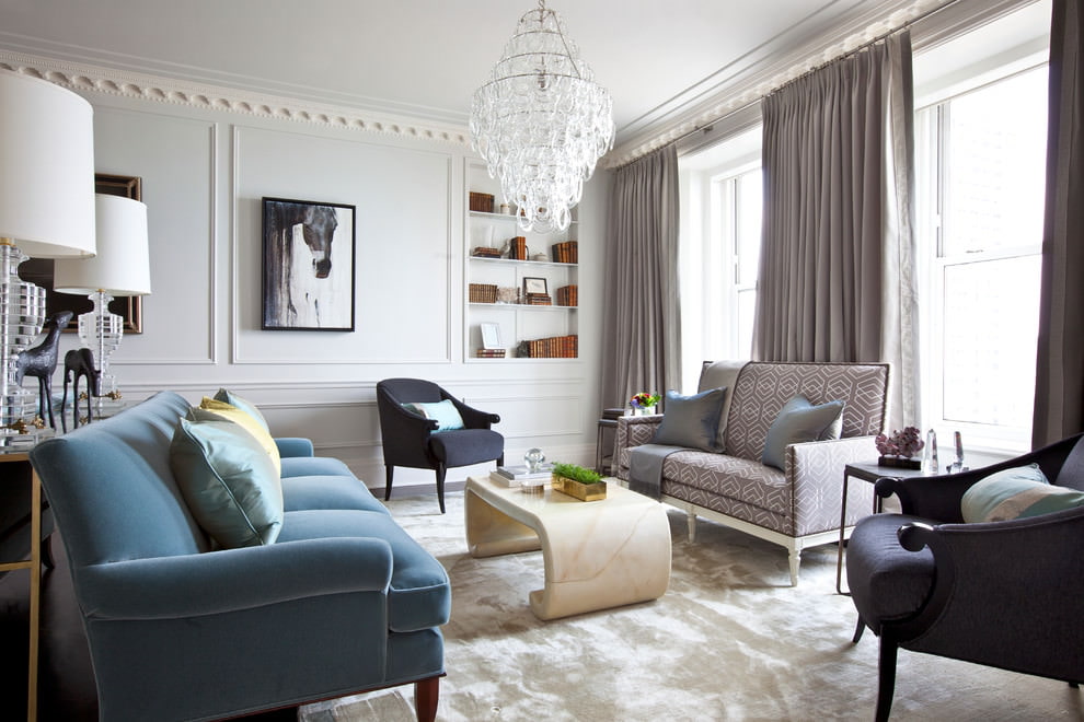
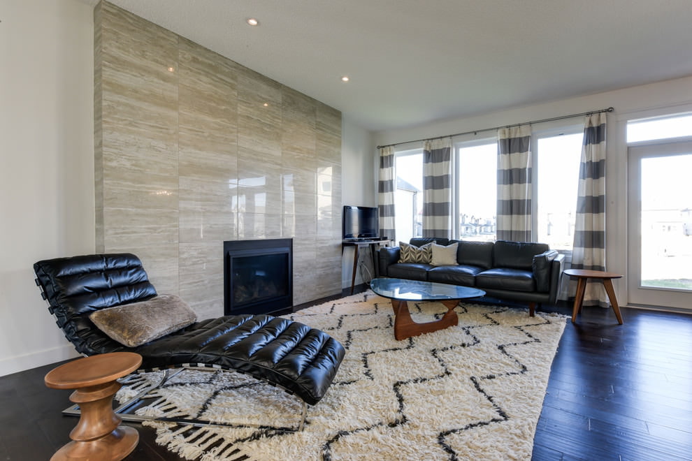
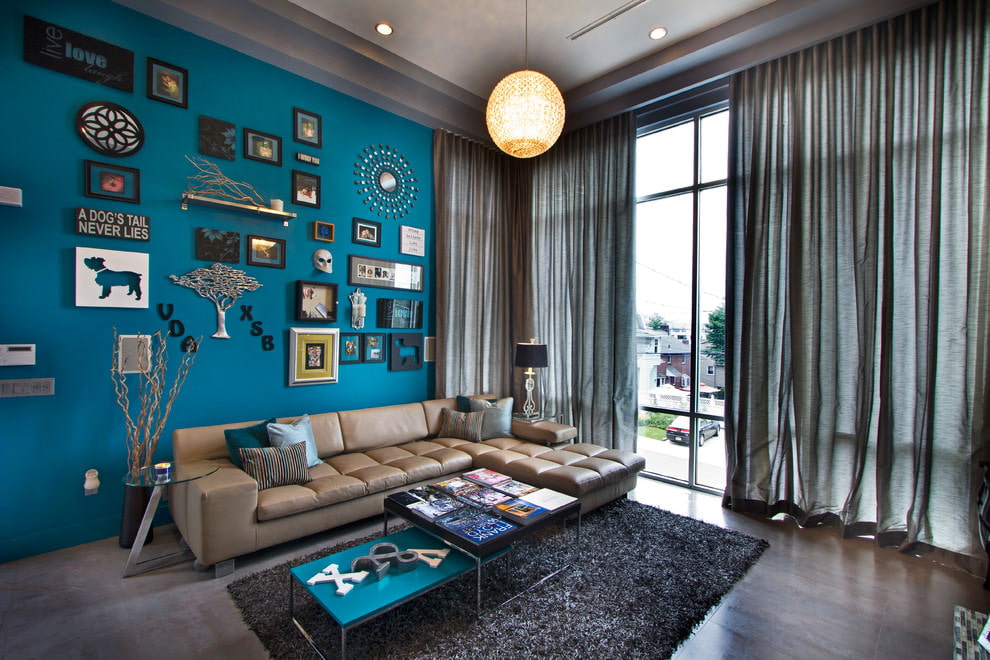
Shades for the living room
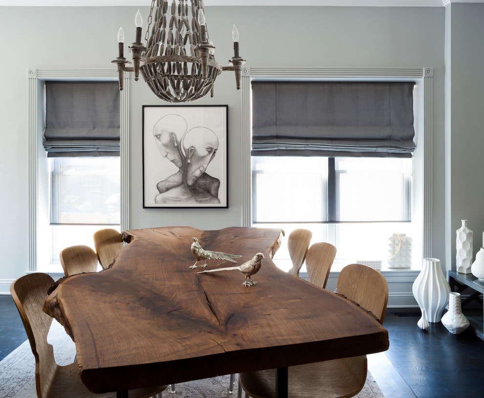
The living room is an ideal option for curtains with unusual names for textiles: gainsborough, monsoon, slate, pigeon, wet stone. With them, the guest room acquires a touch of fashionability.
But to get a truly sophisticated design, you need to follow a few recommendations:
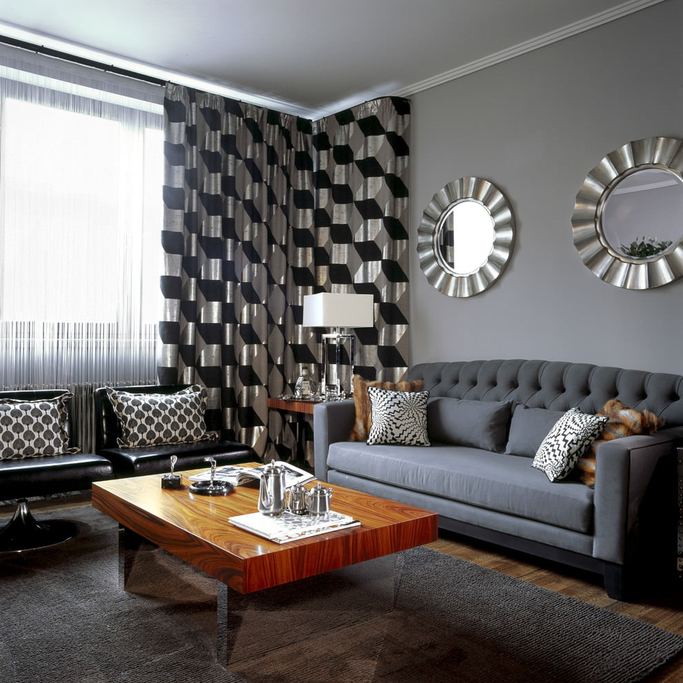
- Combine gray curtains with wallpaper of the same color. This combination is now very popular with designers. But there is an important rule: the wallpaper should be a little lighter or darker than the textile. The saturation depends on the overall design of the room.
- Create contrast. Curtains in the style of "storm cloud" or "smoking coals" should always be 2-3 tones lighter than the furniture, wallpaper, decor. Otherwise, when paired with other colors, smoky tulle or curtains risk becoming faceless.
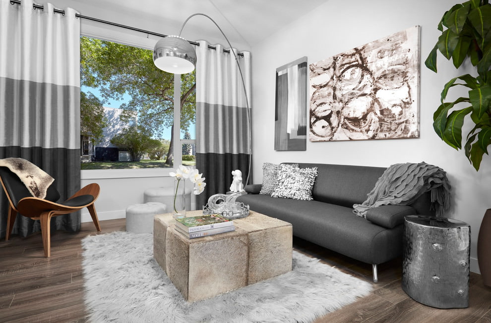
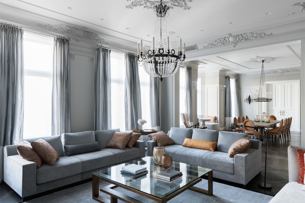
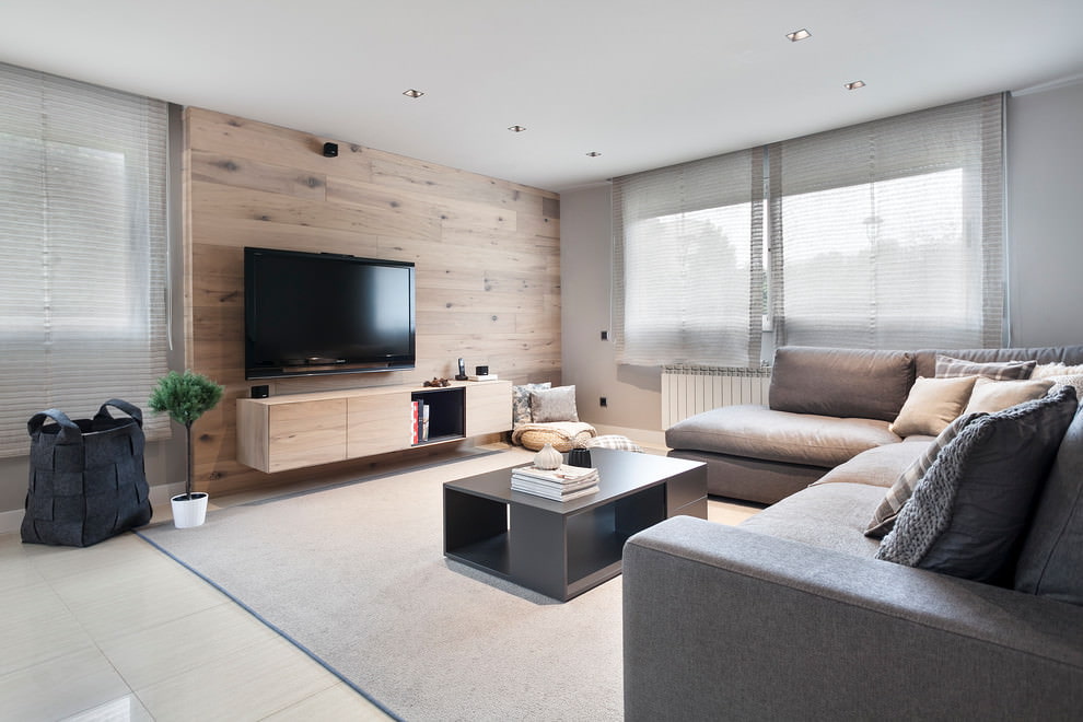
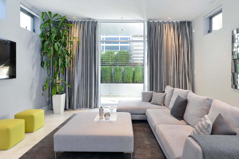
- Use pastel colors. The living room should be soft and cozy. To achieve this, you need to combine pearl, ash or coal with any other representatives of the neutral, pastel colors. Thus, silver curtains against the background of milky white wallpaper will be a winning solution for any living room.
- Consider the volume of the room. In a small room, it is better not to use dark curtains. They will visually "eat up" the space. In this case, pastel, shaded accents are more suitable: river mother-of-pearl, coventry, abalone.
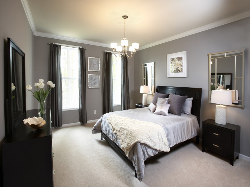
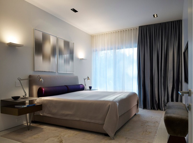
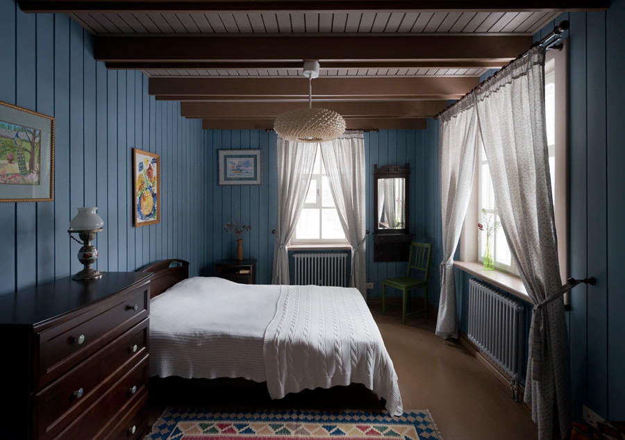
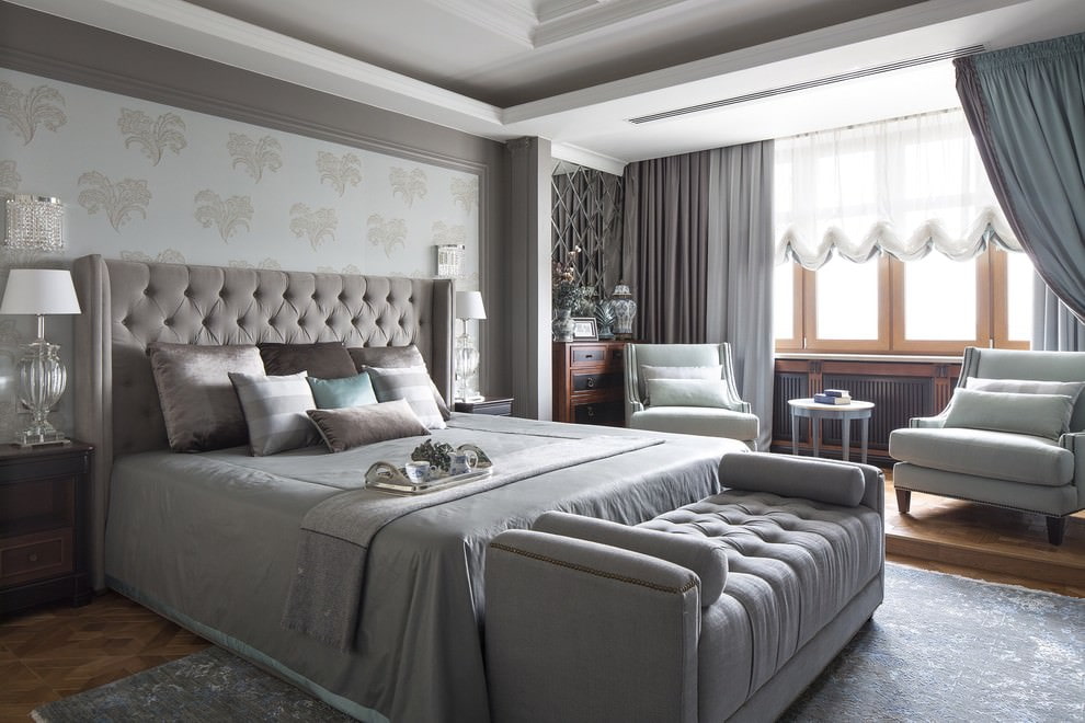
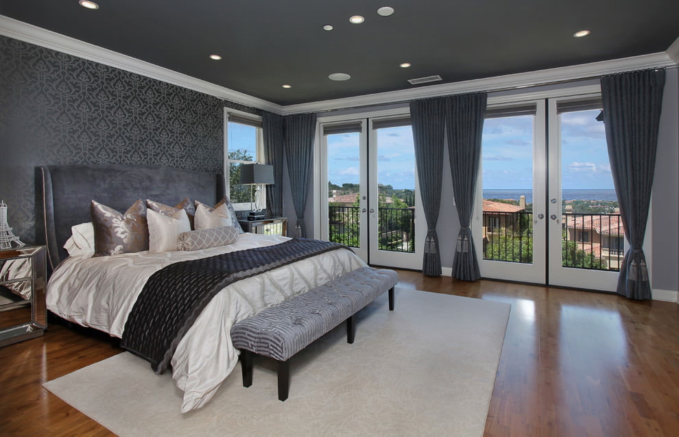
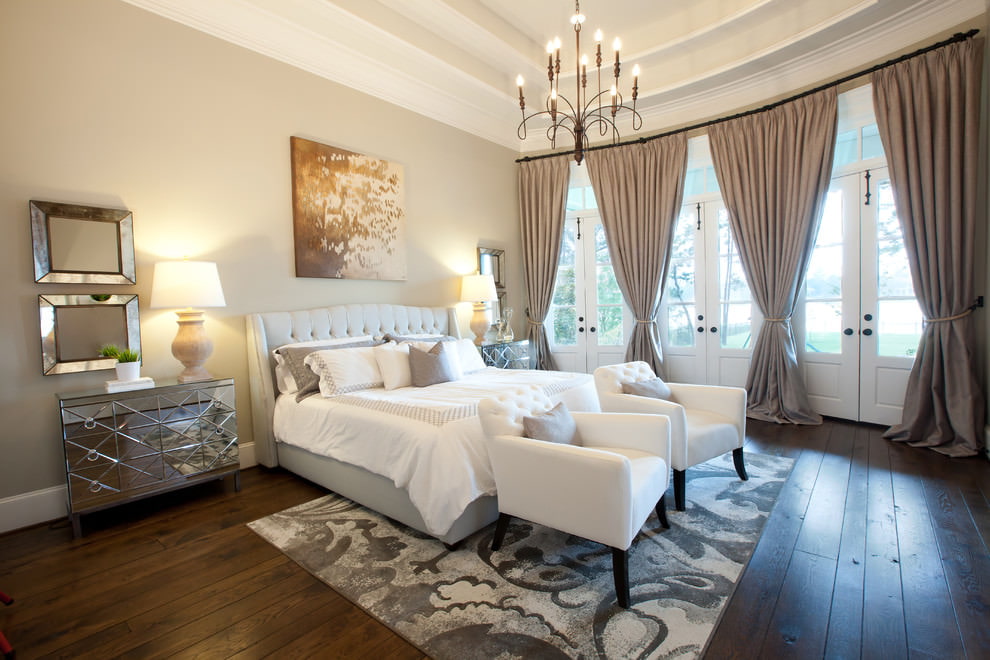
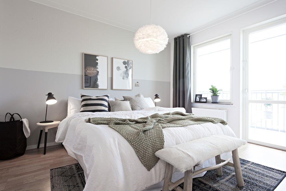
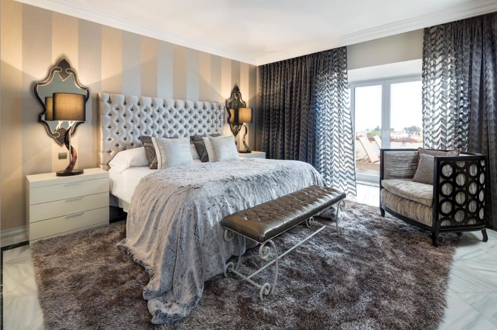
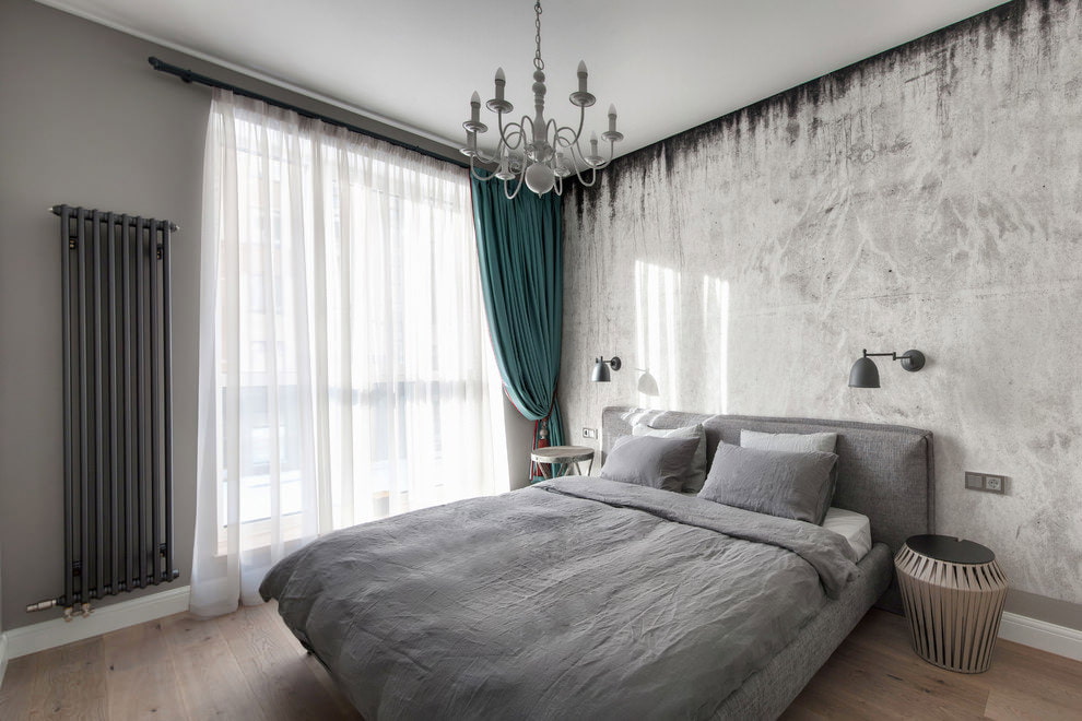
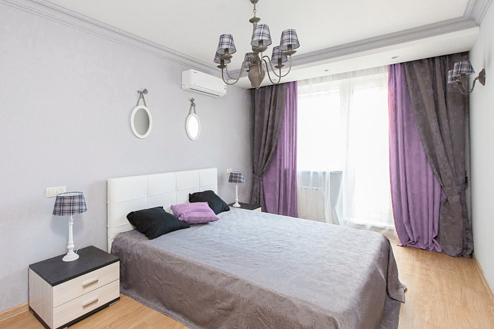
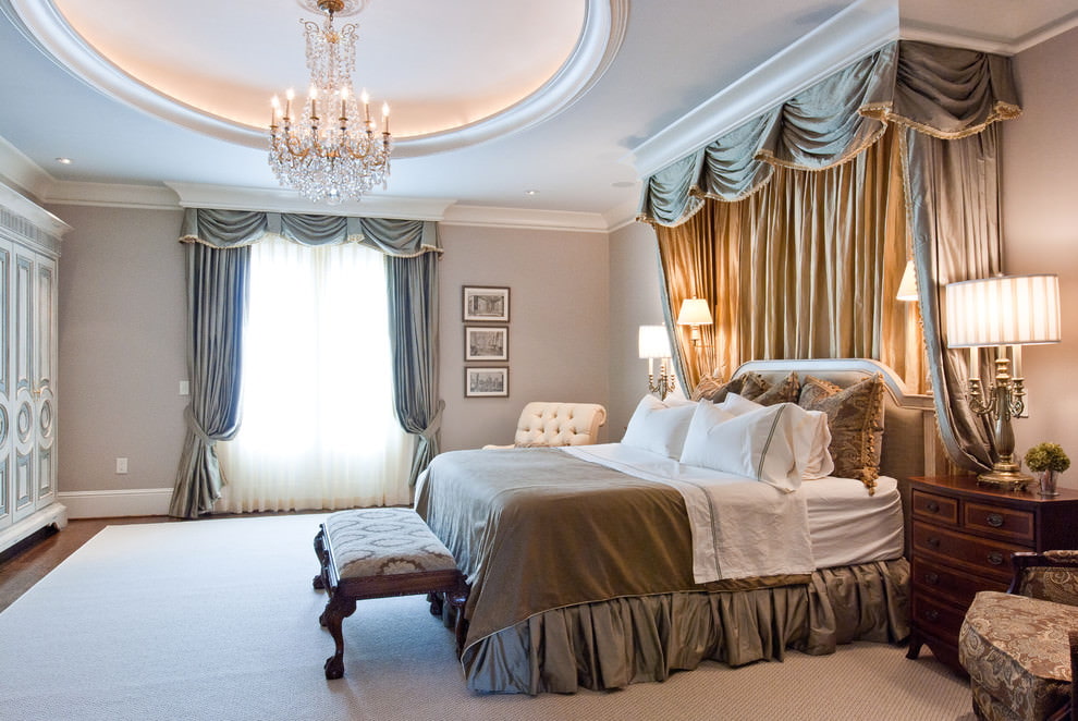
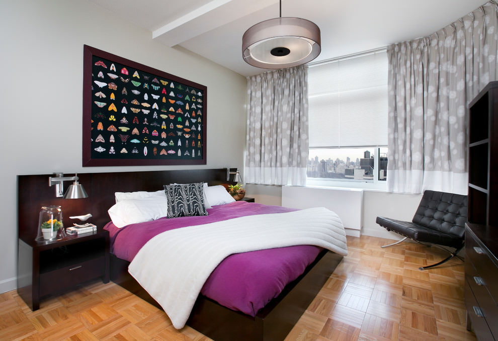
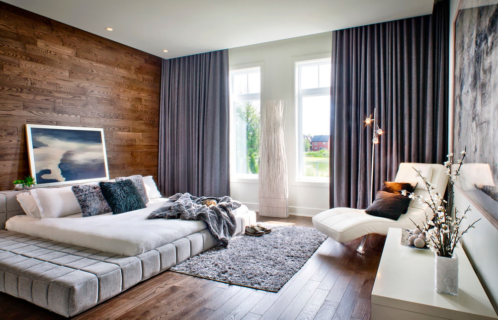
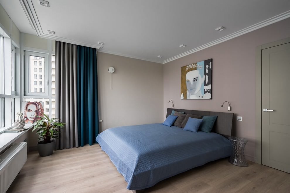
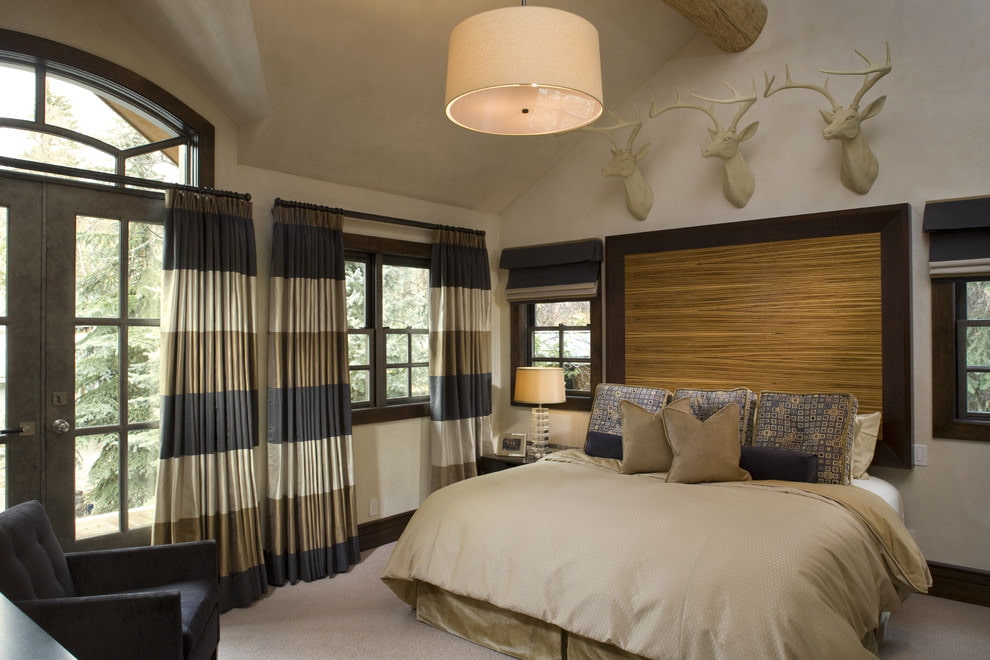
Curtains in the bedroom
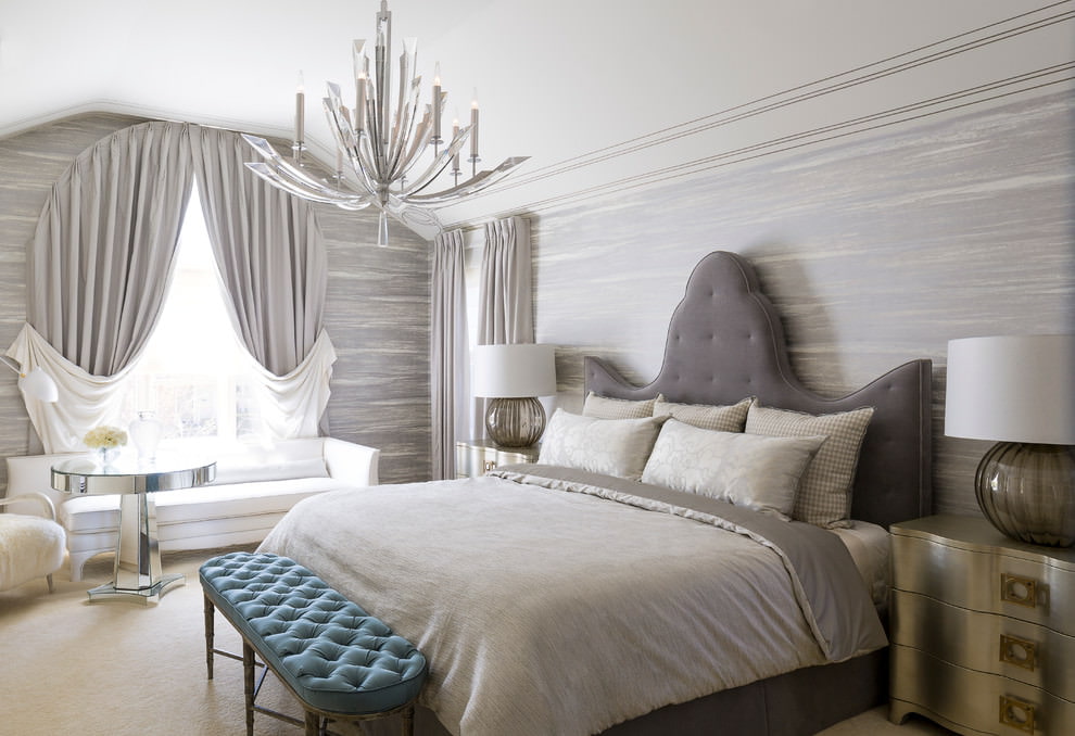
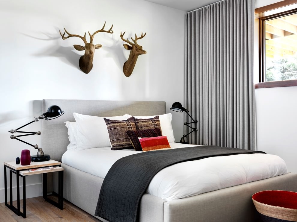
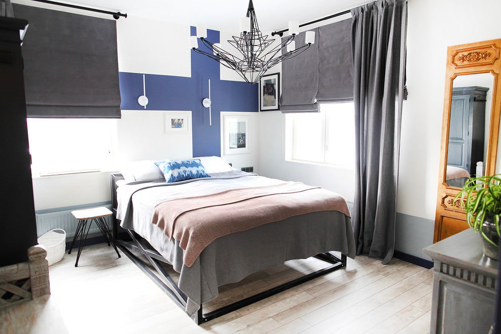
The richness of warm and cold, light and dark shades allows you to create a calm and peaceful design. That is why the second most popular place to use ash curtains is the bedroom. A soft atmosphere, comfortable for sleep and rest, will be built by calm, smoky curtains in combination with cream and white colors.
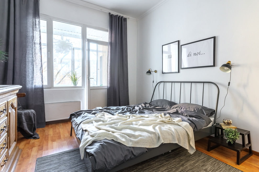
To soften the severity of the color a little, you can use "metallic" details - "metallic" pillows, a clock in chrome trim, a bedspread embroidered with shiny threads. Some designers decide on a monochrome solution in the design of the walls and decor of the bedroom. But then you need to follow several important rules.
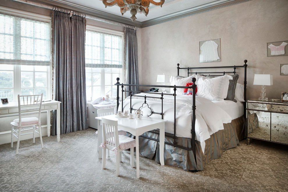
- Use at least three dark and light monochrome shades to organize space or zone it.
- Create contrast. The bed should stand out from the general background. For bedroom furniture, you can choose different options: white, beige, turquoise or light green.
- Place accents. Contrasting details will suit neutral design: pillows, bedspreads, vases, sconces. But there should not be too many bright little things. Two bright pillows and a pouf are enough to dilute the monotony of the design.
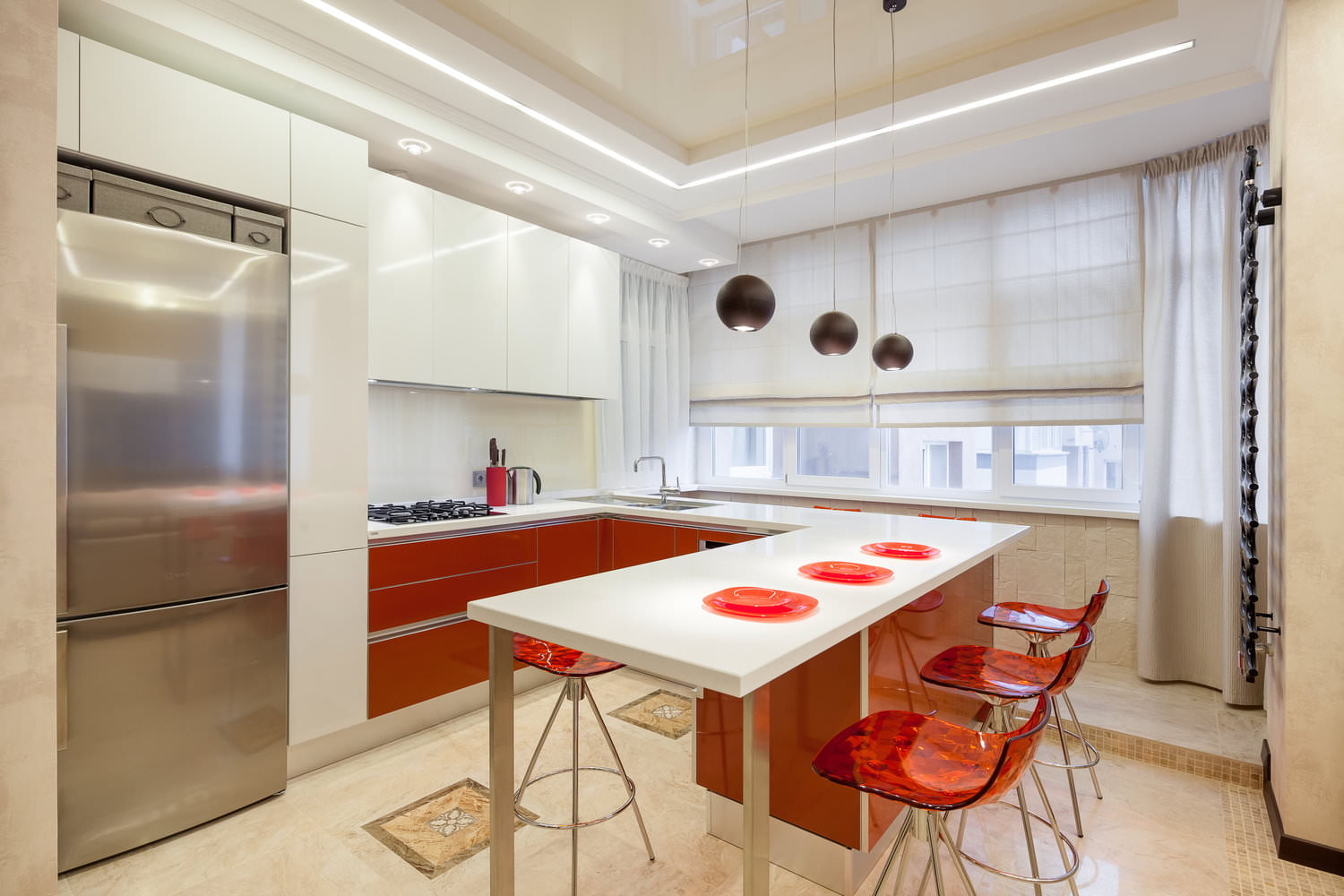
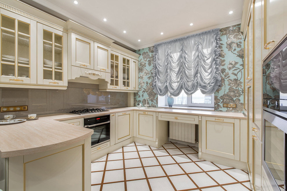
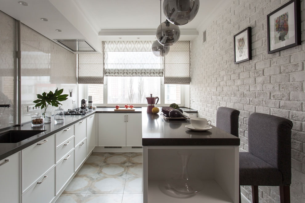
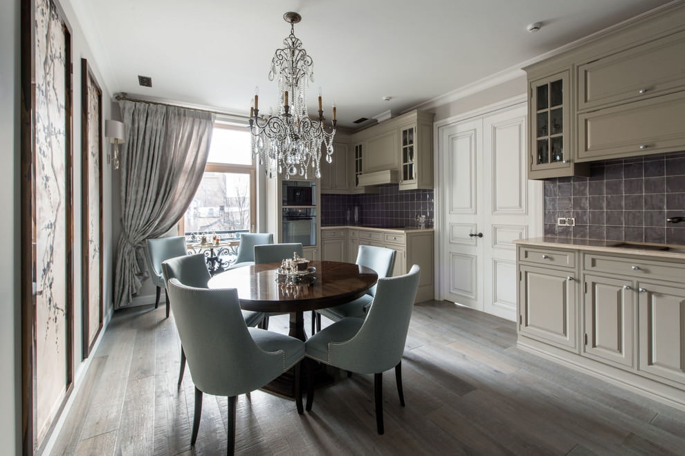
Kitchen decoration
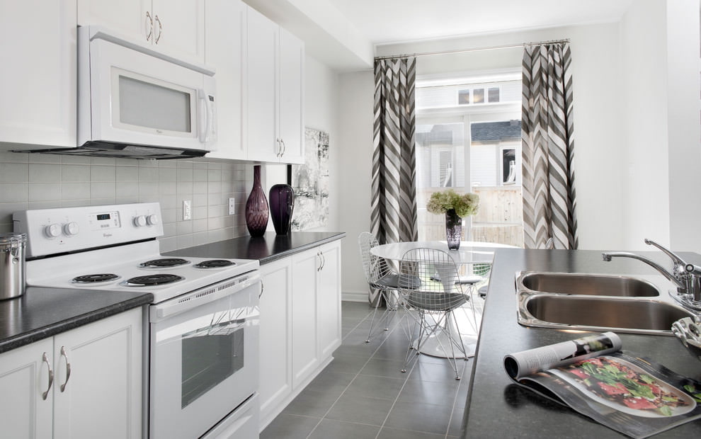
The quartz-slate palette is perfect for the kitchen. And it's not just about the laconic design. The color is not easily soiled, which makes it easier to use textiles in everyday life. There is another plus - metallic curtains go well with chrome surfaces on household appliances.
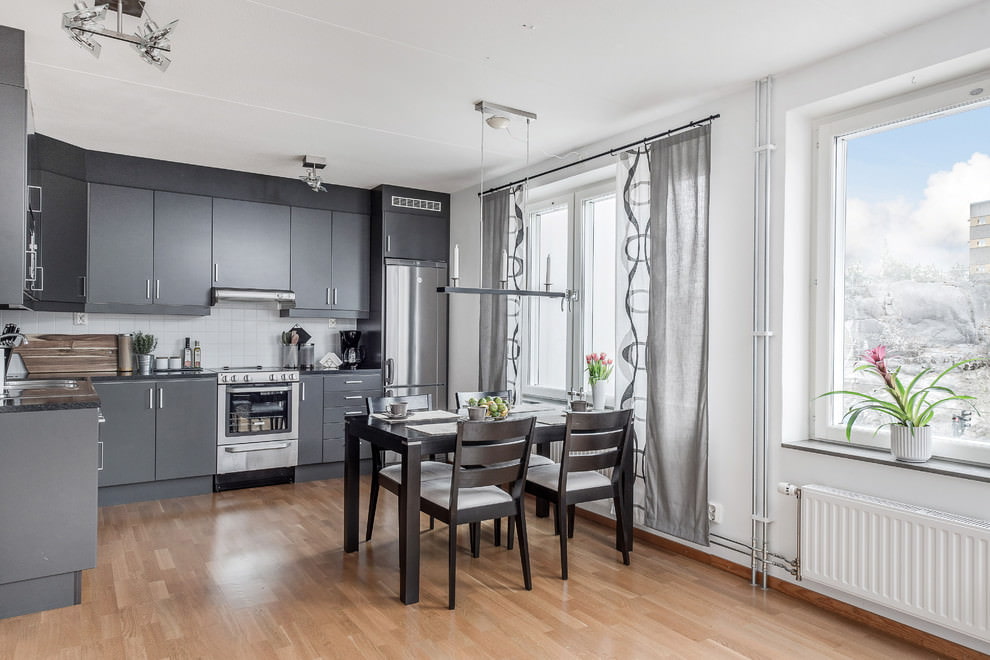
To prevent the kitchen design from becoming gloomy, you can add other, brighter colors. But you need to take into account the location of the room. If it is the south or southeast, then cold "additives" will suit the main background.
- White + turquoise/blue/green.
- Blue/purple.
If the room faces north or west, it is better to give preference to warm compositions and add:
- beige;
- white (warm);
- light brown.
All these options are suitable for a classic kitchen design. If you don’t like the classics, you can dilute the monochrome with other, brighter inclusions.
- Pink.
- Coral.
- Citric.
Important! When adding bright colors to the kitchen, be careful. Firstly, there shouldn't be too many of them, only as accents. Secondly, psychologically juicy colors whet the appetite. And if you are planning a strict diet, they will not help you lose weight.
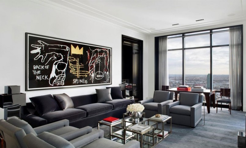
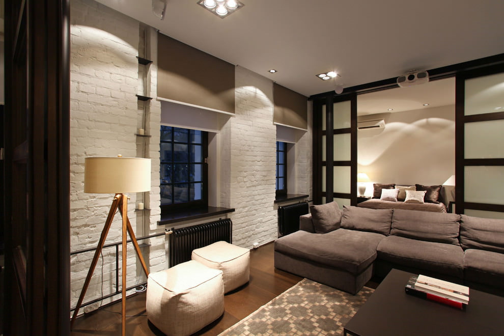
Dark curtains in the hall
Today, curtains in such "dark designs" as steel, wet stone, and coal are especially popular. But there are several nuances to using such textiles. In order to accurately include them in the interior, it is necessary to carry out preliminary preparation:
Add light. If you plan to use textile decor made of dark, anthracite tulle or curtains, you need to add lighting: hang a few additional lamps, sconces or install a stylish floor lamp.
Add chrome. A good tandem for dark curtains will be chrome details - door handles, furniture edging, mirror frames, chandeliers, chrome appliances.
Cover the walls with light colors. This technique will make the space appear larger and the curtains will look better.
Important. It is better not to use dark curtains for small square meters. They will create an oppressive feeling and reduce the volume of space several times.
Pros and cons of gray and steel shades of curtains
Curtains made of smoky and metallic textiles have their strengths and weaknesses. You need to know about them so that the curtains become a real decoration of the room and reveal their full "designer" potential.
The unconditional advantages include the following.
- Moderation. The neutral nature of the palette allows it to be used as a background for revealing more juicy colors.
- Serenity. Promotes relaxation and calmness, distracts from pressing problems.
- Nobility. This design gives the surrounding environment a solid and quality look.
- Versatility. Suitable for most rooms: kitchen, living room, bedroom, hallway.
- Multifaceted. There are many warm and cold halftones, diluted with different colors.
- Practicality. The non-marking textile can be used even for kitchens and children's rooms.
Among the few downsides.
- Monotony. In its pure form it can be a bit boring. Only experienced designers are able to create effective monochrome compositions.
- Demanding. It is necessary to take into account many important points: lighting, dimensions, general style and content.
Examples of combinations of gray curtains with other colors in the interior
Despite its almost universal compatibility, it is necessary to skillfully combine this calm color with other shades. The best "partners" for it are the following colors.
- Pink. Gray-pink curtains can make the interior of the rooms a little feminine and laconic or glamorous and pretentious. It all depends on what color scheme you choose – light or dark.
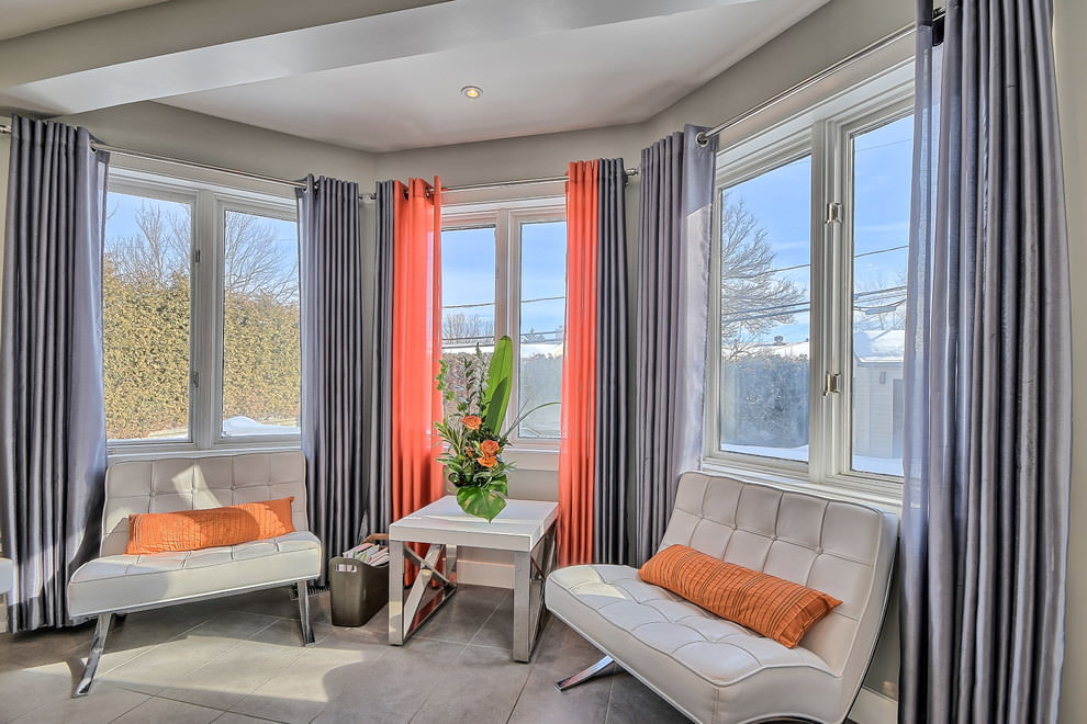
- Yellow and orange. The combination will be successful only if gray prevails in the furnishings and decoration of the room. And yellow will be just a small inclusion, giving the feeling of sun glare. Therefore, smoky tulle and wallpaper are used in the basic interior, and yellow or orange are used for lamps, furniture and in decor.
- Blue, light blue, turquoise. Excellent companions for the ash palette. Especially if we are talking about a classic design. In this case, it is better to choose discreet options - pearl and light blue. Ideally, add white to this pair.
- White. Gives a refreshing effect. The combination looks noble and elegant. Often used for the design of rooms in the Scandinavian style.
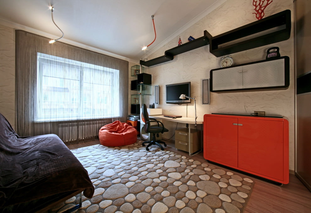
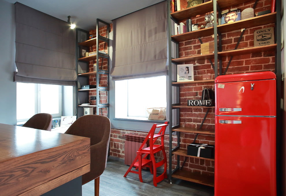
- Red. Often such an unusual "mixture" is used to create the style of hi-tech, loft, minimalism. The expression of red is softened by restraint, calm and noble background of curtains. The ideal set is "mouse" textiles, complemented by coral decor.
- Brown. Opinions differ on this combination. Some believe that combining two neutrals of the palette is not an easy task. Others argue that you just need to create a contrast. For example, dark anthracite curtains will perfectly emphasize the beauty of furniture in a light and warm brown range.
- Green. The severity and asceticism of neutral shades are refreshed by the green range. Especially if it is selected in a natural, light, natural palette - soft light green, green moss, pistachio. The duet can be diluted with a warm beige addition.
When combining shades, it is necessary to take into account the area. For small rooms, it is better to choose light, warm and pastel tones. If you turn to a more saturated palette, there is a risk of overloading the already small square meters.
Gray curtains evoke different emotions. For many, they will forever remain depressive and boring. But for those who were able to appreciate their elegance and nobility, such curtains will become an exquisite and stylish addition to the interior.
VIDEO: Interior with grey curtains.
50 photos of gray curtains in various interiors: